
|
Big Jump Press
~ Alabama |
Share this page:
|
Sarah Bryant: "Big Jump Press is the imprint of Sarah Bryant. Under this name, I produce letterpress printed artists’ books, prints, broadsides, and hand-bound books. I started Big Jump in 2005 in Tuscaloosa, Alabama while an MFA student at the University of Alabama." SFCB “From the Bench of Sarah Bryant” (Sept 2021): “Letterpress printer, book artist, and University of Alabama professor Sarah Bryant shows us her home studio and some of her projects - one made up of swatches / sample books from objects in her life and one with her Shift Lab collaborators” https://vimeo.com/604153347 |
|
| Acts of Translation | |
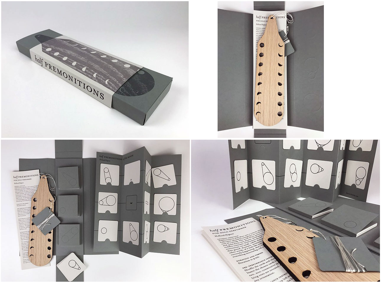
Half Premonitions of the Moon 11 x 3 x 1" when closed. Letterpress printed from polymer plates and laser-cut oak on French Construction paper. Typeface is Mrs Eaves, designed by Zuzana Licko. Includes a 4 page accordion pamphlet with instructions for using the cards with the instrument; 6 page accordion music sheet slotted for inserting cards; three flap containers for housing cards; and, a bullroarer instrument made of laser cut oak and a length of nylon cord. Enclosure designed by Sarah Bryant. Instrument designed by Holland Hopson. Big Jump Press: "Half Premonitions of the Moon is an instrument, modular score, and set of performance instructions housed in a custom-built enclosure. The score and instrument were developed by Holland Hopson, a sound and media artist, composer and improviser. The enclosure was designed, printed, and hand produced by Sarah Bryant, a book artist who works under the name Big Jump Press. “The customizable score is assembled from a set of 36 cards. This allows individuals or groups to use chance operations to create a unique version of the piece for each performance. The instrument itself is a custom-designed, laser cut bullroarer played by swinging it in circles on the end of a string. Bullroarers are some of the oldest and most widespread instruments in human cultures. They can be found across the globe from Australasia to Africa and the Americas They are often used to evoke natural phenomena such as wind and rain during ritual events. This musical work favors patience, stasis and quiet focus over drama, development and sudden contrasts. “To create the score Hopson wrote code using Processing to generate and position graphic shapes on the page. Bryant converted the shapes to printing plates and used traditional printing and bookbinding techniques to convert Holland’s digital designs to a set of cards and an accordion folded housing. Presenting the project as a kit allows for the dissemination of the piece to multiple venues, including gallery spaces, outdoor performances, and libraries with collections of artist books. By creating this hybrid object, Bryant and Hopson hope to bring together audiences from the book art, music and visual art worlds.” This project was made possible by financial support and community building from the Collaborative Arts Research Initiative (CARI) at The University of Alabama. |
|
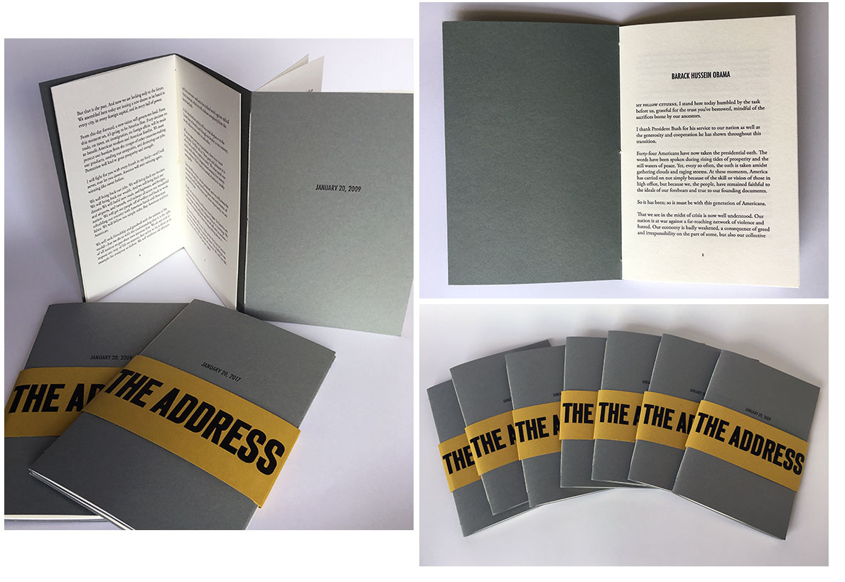
The Address 4.75 x 7”; 20 pages. Dos-à-dos pamphlet construction. Letterpress printed on Mohawk Superfine and French Construction papers. Belly band closure with title. Numbered. Big Jump Press: "'The Address' is a dos-à-dos pamphlet featuring the inaugural addresses of President Barack Obama and Donald Trump. This book was designed, printed and bound in collaboration with Anna Embree in an edition of 50 copies in January of 2017 in solidarity with the Women’s March on Washington and sister marches all over the world." This is the second edition of “The Address”. All proceeds from the sale of this book will be donated to the ACLU and the Southern Poverty Law Center. Colophon: “President Barack Obama wrote his 2009 inaugural address with the aid of Jon Favreau, his chief speech writer. According to The Wall Street Journal, much of Donald Trump’s inaugural address was written by Steve Bannon, Trump’s chief strategist until his resignation in August 2017, and Stephen Miller, a white supremacist who (at the time of this printing) currently serves as senior advisor for policy.” |
|
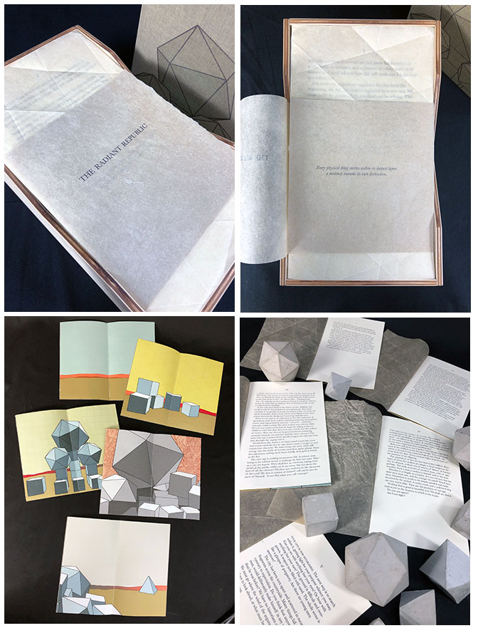
The Radiant Republic Elements housed in 27 x 17 x 11 cm box (removable lid covered in cloth; wood bottom with glass insert). Box constructed with finger jointed, pressed-wood with light green cloth lid. Includes 9 concrete forms and 5 pamphlets. Wrapper around pamphlets with title printed. Text digitally set in Baskerville. Letterpress printed from polymer plates. Color illustrations. Embossed text on the verso. Same text printed in ink. Image of three icosahedron forms on lid. Concrete forms (3 icosahedrons, 3 cubes, and 3 pyramids) in bottom, shielded with glass sheet cover. Signed and numbered by the artist. Sarah Bryant: "'The Radiant Republic' is an artist book about ethics, urban planning, and the inherent flaws in utopian designs. The text at the core of the project is a city-building narrative comprised entirely of language excerpted from Plato’s 'Republic' (c. 380 BCE) and Le Corbusier’s 'The Radiant City' (1933 CE). In these original texts, separated by more than two thousand years, Plato and Le Corbusier each describe city plans designed to prescribe morality and ethics. These works are revered, but they are also deeply troubling, advocating the destruction of existing cities, the separation of children from their families, and the connection between city planning and warfare. "In 'The Radiant Republic', a five-part narrative describes the life cycle of an imagined city using unedited language woven together from the original sources. Each part is bound separately as a pamphlet and contains one section of an interlocking landscape with no fixed beginning or end. Platonic solids, a set of five shapes made up of equilateral faces set at equal angles, feature heavily in the printed imagery. Since ancient times, these shapes have been venerated as physical manifestations of perfection of form. But one cannot create a perfect object, and one cannot build a perfect city. This is a book about the voices we value, the ideals they espouse, and the consequences of venerating their views. "'The Radiant Republic' is housed in an enclosure made of wood and glass containing platonic solids cast in cement. The epigraph is an excerpt from Mostafavi and Leatherbarrow’s 'On Weathering: the Life of Buildings in Time'. "It reads: 'Every physical thing carries within its deepest layers a tendency towards its own destruction.'" Sarah Bryant, interviewed by Red Butte Press: "Although these works and their authors are separated by time and context, both are concerned with designing a perfect city and a belief that there is an inherent connection between their design and a universal form of justice or moral virtue. Additionally, both of them use the structure of the text to weaponize their argument, LE CORBUSIER ATTACKS THE VIEWER WITH ALL CAPS AND EXCLAMATION MARKS!!! while Plato tangles the viewer up with leading questions that coax agreement at the end of each paragraph. Do you not agree? I’ll also say that the other thing that strikes me is that both these voices are so profoundly male, although this is no real surprise or rarity." Robert Bolick: “Sarah Bryant’s The Radiant Republic (2019) insightfully integrates Plato’s and Le Corbusier’s texts and ideas. The very physicality of the blond wood, linen cover, glass window, concrete representations of Platonic solids, embossed type and sewn papers could easily be a response to Juhani Pallasmaa’s comment: “The current overemphasis on the intellectual and conceptual dimensions of architecture contributes to the disappearance of its physical, sensual and embodied essence” (The Eyes of the Skin, p. 35).” |
|
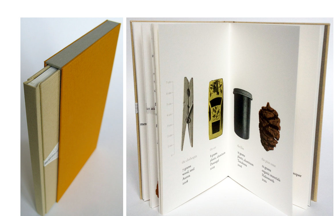
Fond 4.25 x 7.25"; 28 pages. Drum leaf in slipcase. Letterpress printed on Zerkall paper. Type is Adobe Garamond. Edition of 75: 10 deluxe; 65 standard. Deluxe : Numbered 1-10 (Out of Print). Housed in clamshell box with one of the ten objects featured within the text. Each box is constructed to accommodate a different object; therefore, the ten copies of the deluxe edition will be slightly different depths. Ten prints are housed in a paper wrapper alongside the book. Standard: Numbered 11-75. Bound in cloth boards with paper inset on front board. Slipcased. Cloth covered sides with paper top and bottom edges. Sarah Bryant: "Fond is an investigation of memory and archive as manifested by the small, valueless objects that individuals collect and preserve. These objects, casually assembled over the course of years, serve as an information retrieval system and an emotional bank. A fond is a collection of documents organically accumulated by a person or institution. Using halftone photographs, color silhouettes, and a winding rope of text, I constructed a history of several objects. "I produced Fond over the course of 2011-2012 while I moved from Upstate New York to Alabama and finally to the United Kingdom." |
|
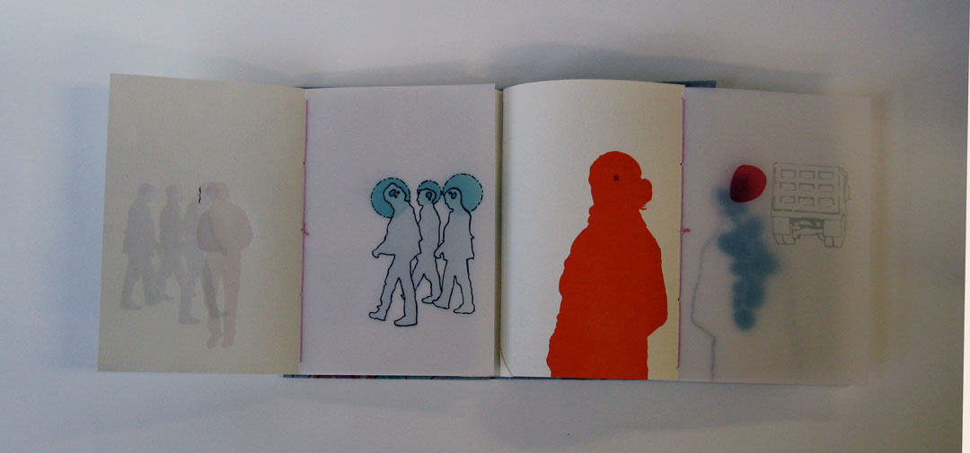
Point of View 5 x 7"; gatefold structure. Letterpress printed from polymer plates and Perpetua metal type on Arches Text and Wyndstone Vellum. [N.B. The colophon says the transparent material is Chartham Natural Clear, but this is wrong. Bryant's Creative Thesis cites many problems with Wyndstone Vellum: "I apparently hated this material to such a degree that I didn't even want it in my colophon, accidentally citing a paper I had used in some earlier mockups as the transparent material for the book."]. Endsheets: Fabriano Ingres. Casebound: German flatback case with 6mm joint. Cloth bound, blind stamped. Sarah Bryant: "An exploration of one moment and location, one position in space and time. This book was designed, printed and bound over the course of two years." "Objectives: When I embarked on this project in the spring of 2007, I started with a series of simple guidelines. I wanted to incorporate the structural device of the dissection plate into a book that dealt with a person's relationship to their immediate, everyday environment. I wanted to create a book with a relatively simple binding in a significantly larger edition than my other books, printed in editions of 45. I wanted to work primarily with imagery, using text sparingly. "Design: ... I hit upon the gate fold as an ideal structure for the book. The gate fold allows for the simultaneous dissection of the recto and verso pages. It was the simplest structural solution to the problems inherent in creating a series of dissected spreads. As in my other books, the structure and content of this project are linked: one cannot be developed without the other.... [Questions as to how to use the structure led the artist to these conclusions] "Initially, I believed that these groups of people should be environmentless, simple halftone figures floating in a white space. ... [but I] realized that those that included an environment were much more interesting. The surroundings of these people were critical to the book, helping both to establish a position in time and space, and to reinforce that these spreads were connected in some way.... "... the back sides of the gate folds ... presented a challenge. Somehow, this space needed to introduce each spread and use a system which unified the book.... I decided to use a map, complete with dots to indicate locations of people. I used red to highlight the groupings which would immediately follow each map. The central point, which represents the observer whose perceptions the book explores, is gray throughout all of these maps, save the collection of dots on the title page, where it is red.... "Determining the text: ... I decided on a combination of two text systems. First I inserted a small amount of text that indicated direct (printed in black) and overheard (printed in gray) dialogue. It is my hope that using dialogue places this book in a moment and an environment, and helps to set up the idea of being aware, sometimes inadvertently, of the immediate environment; of being an observer and eavesdropper. The second system, punctuation, gives an abstract indication of the relationships between the groups of people in the book. I used ampersands, ellipses, brackets and asterisks: punctuation whose basic function is to indicate that something is missing or anticipated. Brackets include and exclude. Asterisks highlight something unusual or important, and ask you to seek an explanation elsewhere. It is my hope that the punctuation sets up a system of classification that highlights themes of inclusion and isolation." |
|
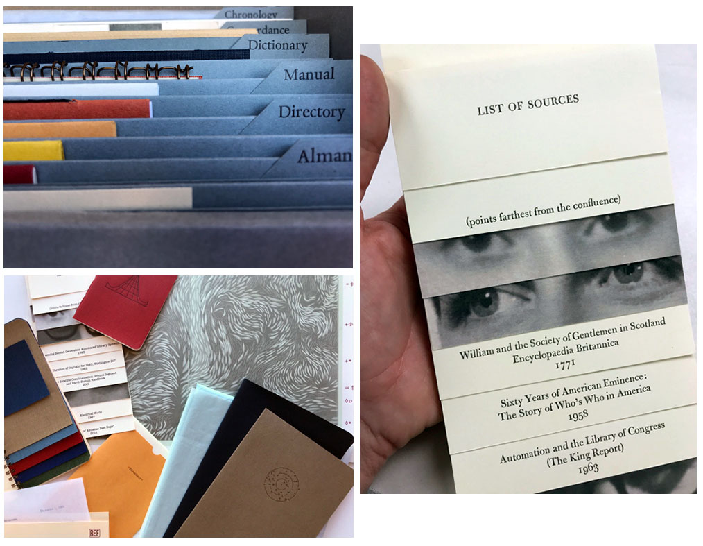
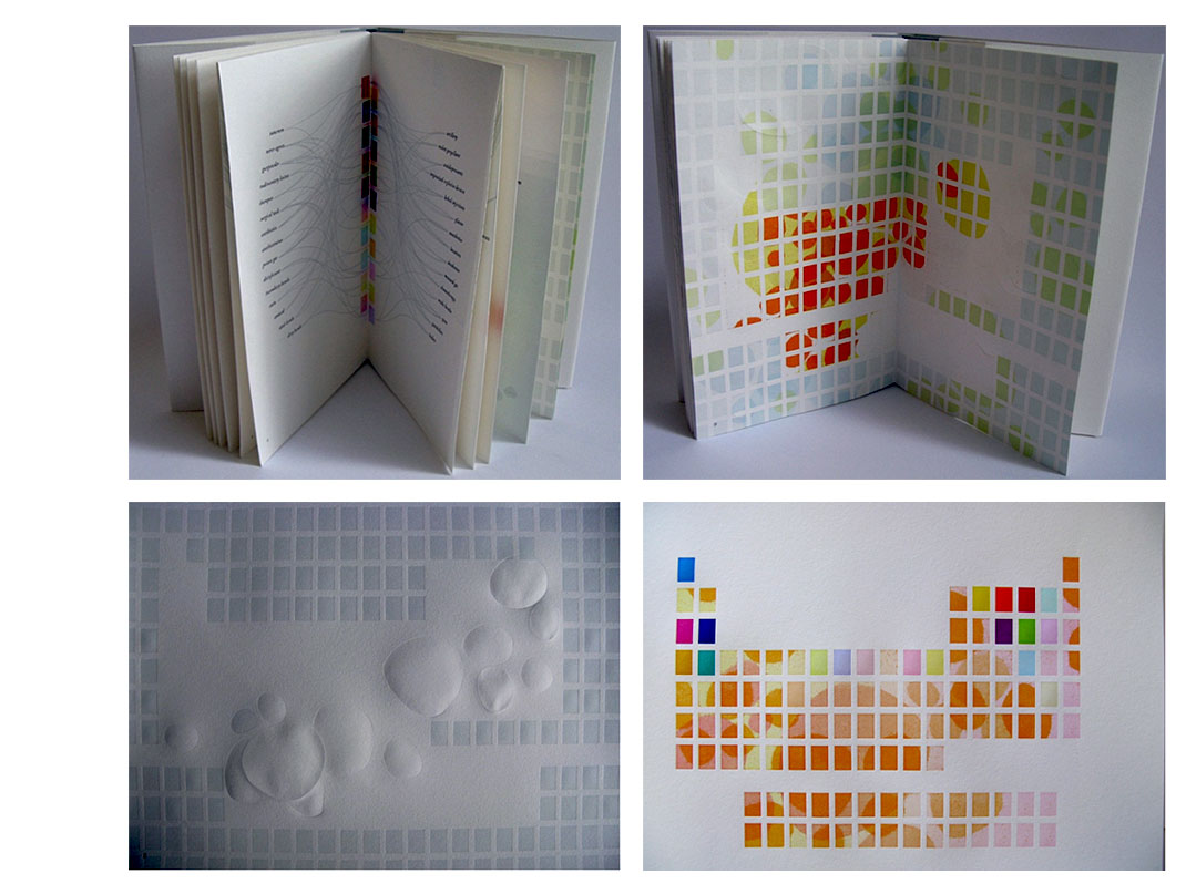
REF 15 parts housed in a custom 23 x 29 x 12 cm archival document flip-top box with an ascending accordion folder structure. Printing methods include letterpress, risograph, screenprinting, laser printing, and digital printing. Binding formats include concertina, spiral bound, document binder, pamphlet, double pamphlet, folder, paper envelope. Signed by each artist and numbered on the colophon. Big Jump Press: "REF is an investigation into the erosion of the physical reference area of the library, and the fundamental shift taking place in the way we ask and answer questions. This project was produced by the members of Shift-lab: Katie Baldwin, Denise Bookwalter, Sarah Bryant, Macy Chadwick, and Tricia Treacy. Artists worked individually and collaboratively to produce elements inspired by the traditional components of a physical reference section: Almanac, Atlas, Bibliography, Biographical Dictionary, Chronology, Concordance, Dictionary, Directory, Encyclopedia, Gazetteer, Guidebook, Handbook, Index, Manual, and Yearbook. "We’ve been working on this project for two years but made a big leap forward last May when four of the five of us met at the University of Alabama Huntsville. We spent a week workshopping ideas, speaking to librarians, making mockups, and investigating the reference area of the library there, a labyrinth of warm and cool buckram. "This week of research and making culminated in a series of mockups that we used when we returned to our separate studios. "As we designed our responses to traditional elements of the reference section, we used several dates as loose organizational principles to tie our work together:
"Reference sources evolved slowly to answer specific types of questions that emerged over time as people sought to engage with information. These types of questions, asked repeatedly for many hundreds of years, were the catalyst for the production of the 15 standard types of printed reference that we were responding to. We each worked as leads on between one and four components, sometimes individually, sometimes collaborating with other Shift-lab members. We kept a google doc of all of our sources, materials, sizes, and images. Our aim was to create a reference section that operated the same way a library reference section would operate: creating and highlighting linkages, and answering (or posing) multiple questions about related material. "Where possible, we used our selected dates and sources as material content for our components. Repeated language, names, materials, and images crop up in multiple places. The Bibliography, itself a traditional reference type, became a natural place to list our sources for the project." |
|
“Acts of Translation is a forthcoming series of collaborative books which share a common theme and set of dimensions. Each component of the project will examine an act of translation, broadly defined as “the conversion and communication of information,” and interpret that act through the combination of text, image, material choices, and book structure. When complete, these books will be gathered into a boxed set, each book an exploration of the theme from the perspective of a different individual. Housed together, the books will offer unexpected points of connection across disciplines. “Forthcoming component will feature Ben Mitchell, a type designer in the UK who specialized in Southeast Asian scripts.” |
|
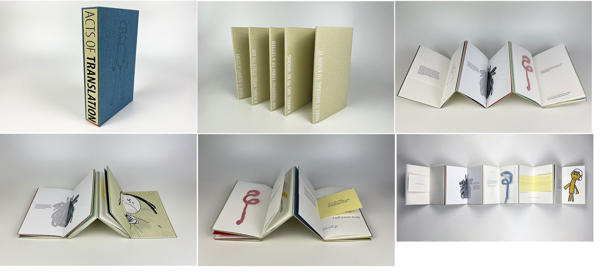
Acts of Translation: Comprehensive Edition Big Jump Press:” ‘Acts of Translation’ is a collected series of collaborations. Each component of this book describes a distinct act of translation, defined for the purposes of this project as ‘the conversion and communication of information.’ Text for this project was gathered, edited, and recombined from recorded interviews conducted between 2021 and 2023 with a photographer, a biology professor, a type designer, a soprano performer, and an elementary Spanish teacher. When housed together, these collaborations offer unexpected points of connection across disciplines and highlight our shared experience.
“Acts of Translation is bound in a structure which can be expanded to reveal all five books at once, or collapsed so that the texts from any two books can examined side by side. The project is housed in a chemise and slip case. Papers for Acts of Translation include Zerkall Book, Clearprint Design Vellum, Colorplan, Canon Pro Premium Matte, and Red River Premium Matte. Text has been digitally set in Arno, a typeface designed by Robert Slimbach; and Myriad, designed by Robert Slimbach and Carol Twombly. Text was letterpress printed from polymer plates. This edition has been bound in Iris and Dubletta bookcloth. Individual collaborative components have been issued separately in lettered editions of 26 copies each. This project was made possible by financial support and community building from the Collaborative Arts Research Initiative (CARI) at The University of Alabama and funding from the School of Library and Information Studies in the College of Communication.” Five pieces in special enclosure. |
 Click image for more |
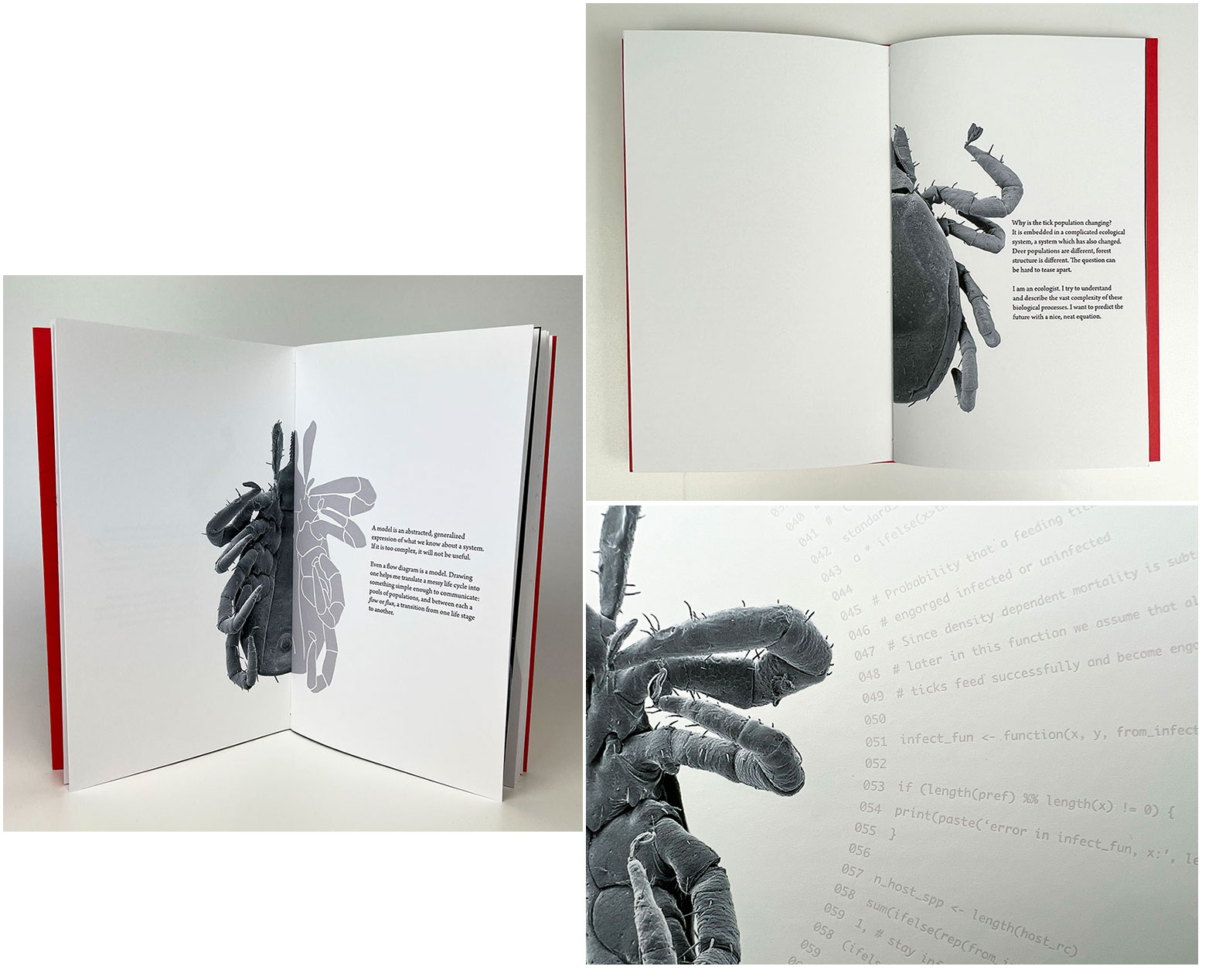
Acts of Translation: David Allen 5.5 x 9"; 20 pages. Papers include Red River double side Premium Matte and Colorplan. Text set in Arno, Myriad, and Monaco type. Printed letterpress using polymer plates from Boxcar press. Produced in an edition of 44, of which 26 lettered copies bound individually and 40 bound alongside other collaborative components of the ‘Acts of Translation” project. Signed by Allen and Bryant. Lettered. Big Jump Press: "Dr. David Allen studies the ecology of ticks and tick-borne diseases. He uses an integrated theoretical and empirical approach to tease apart the biotic and abiotic drivers of tick populations and tick-borne pathogen persistence. He has published his work in numerous journals, including ‘Journal of Medical Entomology, Biological Conservation, Emerging Infectious Diseases, and Northeastern Naturalist’. His research into the Ixodes population has received a grant from the National Institute of Allergy and Infectious Disease." Excerpt of conversation: “Why is the tick population changing? … I am an ecologist. I try to understand and describe the vast complexity of these biological processes. I want to predict the future with a nice, neat equation.” Colophon: "Ticks collected by Allen in Vermont were imaged with a scanning electron microscopy by Jody Smith in 2019 and inkjet printed in Bryant’s studio with generous help from Allison Grant using an Epson Surecolor P900. The code featured in this book is a section of ‘IsPopDyMod: Ixodidae population dynamics model’ which was written in R by David Allen.” |
|
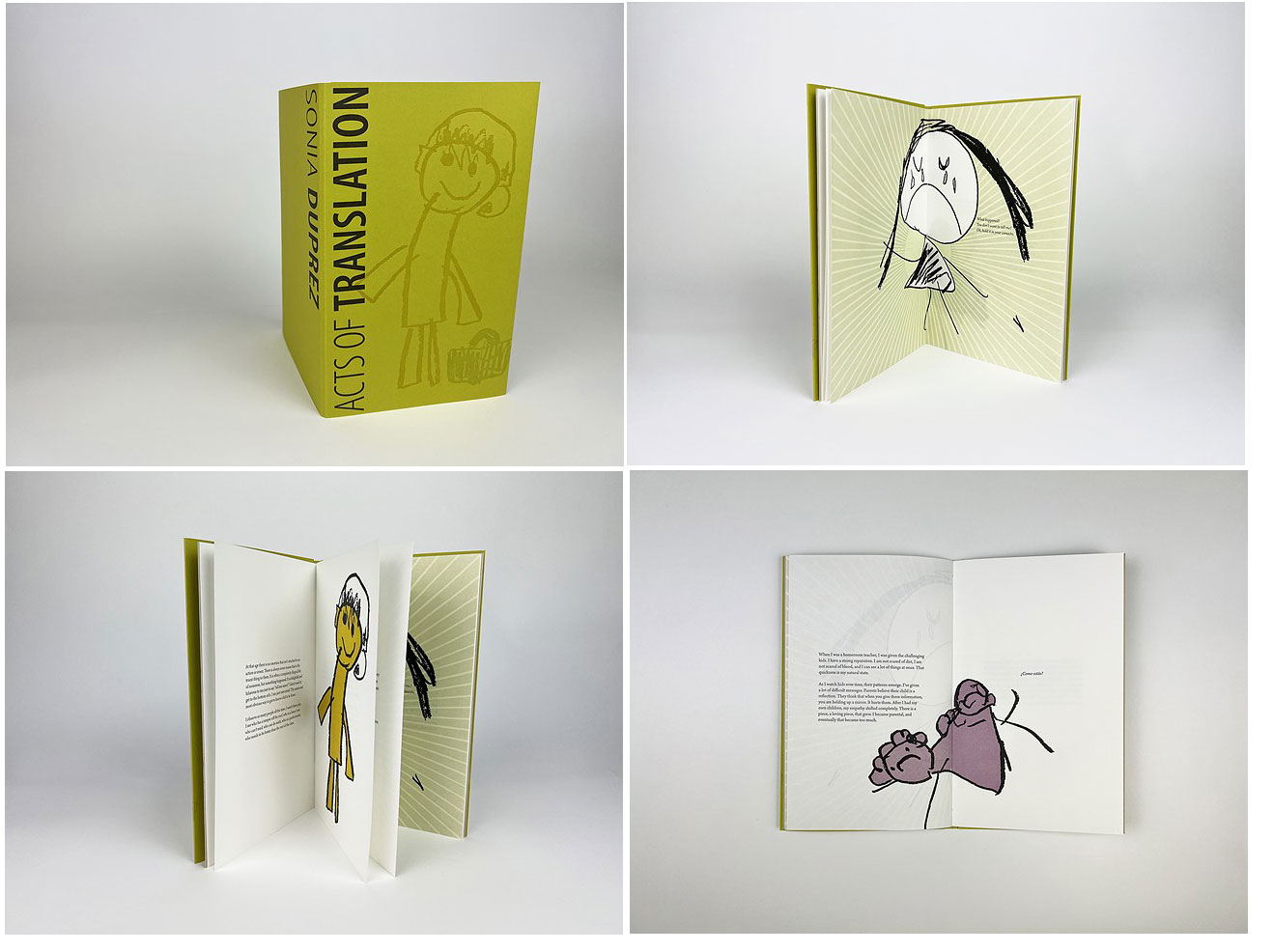
Acts of Translation: Sonia Duprez 5.5 x 9" pamphlet in yellow covers. Papers include Zerkall Book, Canon Pro Premium Matte, and Colorplan. Text digitally set in Arno, a typeface designed by Robert Slimbach. Printed letterpress from polymer plates. This book has been produced in an edition of 66, of which 26 copies are lettered a through z and bound individually and 40 copies are numbered and bound alongside other collaborative components of the Acts of Translation project. Signed by Duprez and Bryant. Big Jump Press: "'Acts of Translation: Sonia Duprez is the fifth in a series of collaborative books from Big Jump Press devoted to translation and communication. Text for this project was gathered, edited, and recombined by Sarah Bryant from a series of recorded interviews conducted in 2023. Imagery for this book was collected during a visit to Sonia Duprez' Spanish classroom in Philadelphia in the fall of 2023, and printed with a combination of polymer plates and linoleum carvings. Student drawings were made in response to the question ‘¿Como estás?’ In this book, Sonia Duprez describes her interpretation of body language and other non-verbal cues in a classroom full of children. “Sonia Duprez has worked professionally in education since 2003. She began her career with the New York City Teaching Fellows, an accelerated accreditation program designed to recruit teachers to high-needs public schools. She earned a M.Ed in Bilingual Education from the City College of New York in Harlem while teaching Spanish and bilingual kindergarten full-time in the South Bronx. Duprez moved to Philadelphia, PA in 2005, when she began her work in Quaker education. She has been a lead elementary teacher in almost every grade, and recently made a career move to teach Spanish in the elementary grades. She is currently working on programming that promotes cultural competency, de-colonized perspectives, language-loving and a fuller understanding of the diaspora or Latinidad.”
$225 |
 Click image for more |
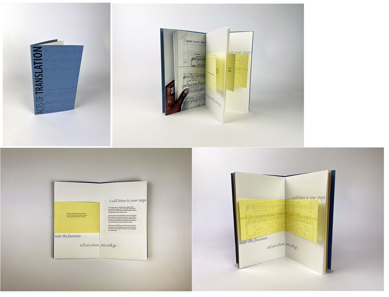
Acts of Translation: Luvada A. Harrison 5.5 x 9" pamphlet in blue covers. Papers include Zerkall Book, Canon Pro Premium Matte, and Colorplan. Text digitally set in Arno, a typeface designed by Robert Slimbach. Printed letterpress from polymer plates. This book has been produced in an edition of 66, of which 26 copies are lettered a through z and bound individually and 40 copies are numbered and bound alongside other collaborative components of the Acts of Translation project. Signed by Harrison and Bryant. Big Jump Press: "’Acts of Translation: Luvada A. Harrison’ is the fourth in a series of collaborative books from Big Jump Press devoted to translation and communication. Text for this project was gathered, edited, and recombined by Sarah Bryant from a series of recorded interviews with Dr. Harrison conducted in 2023. In this book, she describes the conversion of a musical score into an emotional connection with an audience. The musical score featured in this book, ‘F.giunto il nostro ultimo autunno,’ was composed by Franco Alfano in 1943 and published by Ricordi. The poem which inspired the composition was written by Miranda Bona. Excerpts of this poem printed in English originated in a translation by Ruth Lakeway. Portions of the text in Italian have been handwritten by Dr. Harrison, scanned and printed from polymer plates. Photographic imagery was inkjet printed in the studio of Allison Grant. You can see/hear Dr. Harrison performing ‘È giunto il nostro ultimo autunno’ by following this link. "Soprano Luvada A. Harrison made her Carnegie Hall debut as soloist with the Manhattan Philharmonic and her Lincoln Center debut in Alice Tully Hall with the New York Choral Society as the soprano soloist in Rossini’s Stabat Mater. Dr. Harrison has performed with regional opera companies and symphony orchestras throughout the United States and Europe. A graduate of Towson University, Dr. Harrison holds a Master of Music from Binghamton University, and a Doctor of Music from Florida State University, where she was the recipient of the prestigious University Fellowship. Dr. Harrison currently lives in Tuscaloosa, Alabama, where she is an assistant professor of Musical Theatre/Voice in the Department of Theatre and Dance."
$225 |
|
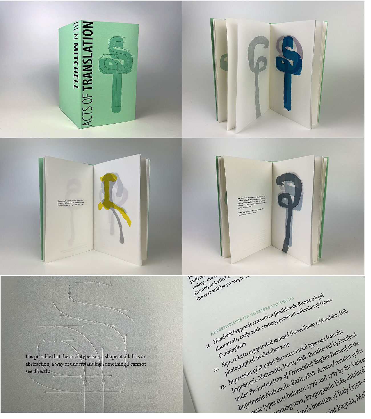
Acts of Translation: Ben Mitchell 5.5 x 9"; 20 pages. Colophon: “Text for this project was gathered, edited, and recombined by Sarah Bryant from a series of recorded interviews conducted in 2022. Imagery in this book comes from photographs of Burmese letterforms taken by Ben Mitchell as part of his design process. Examples of the Burmese letter Na were traced and carved in linoleum by Sarah Bryant. Papers for this book include Zerkall Book, Clearprint Design Vellum, and Colorplan. The text has been digitally set in Arno, a typeface designed by Robert Slimbach, and Sanomat Burmese, designed by Ben Mitchell, and printed letterpress from polymer plates.” Handsewn pamphlet style binding. Stiff paper wrapper with printed illustration on front cover. Laid in letter fold wrapper. Produced in an edition of 44, of which 26 lettered copies bound individually and 40 bound alongside other collaborative components of the ‘Acts of Translation” project. Signed by Mitchell and Bryant. Numbered. This is the third in a series of collaborative books from Big Jump Press devoted to translation and communication. This collaboration begins with the question “What is the essential form of a letter?” The text then becomes Mitchell’s philosophy of looking for the archetype of the written letter of a language. His views are accompanied by letterform discoveries that help translate a writing system that will be “a link between language communities and the computer, between the hand and the keyboard, between the archetype and the printed word.” The letterforms illustrated are accompanied with bibliographic information as to where that form was discovered. For example under “Attestations of Burmese Letter NA”: “Stone-carved inscription at eastern entrance to Dhammayazika Zedi, Pwasaw, 19996 CE” and “Lettering painted on a shop sign, Ein Daw Yar Pagoda, Mandalay, photographed in November 2015.” Acts of Translation: Ben Mitchell, cover flap: "Ben Mitchell is a UK-based type designer and founding director of The Fontpad Ltd. He has been visiting Southeast Asia since the 1990s, and lived in Thailand from 2003 to 2006. With a long-held interest in visual communication and especially different writing systems, he has become one of the foremost researchers of Southeast Asian scripts. He has designed and consulted on fonts for Burmese, Buginese, Chak, Cham, Hmer, Kwekor (Myainggyingu), Lao, New Tai Lue, Tai Phake, Thai, Tham and Vietnamese, and regularly makes research trips to Southeast Asia to study typography, lettering and handwriting, which help inform his professional practice. “Mitchell studied his master’s in typeface design at the University of Reading … His research and dissertation traced the evolution of the Burmese alphabet from its Brahmi roots in inscriptions, palm-leaf manuscripts and traditional folding books, through its initial casting in metal type in 1776, to its modern-day form. “Alongside his design work, Mitchell researches and documents the graphical and technical aspects of lesser-known writing systems of Southeast Asia, particularly those used by minority groups. To help preserve these written languages, he compiles his findings in Unicode proposals that ensure those scripts can become digitally enabled.” "Proceeds from the sale of the lettered edition of this book will be donated to Health&HopeUK, a charity working with vulnerable rural communities in Myanmar (Burma), particularly in and around Chin State." |
 Click image for more |
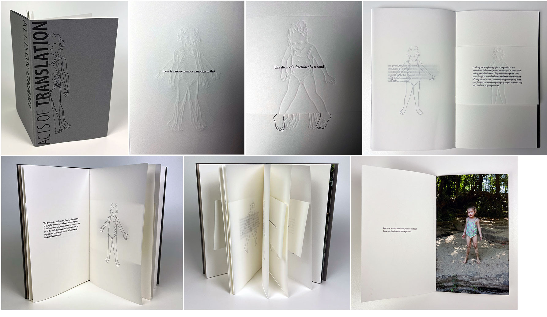
Acts of Translation: Allison Grant 5.5 x 9”; 33 pages. Papers for this project include Clearprint Design Vellum, Colorplan, and Canon Pro Premium Matte Photo Paper. Text was set in Arno and Myriad type and printed letterpress using polymer plates from Boxcar Press. The photograph was inkjet printed by Allison Grant in her studio. Handsewn pamphlet style binding. Stiff paper wrapper with printed illustration on front cover. Laid in letter fold wrapper. Signed by Grant and Bryant. Produced in an edition of 66, of which 26 copies are lettered a through z and bound individually, and 40 copies will be numbered and bound alongside other collaborative components of the Acts of Translation project. This project was made possible by financial support and community building from the Collaborative Arts Research Initiative at The University of Alabama. Sarah Bryant: "Acts of Translation: Allison Grant is the first in a series of collaborative books from Big Jump Press devoted to translation and communication. Text for this project was gathered, edited, and recombined by Sarah Bryant from a series of recorded interviews with Allison Grant conducted in 2021 and 2022. The images are tracings of photographs taken by Grant at Hurricane Creek in Tuscaloosa, Alabama in 2019. 'Isa at the Swimming Hole' was selected from 21 frames, eight of which are represented as traced drawings in the book. "Isa at the Swimming Hole" is part of Grant's series 'Within the Bittersweet', a dark pastoral examination of her experiences raising her children amid concerns about the impacts of the climate crisis and environmental contamination. “Allison Grant is a photographer, writer, and curator. Her artworks have been widely exhibited at venues including the High Museum of Art in Atlanta, DePaul Art Museum in Chicago, Patti & Rusty Rueff Galleries at Purdue University, Edelman Gallery in Chicago, and the Weston Art Gallery in Cincinnati, among others. She was named on the Silver Eye Center for Photography’s 2022 Silver List. Grant received the 2020 Portfolio Purchase Award from the Atlanta Photography Group, the 2019 Developed Work Fellowship from the Midwest Center for Photography and was shortlisted for the 2019 FotoFilmic Mesh Prize. Works by Grant are held in collections at the High Museum of Art, DePaul Art Museum, Columbia College Chicago, Cincinnati Children’s Hospital Research Foundation art collection, Cisco Systems Corporate Art Collection in Durham, NC, and the King County Portable Works Collection in Seattle. “Grant has curated exhibitions at venues including the Museum of Contemporary Photography, Chicago; Photoforum Pasquart, Biel, Switzerland; Filter Space, Chicago; and Atlanta Contemporary. Essays by Grant have appeared in Minding Nature Journal and INCITE: Journal of Experimental Media, as well as numerous artist publications and exhibition catalogs. Grant holds an MFA from Columbia College Chicago and BFA from the Columbus College of Art and Design. She is currently an assistant professor of photography at The University of Alabama.” |
|
| Big Jump Press Out of Print Titles: | |
Biography 5.5 x 8.75 x .75"; 26 pages. Twelve spreads (including title, colophon, and an unfolding spread near the center). Letterpress printed on Zerkall Book Vellum. Quarter bound as a hard cover drumleaf with one unfolding spread near the center. Housed in a clamshell box.
As with many titles from Big Jump Press, the printing and design are meticulous and exquisite, the content is poetic, and the result mesmerizing. (Winner of the 2011 MCBA Prize) |
|
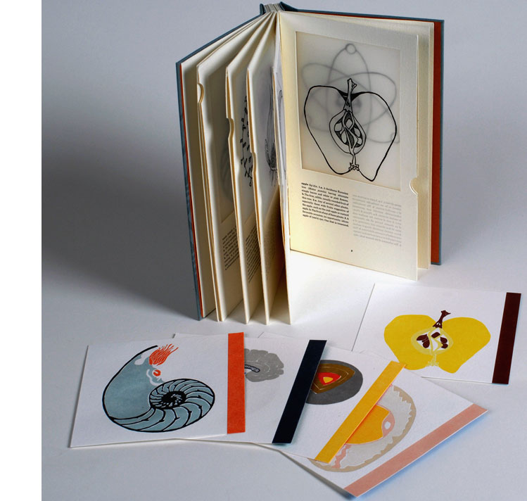
cutaway 5.25 x 8.25 x .75"; 14 pages. Printed on mylar, Rives BFK, and Hahnemuhle Copperplate. Text set in Century Schoolbook and printed from polymer plates. Bound in cloth-covered boards and housed in a cloth-covered slipcase. A puzzling book, so meticulously crafted that it carries the sense that something important is happening; however, what that something is is not obvious. Designed to suggest a dictionary (each page seems to have a finger index tab), but with a single image and corresponding word-plus-definitions per page. The top portion of each page has an image, a slice or cross-section of an object, outlined in black on mylar. The pages are of double thickness and in between the sheet is a removable card that gives the image color. Beneath each object is very dictionary-like text: pronunciation key and list of definitions. But some of the definitions don't fit: the brain as "the lair of a burrowing animal"? Adjacent to the definitions is lightly printed reversed text that turns out to be the definitions of the work on the backing page. The words: shell, trunk, brain, influenza, earth, bulb, egg, tide, apple, atom. Like a list you give to creative writing students: make a story. Correspondences? Resemblance? Wittgenstein's fuzzy categories? How format suggests genre and genre guides – or determines – our expectations and thus our thinking? This work plays with our need to make sense of things, and our human facility for seeing patterns. |
 Click image for more |
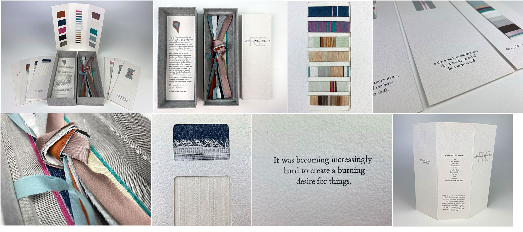
Fairmont Color Card 9.4 x 3.5 x 1.75” box containing three-panel sample book, introductory collage card, seven individual card collages, textile samples. Letterpress printed text from handset Bembo type. Foil blocking. Materials for the enclosure include binders board, Duo Bookcloth, and fabric. Colophon tipped in interior lid of box. Ribbon lift attached to interior of bottom of box. Signed and numbered by the artist. Big Jump Press: "’Fairmont Color Card’ is an exploration of the roles of textile, color, and fashion in the origin story of landfill culture. Text for the project was culled from 1977-1978 Home Furnishing Color Card, produced by The Color Association of the United States, Inc. and ‘The Wastemakers’, written by Vance Packard in 1960. Designed and produced between 2019 and 2021, the project began in one place and ended in another. “This project includes a three-panel sample book and a series of seven collages housed in an enclosure. Materials for this project include my sheets, my clothes, and thread color matched to these textile samples and the walls, hair, and skin found in my home. Produced in an edition of twenty copies, the fabric collages included in this project are all identical save for one, the card titled ‘the significance of these private worlds,’ which is unique to each copy. This project was made possible by a small grant from the Office of Research and Economic Development at The University of Alabama. Research on Color Cards was conducted at Yale University Birren Collection of Books on Color in 2019. Thanks are due to Sarah Scarr and Beth Sheehan for their assistance with this project." Artists’ Books Unshelved / “Sampling the Books”: “In this episode, we look at two distinct examples of ow artists have used and been inspired by sample books. Featured artists books are ‘Exuberant Resilience,’ by Mary Tremonte, and ‘Fairmont Color Card’ by Sarah Bryant.” |
|
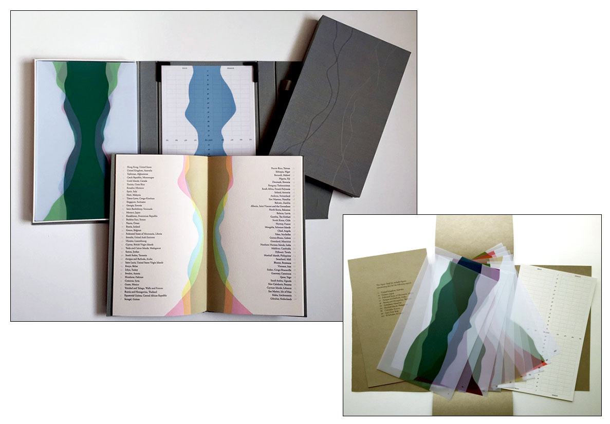
| Figure Study By Sarah Bryant and David Allen Brighton, United Kingdom: Big Jump Press, 2015. Edition of 35. 11 x 7 x 1.25" closed, 11 x 21 x .75" open; 134 pages including drafting film sheets. Letterpress printed from polymer plates and linoleum on drafting film and Arches Velin paper. Housed in cloth covered wraparound cover. Signed by Bryant and Allen. Numbered. Sarah Bryant: "I produce books that examine both our physical composition and our social anxieties; our dry assessment of our environment and our emotional connection to those surroundings. I use diagrammatic imagery and text derived from reference materials to convey these ideas. Analytical imagery is critical to how we imagine ourselves and the world around us, and how we relay that understanding to others. I am interested in the simplicity of this language, which allows for slight variations in line, color and format to describe a great variety of different systems; the movement of peoples, changes in climate, the progress of disease. This flexibility speaks to our need to connect, to find patterns, and to place ourselves in a world we can understand and explain. "Figure Study is a collaborative project with David Allen, Visiting Assistant Professor in the Biology Department at Middlebury College. This book enables a quick and compelling comparison of population data for every region on earth. Using estimates prepared by the US Census Bureau, which are available through their International Data Base, we created population pyramids for every region and paired them up to create abstracted human forms. A thick-waisted form indicates two populations with a large older population that lives to quite advanced age. Narrow-waisted figures represent the combination of two populations with very few elderly people. Asymmetrical bulges to the left or right indicate a higher male or female population for particular age segments. "All 114 of these figures have been printed from linoleum onto drafting film and are housed together alongside a grid. The figures are each numbered and can be interpreted using a booklet containing an alphabetical and numerical index, as well as a short essay by David Allen about our process and the source of the data. The design of the enclosure encourages the viewer to layer the forms to create different combinations of shape and color. This process and the resulting imagery is initially reminiscent of elaborate dresses, paper dolls, and dissection plates, but the source of the data gives a different picture, laying bare the vast and critical differences between the basic equations of life in different parts of the world. "Although we carefully graphed all of the available information, it was initially collected using a variety of different methods. The data is a combination of accurate reporting, biased self-description, out of date or incomplete reports, and best guess projections by Census Bureau demographers. It is a flawed narrative drawn from our combined and often conflicting desires to give a truthful and exact account and to tell a story about ourselves. In this way, Figure Study is similar to any self-portrait, conveying alternating moments of accuracy, optimism, and humility." (SOLD) |
|
Page last update: 05.29.2024
Home | About Us | Contact Us | New Arrivals | Fine Press & Artists' Books | Broadsides |Resource Books | Order/Inquiry
Copyright © 2023 Vamp & Tramp, Booksellers, LLC. All rights reserved.