
|
Heavenly Monkey
~ Canada |
Share this page: |
| Heavenly Monkey: "Heavenly Monkey is the imprint of publisher Rollin Milroy, dedicated to creating books for people interested in contemporary applications of traditional book crafts: handmade papers, letterpress printing, and bindings that emphasize both aesthetic and structural integrity. Our books are designed as objects to be experienced both intellectually and physically; innovative use of technology from any era, and its skillful application are the studio's guiding principles. ... Without worshipping form over function—style over substance—we know there is nothing like the look, feel and even smell of a well-made book. Rather than the death knell of books, we believe the digital age could be a boon for people interested in truly well-wrought books." | |
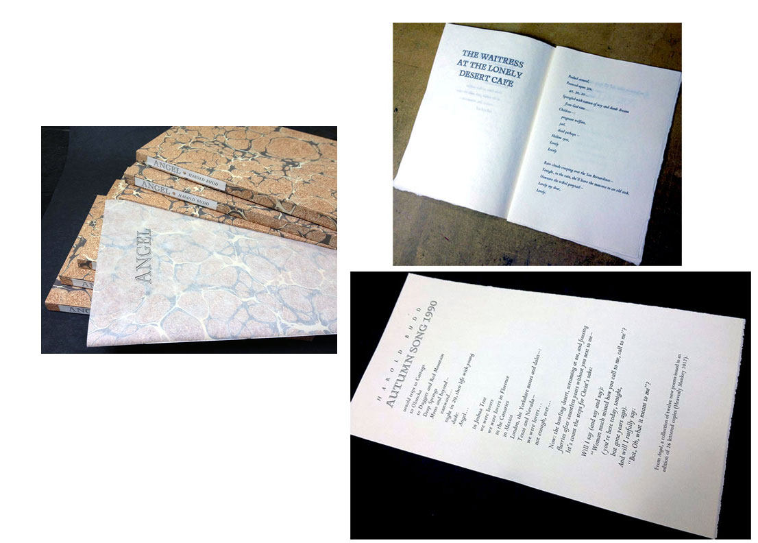
| Angel By Harold Budd Vancouver, British Columbia: Heavenly Monkey, 2012. Edition of 26. 7.375 x 10.625"; 28 pages. Letterpress printed. The poems set in 18-point Perpetua italic, titling with 30-point Monument. The paper is Barcham Green Bodleian, a white, laid 80 gram sheet. Sewn into a hand-marbled paper wrap. In slipcase with a spine label. Signed & numbered by the poet. Heavenly Monkey: "Harold wrote the poems in this collection between December, 2010, and July, 2012 - the last, 'Ellen's Death' on the passing of his son's mother. The collection includes both short, abstract poems of the type presented in 4 [Heavenly Monkey, 2010] and longer allusive poems similar to 'A Thousand Years from Now,' one of the most frequently recommended poems from Harold's first collection, Colorful Fortune [Heavenly Monkey, 2009]. Like the poems, Angel's format and production were unadorned and straightforward. "The paper is Barcham Green Bodelian ... of which we had just enough to produce an edition of 26 copies. It was lightly dampened and printed with our Washington handpress.The lightness of the Bodleian paper made a single signature of 7 sheets (28 pages) possible. It is sewn into a stiff printed wrap with a two-layered dust jacket: a sheet of hand-marbled paper is wrapped in semi-transparent Japanese tissue, upon on which the title has been printed. The book is presented in a slipcase covered in the same vintage marbled paper." $450 (Last Copy) |
 Click image for more |
| An interest of Rollin Milroy's is the history of printing and the book. Items in this section deal with the processes and people who have made or are making books. | |
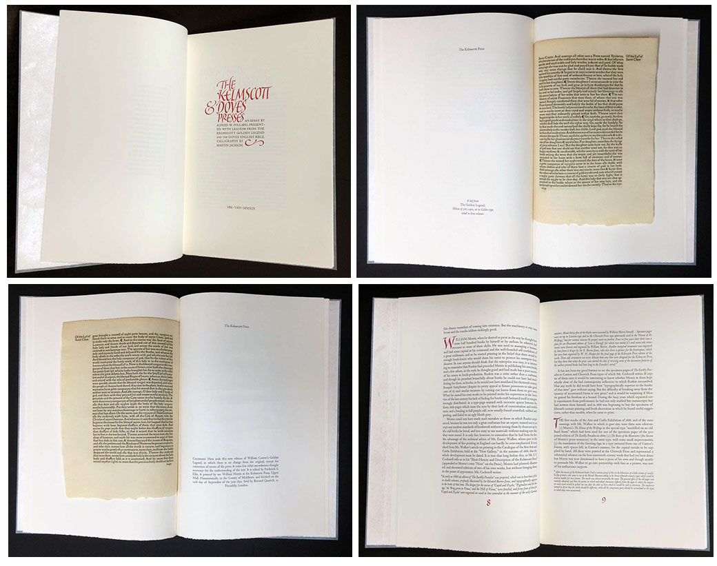
The Kelmscott & Doves Presses 10 x 15"; 30 pages. Set in Centaur type. Printed on dampened Arches wove paper by Rollin Milroy with the Heavenly Monkey handpress. Martin Jackson's calligraphy reproduced from polymer plates, printed in red. Written issue: copies 1- 12. Handwritten calligraphy. Signed by Martin on colophon. Bound by Claudia Cohen in handmade paper over boards, embellished with gold tooling. Housed in a box. Printed issue: copies 13-50. Cased with decorated paper over boards. Heavenly Monkey: "Alfred W. Pollard's introduction to the catalogue of William Andres Clark Jr.'s Kelmscott and Doves collections [was] originally printed in 1921 by John Henry Nash and issued in an edition of 150 copies. HM's edition [is] enhanced by the inclusion of leaves from the Kelmscott Press's 'The Golden Legend' (1892) and the Doves Press's English Bible (vol. 1, 1902); and the incorporation of Martin Jackson's beautiful calligraphy through the text. "Pollard's essay provides an overview of each press's aims, with particular emphasis on typography and aesthetics, and specific references to 'The Golden Legend' and the Bible. Having pages from those books will provide readers the opportunity to consider Pollard's comments on type design and page layout while examining actual samples of the work. Pollard also discusses the Doves Press's use of calligraphy in its books, and this was the spark for the idea of recruiting Martin for the project. His work [appears] on the title page, the essay's opening, numerous initial capitals throughout, the page numbers and colophon." |
 Printed issue Click image for more |
Out of Print/ Sold Titles by Heavenly Monkey: |
|
| Aurora Teardrops Poems by Harold Budd Paintings by Jane Maru Introduction by David Sylvian Vancouver, British Columbia: Heavenly Monkey, 2016. Edition of 76 (Deluxe edition of 26 lettered copies; Collector's Edition of 50 numbered copies). Heavenly Monkey: "Harold started writing the 59 poems in Aurora Teardrops during his first collaboration with artist Jane Maru, a collection of her short films and his accompanying scores, Jane 1–11. It was, however, her batik paintings on silk that he first encountered, and it is these batiks that form the vibrant visual core for Aurora Teardrops. HM publisher Rollin Milroy worked with Harold and Jane for over two years on the book’s content and design, experimenting with (and discarding) a variety of ideas before settling on what all three felt was the right combination of materials, methods and presentation. "Like all Heavenly Monkey books, Aurora Teardrops is printed letterpress. While letterpress is not uncommon among the today’s small- and fine-press publishers, Heavenly Monkey is one of just a handful of studios that print from a traditional handpress – nothing is automated: everything, including inking the type, is done by hand. This is not a token exercise in antiquarianism: we use a handpress because only it offers the versatility to achieve the best possible results. The poems and introductory texts have been set in Cancelleresca Bastarda, a widely-admired face designed by Jan van Krimpen in the 1930s and briefly available in metal from the renowned Enschedé foundry. It has not, however, been cast in many decades, and what few old fonts remain usually are worn and lacking the many alternate characters van Krimpen created. Aurora Teardrops is set in the first digital version of Cancelleresca Bastarda, created by typographer Pablo Impallari, and printed from polymer plates (i.e. rather than metal type, it is printed from polymer type; the letterpress process is otherwise exactly the same). "Interleaved throughout the book are six of Jane Maru’s batik paintings, digitally printed in full color on traditional drafting vellum, a semi-transparent sheet that creates a visual effect similar to the original works on silk. Being semi-transparent, these prints combine with the printed poems to create an interaction between the two artists similar to their live musical performances of the Aurora Teardrops poems (a sample spread is shown above). Each of the Deluxe copies also includes, as a frontis, an original watercolor painting by Jane. "In addition to Harold’s poems, Aurora Teardrops includes: • A two-page introduction by David Sylvian • A full-page reproduction of Harold’s manuscript score for “It’s Steeper Near the Roses” (dedicated to David Sylvian), a short chamber composition included on his 2006 album Avalon Sutra • A brief introduction by Harold, and a note on his drawings included in the book • An introduction by Jane, and a detailed note on her works included in the book. Both editions of Aurora Teardrops are printed on (dampened) English papers made in the 1950s. The Deluxe copies are printed on a laid, off-white mouldmade sheet from the T.H. Saunders mill. The Collector’s copies are printed on laid, white mouldmade Golden Hind from the Arthur Millbourn & Co. mill. The Deluxe Edition (7.5 x 10 inches, approx. 65 pages including prints) will be 26 lettered copies, of which 20 will be offered for sale. There also will be eight numbered copies for contributors. Set in Cancelleresca Bastarda and Umbria types, printed on dampened T.H. Saunders mouldmade paper. Six two-page color reproductions of Jane Maru’s batik paintings, printed on semi-transparent vellum, will be interleaved among the text pages. Each copy will also include an original frontispiece watercolor painting by Jane. The Deluxe copies will be signed by Harold Budd, Jane Maru & David Sylvian (note: only the Deluxe copies are signed by David). These copies will be bound at HM, the sections sewn by hand and put into a case with a Japanese paper spine and clear Plexiglass boards. The flyleaves will be prints of paintings by Jane; although technically being inside the book, they will be visible through the Plexiglass and essentially become the book’s cover. With a slipcase. The Collector’s Edition (7.25 x 9.5 inches, approx. 60 pages including prints) will be 50 numbered copies, of which 40 will be offered for sale. Set in Cancelleresca Bastarda and Umbria types, printed on dampened Golden Hind mouldmade paper. Double-page color reproductions of Jane Maru’s batik paintings, printed on semi-transparent vellum, will be interleaved among the text pages. The Collector’s copies will be signed by Harold Budd and Jane Maru. Handbound at Heavenly Monkey in decorated paper over boards. (SOLD) |
|
| A Codex Miscellany MMXIII By Rollin Milroy Vancouver, British Columbia, Canada: Heavenly Monkey, 2013. Edition of 50. 6.75 x 10.25"; 16 pages. Papers, all of which were printed damp, are Guarro, Roma, Barcham Green Canterbury, and Arches Wove. Bound in stiff wraps with sewn binding. In the edition of 50 the first ten are hors de commerce, for the contributors. Codex Miscellany was produced for the 2013 Codex Book Fair held at the Craneway Pavilion (Richmond, California) in February. Rollin Milroy: "Codex Miscellany contains a new poem from Harold [Budd], a new drawing from Briony [Morrow-Cribbs], an original painting of a Bird of Paradise egg from Barbara [Hodgson] (leftover from the 'Cabinet'), two prints by a new guy I'll be working with this year (ever heard of phonautographs?), a 1950s wood engraving, and a page showing two fonts of 100-yr-old type designed by the same German, all in wraps cut from original etchings (proofs & rejects) by one of Canada's greatest living artists (Gordon Smith)!!" The tipped in wood engraving on the colophon page is believed to be by the British Columbia artist Jessie Webb, done while at art school in the 1950s. (SOLD/Out of Print) |
 Click image for more |
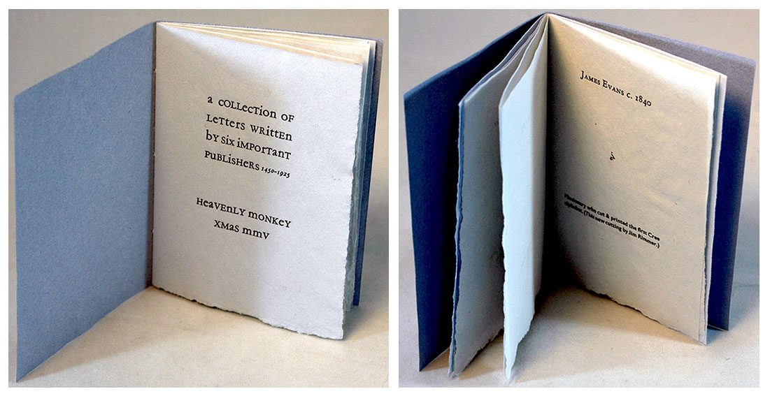
| A Collection of Letters Written by Important Publishers (1450 - 1925) | |
By Heavenly Monkey |
 Click image for more |
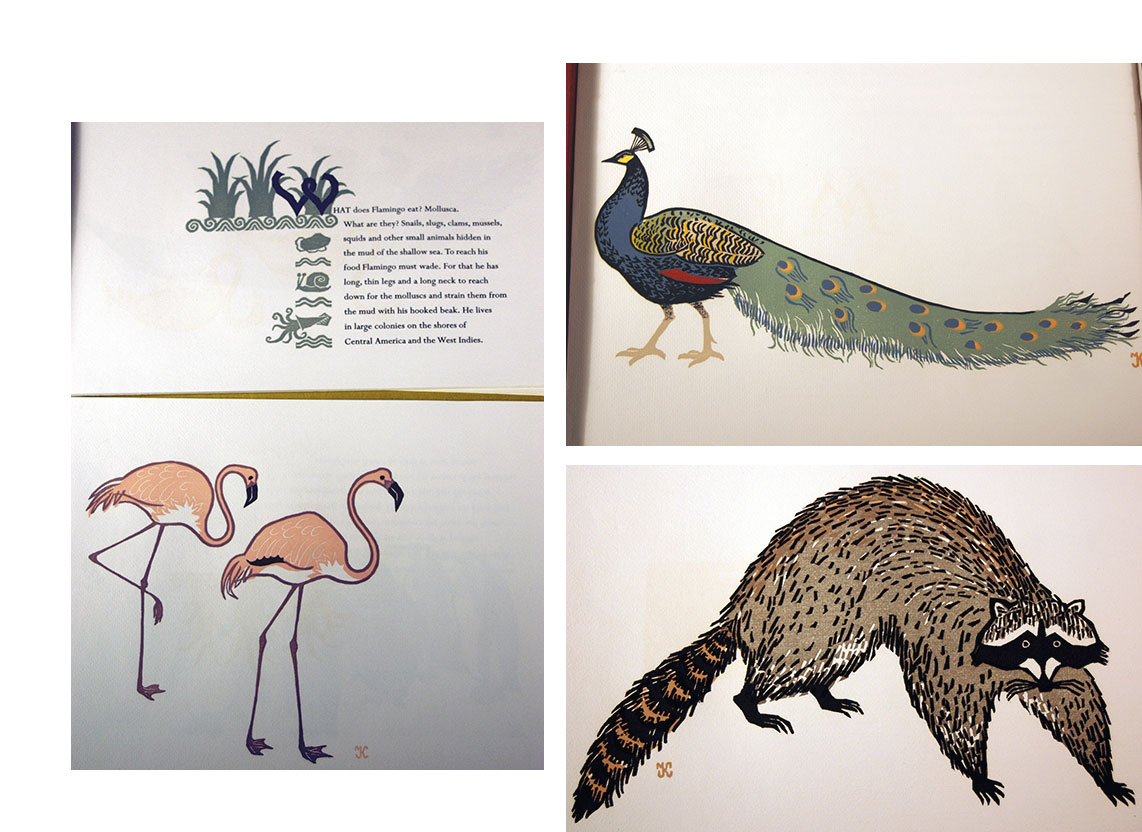
| Kuthan's Menagerie Completed Vancouver, British Columbia: Nevermore Press & Heavenly Monkey, 1960 & 2003. Edition of 50. 9.75 x 13". Letterpress printed in 18 pt Perpetua on Golden Hind. Laid in clamshell box. Numbered. Signed by Robert Reid. Heavenly Monkey: "Kuthan's Menagerie of Interesting Zoo Animals was published in 1960 from the private press of Robert and Felicity Reid (under the imprint Nevermore Press). It has since become famous in the history of fine printing in Canada, not just for Kuthan's exquisite multi-color linocuts of animals, but also for the fact that only 60 of the edition's 130 copies were ever bound; the balance remained in the bindery, eventually forgotten but luckily, not lost. Heavenly Monkey has completed the book's issue. Kuthan's Menagerie measures 9.75 x 13 inches. The paper is Golden Hind, a laid sheet, printed one side only and folded. Reid explains this both helped solve a problem with see-through and bulk up the book (which consists of 13 sheets forming 26 pages, from half title to colophon). The pages were printed landscape, and the sheets bound along the open edge. The unbound copies were purchased from the original binder's estate by Vancouver booksellers Stephen Lunsford and William Hoffer, in the late '80s; all of the 50 complete copies remaining have now been issued through Heavenly Monkey. Rather than attempt to recreate the original binding, the remaining copies were issued in the livre d 'artiste manner - loose, with a new wrap and custom-made clamshell box. Kuthan's Menagerie Completed feature a new title page; the two-page preface by Robert R. Reid, the original publisher; and an additional colophon, all printed at Heavenly Monkey in 18-point Perpetua on the same Golden Hind paper used in the original book. The original sheets are surrounded by an inner wrap of the yellow Japanese paper used for endsheets in the copies bound in 1960. All of the sheets are held in an outer wrap of handmade St Armand paper. The colophon is numbered (50 copies) and signed by Robert Reid. (Please note these copies do not bear George Kuthan's signature. The copies issued in 1960 were numbered and signed after being bound.) The clamshell box, made by Simone Mynen, is covered in red Japanese fabric with decorative printed labels debossed on the front and spine." (SOLD) |
 Click image for more |
An Invitation to British Columbia 6 x 8"; 20 pages plus fold-out facsimile. Set in 12-pt Garamont. Printed on Heavenly Monkey Text handmade paper. Letter facsimile printed on vegetable parchment from polymer plates by David Clifford. Signed by both contributors. Issued in two states. Copies 1-10 were bound by Claudia Cohen in quarter leather and pastepaper over boards. Copies 11-50 and all A.P. copies were sewn on tapes and put in a limp case made from Reg Lissel's natural faux parchment paper, with the title printed up the spine. Heavenly Monkey: "A brief but illuminating letter, previously unrecorded (or published), by T.E. Shaw (i.e. Lawrence) written in 1929 to Martin Allerdale Grainger, BC's first chief forester, in response to his suggestion that Lawrence consider retiring in the province. The letter is reproduced in facsimile and type. Noted Lawrence scholar Jeremy Wilson (a co-proprietor of the Castle Hill Press) wrote the preface, and bookseller Don Stewart (MacLeod's Books) wrote a brief essay on Grainger's life in BC. "As a frontis, the book features a wood engraving by George Kuthan, borrowed from the extensive collection of his original blocks at the Rare Books & Special Collections Library at the University of British Columbia." Rollin Milroy, blog: "A disaster barely averted. The plan was to use the Garamont freshly cast for 'Good & Evil in the Garden', but after printing the first sheet (Jeremy's essay), the type started dissolving before my eyes. Despite the fact that it was practically new, and being printed on dampened paper with the gentlest of impression, serifs, descenders and ascenders would disappear with each pull. The project was saved with David Clifford's help: we would set Don's essay in digital Garamont and print it from polymer. But even with the greatest care, it wouldn't look the same as the sheet I'd printed, so we set both Don and Jeremy's texts in polymer, and printed them dry with David's Golding treadle. My metal type was able to handle the remaining pages in the book, none with much text. But the difference between the metal type pages, printed damp, and the polymer, printed dray, cannot be missed. The original letter reproduced in the book was issued with Copy 1, in a tray case." |
|
| 4 By Harold Budd Vancouver, British Columbia: Heavenly Monkey, 2010. Edition of 50. 6.125 x 9.75"; 12 pages. Set in Bembo, one poem per page, and printed damp on Arches Wove at HM with the Washington press. Copies 1 - 10 are reserved for Patrons, and contain all four of Harold's new etchings. In addition to the frontis, one faces the first poem; one faces the last; and the fourth faces the colophon. The second and third have been printed on the blank verso of a text sheet. In these copies only, the frontis etching is initialed by Harold. The Patron copies are issued with an additional transparent tissue jacket. Copies 11 - 50 contain one of the etchings (though which etching varies from copy to copy; we printed 10 of each, and are distributed randomly among the 40 hors de commerce copies). The pages are sewn into a heavy handmade paper wrap printed on both front and back. Rollin Milroy: "In the spring of 2010 Heavenly Monkey announced the launch of a new series of occasional pamphlets, each featuring the writing and artwork of an artist from outside the world of books and printing. The format is intended to be somewhat uniform – an eight-page pamphlet, approximately 6 x 10 inches, plus a frontis, sewn into a stiff wrap – but how each contributor chooses to use those pages will be entirely up to them. This simple format will allow us to plan and produce each pamphlet relatively quickly, capturing the spirit and spontaneity of a first collaboration. "The series has been launched in the fall of 2010 with four new poems by previous HM collaborator Harold Budd, simply titled 4. To accompany the poems Harold created four new etchings, which in style and theme continue his exploration of the enigmatic 'arabesques' designs that previously appeared in Colorful Fortune and CARNIVAL (among other places beyond HM). Each etching in this latest suite of four is named for a film director: Akerman, Cocteau, Jarman and Anger. " (SOLD) |
 Click image for more |
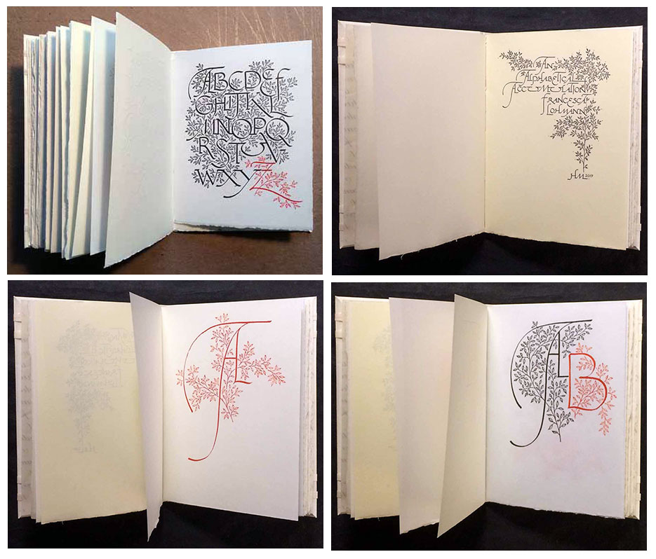
Alphabetical Accumulation 4 x 6"; 28 printed rectos. Printed damp on three different English papers intermingled throughout the book – Crown & Sceptre, J. Whatman, and T.H. Saunders. Printed on the Ostrander-Seymour handpress. Bound by Claudia Cohen, in a non-adhesive structure. Signatures sewn into a parchment chemise, the whole then laced into a limp vellum case with gold tooling. Title calligraphed by Lohmann in red on spine. Numbered and signed by Lohmann on the colophon. Issued in a clamshell box with paper title label on spine. Heavenly Monkey: "The inspiration for this book was a manuscript copy Francesca created a few years ago: 26 rectos, starting with a majuscule A, each subsequent recto adding the next letter of the alphabet, all done in red ink on a thin, blue-tinged J. Whatman handmade paper. This new printed version takes the same format and approach, but was completely redrawn by Francesca. "The layout for each page changes to best present the letters included, and allow space for the next letter in the sequence to be added by hand. The book is entirely calligraphic – there is no type used. The reproductions of Francesca’s calligraphy were printed in black with polymer plates. The next letter in the accumulation is added to each page by Francesca, in red ink; thus, every copy contains the full alphabet in original calligraphy across its pages." |
 Click image for more |
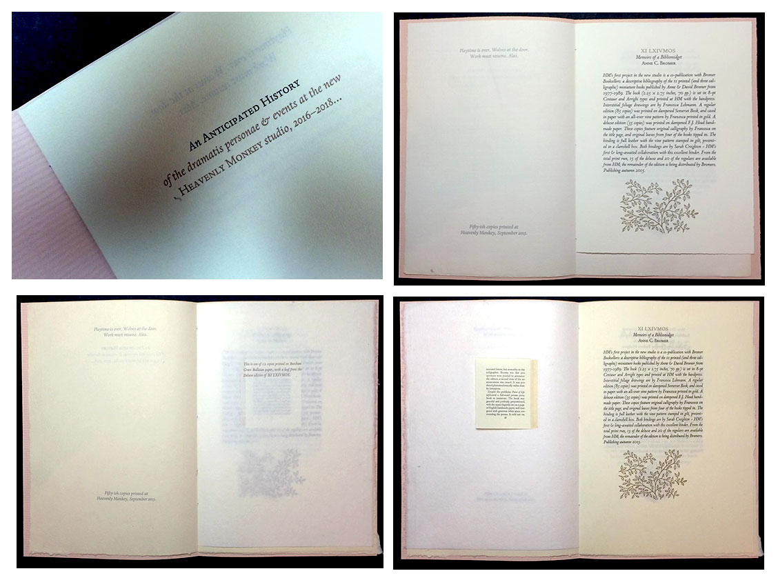
| An Anticipated History of the dramatis personae & events at the new Heavenly Monkey studio, 2016 – 2018 By Rollin Milroy Vancouver, British Columbia: Heavenly Monkey, 2015. Edition of fifty-ish copies. 7.25 x 10.25"; 8 pages. Letterpress printed. Handsewn pamphlet. Edition of "fifty-ish" with 12 deluxe large-paper copies. This is one of those deluxe copies printed on Barcham Green Bodleian paper, with a leaf from the Deluxe edition of XI LXIVMOS . Anticipated History: is an eight page advance history of Heavenly Monkey's anticipated doings for the next two years. Rollin Milroy, blog 10.12.15: "Most were printed on off-cuts of Golden Hind, along with a sheet of Arches Wove (about the best over-the-counter text sheet for letterpress around these days, in our opinion). "Had some slightly larger offcuts of BG Bodleian 80 g handmade from some previous project (Metal Types? dunno), enough to make up 12 copies, so I did. These "large paper" copies include a leaf from the Deluxe edition of XI LXIVMOS hinged in. "The cover paper is Roma Fabriano. It's a bizarre sheet in a patently non-HM color (pink), purchased for pennies on the dollar at the bankruptcy sale. The laid sheet (probably machine-made, doubtfully mould) has an exaggerated screen side that makes it useless for printing. It's been in the studio for ages. But the color matches nicely with HM's newly acquired stock of bronze ink, which will be re-appearing in the upcoming Harold Budd project." Rollin Milroy, blog, 10.29.15, regarding the cover paper: "It's a lovely handmade gampi, with the printed title positioned to perfectly overlay the same line on the Roma wrap. Because the gampi is so thin, it's a little tricky fitting it around the book & getting it to stay in place - keeping the two lines in register - while sewing." (SOLD) |
 Click image for more |
| Around the World in Colour: A Multi-Hued Tour of Ochres, Oxides, Roots and Bugs | |
| By Barbara Hodgson and Claudia Cohen Vancouver, British Columbia: Heavenly Monkey, 2014. Edition of 30 plus 5 A.P. copies. 8.5 x 7"; 66 pages plus 24 sample sheets. Printed on Arches Velin by David Clifford. Designed and set in Monotype Fournier by Barbara Hodgson. Includes 2-page bibliography and a fold-out map of the world, colored to show where various natural dyes and pigments are found. Woven design with strips of color examples on pastedowns. Leather spine with titles. Paper-covered boards with gilt design and hexagon of paper color samples. Bound by Claudia Cohen. Housed in cloth-covered custom clamshell box with compartments. Includes: three cork-stoppered vials with title labels, "Samples showing Natural Dyes on Paper" pamphlet (6 x 7.25", 6 leaves, handsewn binding with title label on cover), and a piece of lapis lazuli. Signed and numbered by Hodgson and Cohen. Of the edition: 22 standard, 8 deluxe, 5 A.P. Deluxe version is bound in leather and includes an extra hand-produced dyed paper swatch booklet. This is the fourth and final volume in the color series by Barbara Hodgson and Claudia Cohen. Introduction: "Our focus in Around the World in Colour is on the material of colour: making it and using it. We concentrate on strong traditional palettes and on the naturally occurring dyestuffs and pigments that make up those palettes. Although modern colours and methods have encroached almost everywhere, some regions - Japan, The South Pacific, Australia and Africa, for example – maintain traditions. "In this series, we have followed colour from the 18th century, when Isaac Newton and Johann Wolfgang von Goethe investigated the nature of colour, to the present-day and the attempts of colour forecasters to control and predict our colour choices....We play with colour and work with it, and now, in this fourth and last book and with the same personal approach, we are traveling around the world for it. "We have divided this book into six sections: Asia, The South Pacific & Australia, The Near & Middle East, Europe, Africa, and The Americas. Within each section we have selected regions with fascinating colour associations and have highlighted significant colours for each. Some dyes and pigments are almost universal - for instance, indigo, madder and mineral earths - so it was difficult to decide which area should represent that material. Japan, Indonesia, India, France, Germany, Britain, and North and West Africa, for example, can all claim indigo or its counterpart, woad, as a national dyestuff. Likewise, pigment-rich cultures such as Ancient Egypt could be represented by any of a dozen eligible colours. In the end, we chose what interested us the most. "Most colour examples in this book are made from soluble natural dyes and insoluble pigments.... "Colours of both the dyes and pigments vary from book to book, depending on the paper type and imperfections, if a mordant was used, and the strength of the dye bath or the pigment mix. "With this book are found several samples of the raw material of colour, including a piece of lapis lazuli and vials containing dried cochineal insects and powdered dyes and pigments. A sample swatch book of tints is also included." Rollin Milroy, Heavenly Monkey blog: "For this book they ultimately dyed 1,060 sheets of various kinds of paper in 53 distinct dyebaths. Some papers were pre-soaked (mordanted) in alum or tannin or both; others went straight into the dye. Some underwent multiple dips in the same dye, others were dipped in two or more dyes. Although most of the dyed papers used in the book were unmodified, we also experimented with traditional modifiers, such as cream of tartar, calcium carbonate, and iron. "Keeping the swatches up to date ended up being a project in itself, threatening to overtake the production of the book. Categories of dyes became overwhelming, splitting into ever more precise subcategories, including kinds of paper, timing and combinations of dyes." Standard (Out of Print) |
|
| ARS ANATOMICA By Shinsuke Minegishi Vancouver, British Columbia: Heavenly Monkey Press, (2004). Edition of 50. 2.5 x 3", miniature with 35 unnumbered pages. 9 postage-stamp sized engravings plus frontispiece. Artist Shinsuke Minegishi has created a new series of wood engravings combining studies of human anatomy with his signature abstract mindscapes. Each of the ten engravings in the book is presented in the manner common to contemporary engravings in Japan: hand printed (rubbed) by the artist on gampi, then cropped and mounted on heavier rag paper. The artist's essay and biography are printed letterpress in 8-pt Gill San. The paper is Rives BFK. The book is sewn on two vellum tapes and laced into a paper cover printed with an original color lithograph by the artist. Signed by the artist on the colophon. Copy #11 of 50. Shinsuke Minegishi, introduction: "Miniature books are not part of the tradition I come from, but the format allows me to pursue my interest in creating highly detailed images within a very small space, and also present a series of these images as a single body of work." (SOLD/Out of Print) |
 Click image to enlarge |
Books Are My Utopia 20 leaves, approx. 5.25 x 7.5 inches. Sheets sewn into a folded handmade paper structure with gilt-stamped title label on the cover. Numbered. Signed by Rueter. Bound and boxed by Claudia Cohen. Heavenly Monkey: "Eighteen aphorisms on the theme of books by Will Rueter, proprietor of The Aliquando Press with a long avocation for calligraphy. The project was conceived as an opportunity to collaborate across the 2,000 miles that separate our studios. "Similar in concept and execution to HM's An Alphabetic Accumulation, Will selected, designed and wrote out each aphorism to fill a (recto) page. These originals were then used to create polymer plates, for printing. Some elements - words and/or ornamentation - were omitted, and Will then added these to each sheet, thus every sheet includes some original calligraphic embellishment by him. "The authors quoted in the collection are, in order of appearance, Helen Keller; Bohuslav Martinu; Stefan Zweig; (anonymous); George Santayana; William Morris; Martin Luther; Richard Rodriguez; Paul Auster; T.J. Cobden-Sanderson; Raul Mario Rosarivo; Rabbi Nachman; Joseph Conrad; Herman Koch; John Ruskin; William Blake; Francesco Petrarcca; and Tertullianus. "Because Will shares HM's fondness for paper, a variety of hand- and mouldmades were used in the collection. Three of the aphorisms are fold-out sheets which were printed by Will at his studio in Ontario (the rest of the book being printed at HM with the handpress)." |
|
| A Christmas Book By Rollin Milroy Vancouver: Heavenly Monkey, 2003. Edition of 100. 4 x 8.75" 4 pages plus covers. Letterpress printed in Garamont type on Lana Laid paper. Soft cover with blue wrappers. Pamphlet stitch binding. Heavenly Monkey seasonal publication of 2003 featuring a short tale and 3 drawings by Charles van Sandwyk. Colophon: "This book is for all of the colleagues, friends, patrons & family who helped make this such a productive & enjoyable year at the studio. Printed in the days leading to the Christmas rush, using Garamont type cast by Jim Rimmer, dampened Lana Laid paper & a Washington Handpress. All copies were unsigned. " (SOLD) |
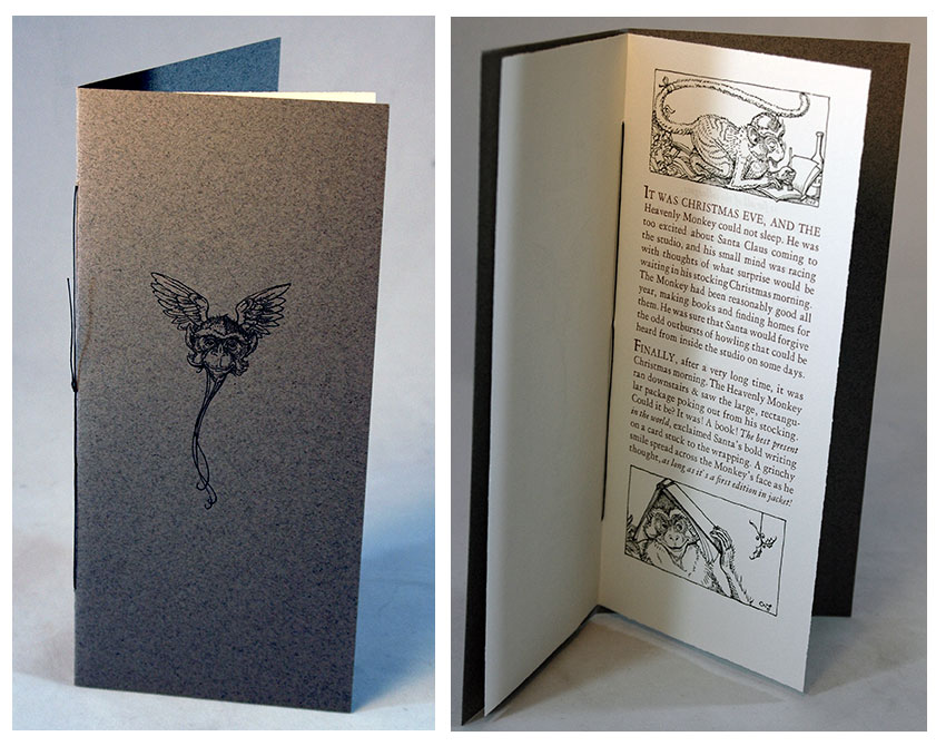 Click image for more |
A Christmas Secret 1.625 x 2.125" miniature; 6 pages. Heavenly Monkey seasonal book for 2002. Features 2 original drawings plus decorations by Charles van Sandwyk. A single sheet of handmade paper folded to make 4 openings, in a stiff printed paper cover. Unnumbered and unsigned as issued. Rollin Milroy: "The answer to where the Heavenly Monkey name came from....not more than 40 produced." |
 |
colorful fortune Letterpress printed on Rives Lightweight, a classic French mouldmade paper. Set in Perpetua with Zapfino. Heavenly Monkey: "Emerging in the 1960s from the American minimalist movement inspired by John Cage and Morton Feldman, Harold Budd has become one of the country's most prolific, consistent, and influential composers and musicians. Throughout his career, poetry – or what Harold refers to as 'something like poetry, but not the same thing' – has been an occasional companion to his music. His 'something-like poetry' now takes center stage in Colorful Fortune, the first published collection of Harold's poems ... "The first half of Colorful Fortune presents the debut of an extended cycle in 18-parts titled Poem Sketches 2007-2008. The second half presents 11 poems which first appeared on three of his albums from the 1990s: By Dawn's Early Light, She is a Phantom, and Glyph. The book also includes 14 original drawings by Harold, inspired by the music of Monteverdi and Tristano. These 'arabesque' drawings are variations on a theme that could be described as a visual expression of his music: a string, or line, or thread, that travels, meandering across a page, entering at one point and departing at another." Standard: 5.5 x 9", 34 pages. Heavenly Monkey: "Hand-bound in limp paper vellum by Keith Lowe, based on the traditional limp vellum binding used for books throughout the Renaissance. The vellum paper is specially made for us from abaca fiber by papermaker Reg Lissel. It is a tremendously tough material, with a feel remarkably like vellum. It is also semi-translucent, a characteristic exploited in the design: the case is lined with a sheet printed with the title and one of the drawings. The printed text sheets are folded into three signatures and hand-sewn by Keith on to paper vellum supports; the spine is lightly pasted and lined with gampi; and the book is then pasted into the paper vellum cover. ...” Deluxe: 6.25 x 9.75 x 1"; 40 pages. Heavenly Monkey: "Each includes intaglio reproductions (i.e. photo-etchings) of four preliminary arabesques Harold drew for the project, which were not used in the final layout. These four drawings were printed by master printer Peter Braune at New Leaf Editions, and bound into the back of the book. Also bound into each of these Deluxe copies is one of the 14 original drawings reproduced in Colorful Fortune, signed and dated by Harold. The Deluxe copies are bound by Claudia Cohen in quarter leather with leather tips, accompanied by a cloth-covered clamshell box. For the boards and endsheets Claudia created a special paste paper design inspired by Harold's arabesques." |
|
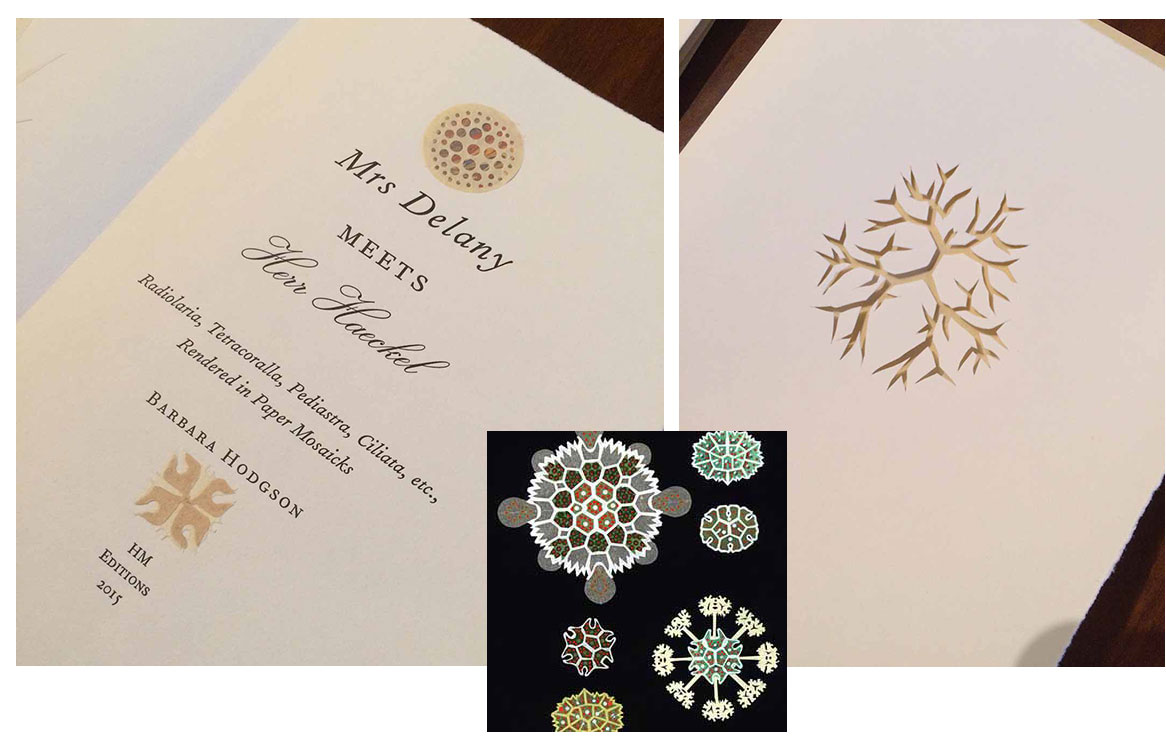
| Cutting Paper By Barbara Hodgson & Claudia Cohen Vancouver, British Columbia: Heavenly Monkey Editions, 2013. Edition of 30 + 6 APs. 10.375 x 13.5 x 2.125"; 86 pages. Designed and set in Bauer Bodoni. Printed on Rives BFK. Gifu, Hahnemühle Ingres, Somerset and a variety of handmade papers. Handbound by Claudia Cohen. Housed in cloth covered clamshell box with paper covered edges. Contains a cut-paper facsimile of Bruno Munari's ll Libro illeggible (originally published in 1953 and recreated by Cohen for this book). Book design by Barbara Hodgson. Edition of 30: 1 - 10 deluxe, 11 - 30 standard. Signed and numbered by the artists. Deluxe: Copies 1 - 10 comprise a deluxe issue, with the book in a more elaborate binding (using leather instead of paper), and an additional selection of samples (available to the authors in more limited quantities) laid in. Heavenly Monkey: "Papercutting, an art that is almost invisible, is as universal as the material it relies on. It can be mastered by anyone with patience and a sharp knife or a pair of scissors. With these basic tools, a papercutter can fashion the simplest Valentines heart, a precious keepsake small enough to be stored between the pages of a book; or he can sculpt complex structures too immense to be exhibited anywhere but galleries." Cutting Paper is divided into two parts: the first section contains a brief overview of paper-cutting styles, techniques, and materials from around the world with a look at its place in education, the avant-garde, and contemporary art; the second section is a papercutting portfolio. The book features dozens of cut-paper examples. In addition to more familiar forms such as the silhouette and collage, there is an original canivet, a card with a border cut to resemble intricate lace; monkiri, a Japanese stencil crest; and Scherenschnitte, a German-style black papercut. Brief essays describe the techniques and the variations found around the world, from China to Poland to Mexico. Jewish and Islamic cut-paper traditions are also explored, as is the place of the technique in the Froebel system of childhood education. There is an extensive bibliography. The samples of cut paper are tipped-in throughout the book, with the corresponding text. The samples which have been created by Barbara and Claudia use a wide variety of papers, including Reg Lissel's handmade papers and Claudia's paste papers. Some of the samples are based on existing historical cuts, including a re-creation of a Matisse-style gouaches découpées, painted with Matisse's own palette of Linel gouaches on Arches text wove. Other samples created for this book use traditional cutting techniques to show cuts that may have existed, such as a henna-hand pattern to illustrate paper-cutting from India, a calligraphic cutting of Sultan Suleyman's tughra (or official signature), and silhouettes of profiles cut from black paper and from white (hollow cuts). The famous paper "mosaick" botanicals of 18th-century artist Mrs. Mary Delany are illustrated by applying her technique to the microscopic images of Ernst Haeckel. Each book contains a full-page original collage done in this style. Deluxe (Out of Print) |
|
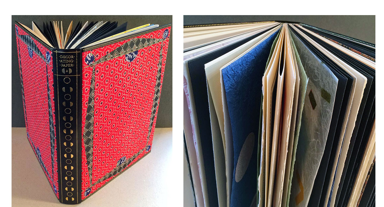
| Decorating Paper By Barbara Hodgson & Claudia Cohen Vancouver, British Columbia: Heavenly Monkey Editions, 2014. Edition of 30 . 9.5 x 12.5"; two volumes (120 pages each). Letterpress printed by David Clifford in Bembo on Arches mouldmade paper. Includes full-page samples and multi-sample specimen sheets. Bound by Claudia Cohen in decorated paper over leather-edged boards with a leather spine. Housed in a clamshell box. Signed by Hodgson & Cohen. Heavenly Monkey, prospectus: "Decorating Paper: Pattern & Technique will feature more than 600 examples of patterned papers from Europe, Asia, and North America. "Original samples of marbling, paste decoration, embossing, pulp manipulation, lithography, block and linocut printing, stenciling, and airbrushing from the 19th and 20th centuries will be found, along with contemporary examples (some made especially for this book). A sampling of Dutch gilt and block-printed papers from the later 1700s to early 1800s will also be included. The text (approximately 80 pages) spans two volumes, interspersed with the many samples, and includes descriptions of techniques and history, along with an extensive bibliography." Click here for Heavenly Monkey blog on progress of Decorating Paper (Out of Print) |
 Click image for more |
Duensing Titling 2.25 x 3'" with thirty unnumbered pages. A miniature book presenting a new titling face designed, cut in metal & cast by Jim Rimmer of the Pie Tree Press & Typefoundry. The face is named in honor of American typographer & private press printer Paul Hayden Duensing. This is its first appearance in a book. The miniature consists of an initial signature with a brief introductory essay about the type and a closing signature with details about the designer & book, both printed on dampened Hahnemuhle Ingres. These signatures bookend a 30-page accordion fold strip of Reg Lissel's handmade paper, presenting Duensing Titling. This strip can be pulled out from the book, extending more than five feet to display the entire face. Book is cased in paper-covered boards, with a printed vellum spine. Signed & numbered by Rimmer. Rollin Milroy: "Jim had given a font of this beautiful new type he'd cut and cast. While suffering through an interminable business meeting in January of '03, I had the idea of publishing the face (which had been used in a couple of broadsides, but not yet appeared in a book) in an alphabet book, each of these letters being about the size of a miniature page. I pitched the idea to Jim and asked him to write a brief introduction about the face, which he was willing to do. There were several variations on the binding, different approaches to combining the printed signatures and the five-foot long fold-out sample." |
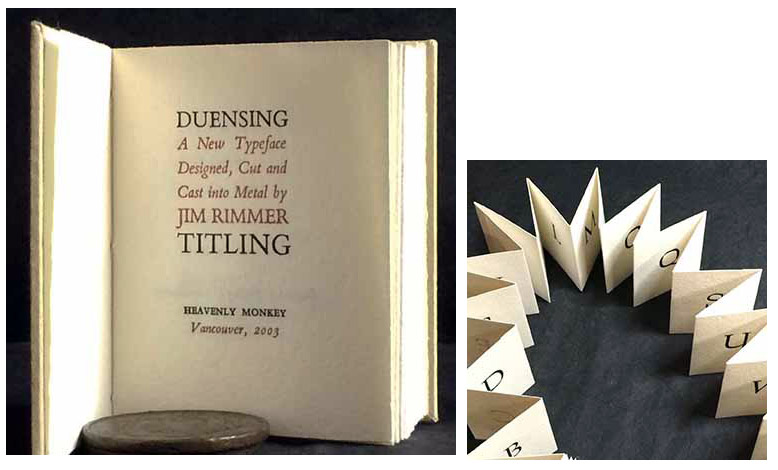 Click image for more |
| El Autobus Azul: Handmade Papers from Costa Rica Vancouver, British Columbia: Heavenly Monkey Press, 2008. Edition of 50. 2.25 x 3"; 36 pages. Casebound miniature. This is the Anniversary Standard Edition, commemorating the first book published by Milroy in 1998 under the A Lone Press imprint. This differs from the original in that it was printed from polymer plates and includes 4 instead of 7 paper samples. Colophon: "The anniversary edition follows the text's original setting, reproduced here in digital Centaur and printed from polymer plates by David Clifford at Black Stone Press. Each copy contains 4 tipped in samples from the original edition. The book has been sewn and cased at Heavenly Monkey. The edition is 50 numbered copies, of which this is 43." Rollin Milroy: "This book was my first letterpress book. It was issued almost one year after our vacation in Costa Rica. During that year I'd taken a few months off to learn the basics of setting and printing at Barbarian Press, and got myself set up with a small Kelsey press and some type. El Autobus Azul was appropriate in size and scope for my skills and equipment. For a first effort, and one printed on a tabletop press (which was unfairly maligned in the colophon), I have always been pleased with the presswork. In the decade since the book's publication I printed one more book on the Kelsey, then graduated to a Washington handpress and produced another two dozen titles. Cleaning up the studio last fall, to make room for a second handpress, I discovered the leftover pieces of Lil Mena's paper in a folder. The original edition of El Autobus Azul was just 15 copies, of which five were hors commerce. All ten copies sold in one week, and it has remained one of the most requested of my books. This, and the realization that I'd been moving leftover samples around the studio for almost a decade, gave me the idea to revisit the autobus. The original edition had seven folio samples sewn in — it was very thick, and the heavy papers didn't turn well. The book was cased in kangaroo hyde with paper fore edges. This edition offers fewer and smaller samples but I think it is more aesthetically satisfying overall. It also includes the linocut frontis I created for the original but did not end up using." (Out of Print) |
|
| Elements in Correlation Printing with the Handpress at Heavenly Monkey | |
| Rollin Milroy Vancouver, British Columbia: Heavenly Monkey, 2009. Edition of 40. 8.5 x 12.5"; 72 pages. Set in Dante roman and italic types and printed by the author in two colors with a Washington press on dampened HM Text. Relief print portrait of Reg Lissel by Andrea Taylor. This is the standard Press issue comprising edition numbers 16-40. Bound in quarter leather with boards covered in a paste paper created by Claudia Cohen specially for this book. Signed by Andrea Taylor on colophon. Heavenly Monkey: "Chapter One is a revised version of an article that originally appeared in issue 13 of Parenthesis magazine, published by the Fine Press Book Association. Complete details for all quoted material are included in the Bibliography. Chapter Three was separately published by HM in 2008, with an original Doves Press leaf printed on vellum bound into each copy." Heavenly Monkey (from catalog): "This book is the first in a planned series of three volumes. The next will be 'Fun with the Handpress at Heavenly Monkey. The third in the series will be a bibliography, 'Heavenly Monkey, R.I.P." Publication dates TBA." (Out of Print) |
 |
EXPRESSed 3.5 x 5.625"; 28 pages. The text was set in Gill Sans and Bembo, and printed with the handpress on Rives Lightweight. Due to the limited number of her earliest stamps still available, the edition consists of just 35 copies, signed by Hodgson. This is the standard copy stitched up at Heavenly Monkey: sewn on tapes and put into a limp case made from Reg Lissel's transparent vellum paper, lined with a printed sheet, and issued in a slipcase. Heavenly Monkey: "Over the past decade, Barbara Hodgson has established a reputation as an author of both fiction and non-fiction books whose narratives are embroidered by her own inventive typography, collages and original art. But known only to her personal correspondents are the postage stamps she has produced as well, often in conjunction with the publication of a new book. With just enough of the earliest stamps still available to make up 35 complete sets, HM was pleased to be publishing a book collecting all 10 of Hodgson's stamps issued to date." From the author's introduction to EXPRESSed: "Getting mail delivered for free may have been the original purpose of faking stamps, but stamp artists are not out to deprive the post office of revenue. Their purpose is to carry the deceit far enough to earn a cancellation while dispatching their images around the world." The book features the stamps tipped to verso pages, with each facing recto presenting a brief commentary by Hodgson. In addition, Hodgson has created ten appropriate (and equally bogus) postmarks with which the stamps will be (roughly) cancelled. |
|
| Folding Paper: Technique, Design, Obsession By Barbara Hodgson & Claudia Cohen Vancouver, British Columbia: Heavenly Monkey Editions, 2017. Edition of 30 + 6 AP. 9.5 x 12.5"; 80 pages. Designed and set in Monotype Fournier by Barbara Hodgson. Printed on 200 g Arches Wove by David Clifford at Black Stone Press. (For technical reasons, the title page - which will itself be a piece of folded art - was printed at Heavenly Monkey on the handpress.) Bound by Claudia Cohen, with an accompanying two-piece box. The box contains about 15 three-dimensional pieces and a separate Zhen Xian Bao (a magical Chinese thread box). All of the pieces will be created specifically for the book. Signed by both contributors. Heavenly Monkey Press: "In a similar manner and format as Cutting Paper, the book explores the art of folded paper, and presents a collection of samples on the pages and laid into the accompanying box. Brief essays discuss approaches to folding techniques, the process of creating illustrated pieces, and paper choices. Interspersed will be over 150 tipped-in examples from pleating, education, computational geometry, toy making, origami and packaging (some examples will be presented shown in progress, as well as finished pieces, in a variety of papers)." (Out of Print) |
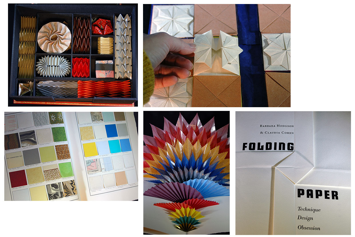 Click image for more |
Francesco Griffo da Bologna: Fragments & Glimpses 114 pages; 6 x 9. Set in roman and italic Bembo, with initial letters adapted from the ones attributed to Griffo in Paulus de Middelburgh’s Paulina de recta Paschae (1512). Copies bound by Natasha Herman were printed with a handpress on dampened Golden Hind, an English laid paper made in the 1950s; the rest of the edition was printed on dampened Arches wove paper. This is one of the numbered copies 21-50 sewn and cased at Heavenly Monkey in quarter cloth with painted paper over boards. Heavenly Monkey: "The first half of this book is a biography of Griffo's life and work, assembled from quotations taken from over four dozen sources spanning the 15th to 20th centuries, structured both thematically (i.e. The Roman Types, The Greek Types, After Aldus) and chronologically. "The second half contains translations of four 19th century texts at the heart of Griffo's rediscovery, after being lost to history and then mis-identified as the artist Francesco Raibolini. These translations, by Emma Mandley, were commissioned by HM, and we believe it is the first time these texts have been published in English. They include the New Appendix added to Antonio Panizzi's second (1873) edition of his pamphlet 'Chi era Francesco da Bologna?'; excerpts from Giacomo Manzoni's introduction in 'Studii di bibliografia analitica' (1882); Adamo Rossi's 'The Last Word on the Question of Francesco da Bologna's Surname'; and an excerpt from Emilio Orioli's 'Contribution to the History of Printing in Bologna' (1899). "At the center of the book is an original leaf from Aldus's 1502 edition of 'Heroidvm'. A broken copy of that volume, the second of three Aldus published collecting Ovid's works, provided enough leaves for an edition of 50 numbered (and eight hors commerce) copies…" Heavenly Monkey, blog, 1/11/20: "… the Aldine carcass that provided the leaves included in each copy. Sadly or not, the leaves that were truly orphan - the ones used in F&G - were the most weather-beaten. … Aside from some basic surface cleaning, I left them alone. Griffo's type, and Aldus's design remain perfectly clear. The best leaf books provide a text that the leaf illustrates, and that was my goal here (and with all of HM's lead books), so whatever an individual leaf's imperfections, it offers a direct connection to the men and materials at the heart of this story. "The copies bound (cased) at HM were sewn, rounded, and put into quarter cloth. The paper covering the boards is the HM Text Reg Lissel used to make. … The paper is beautiful and strong. These sheets were first dyed, then painted with two acrylic washes (silver over blue), and pressed to dry. The impression of the type in the paper creates very faint horizontal bands that can (almost) be seen when light hits at the right angle." |
|
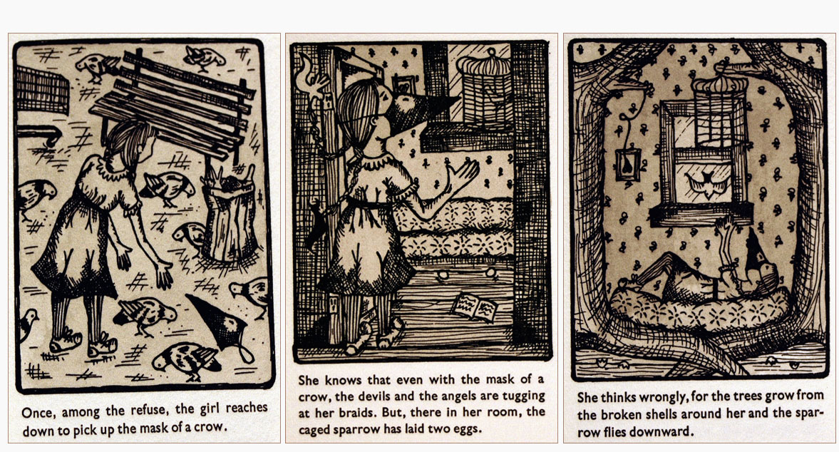
The Girl With The Mask Of A Crow & Other Stories |
 Click image for more |
| Gold: Its Properties, Modes of Extraction, Value, &c, &c. With an introduction by Neal Harlow Vancouver, British Columbia, Canada: Robert Reid & Takao Tenabe, 1958. Edition of 275. 6.125 x 9"; 64 pp. Caslon type on British handmade papers. Originally printed at the Mainland Guardian, New Westminster, British Columbia, in 1871, this reprint was published in an edition of 275 copies in 1958 by the private press of Robert Reid and Takao Tanabe. This is one of 10 copies in full dark-green leather called for in the edition, but not bound until 45 years later (circa 2003). Contains a facsimile of the original title page, a reproduction of the advertisement for the original in the Mainland Guardian (7/1/1871), an Afterword by Robert Reid explaining the printing/binding history, copies of the reprint's two original prospectus tipped in, and a copy of an insert in the July 1960 issue of the B.C. Library Quarterly. Bound by Claudia Cohen (her binder's ticket, inside back cover) with gold tooling and Robert Reid and Taka Tanabe's logo/seal in black on the top board. This is an unnumbered copy. Marbled end pages. Signed by Reid and Tanabe on the colophon. In a drop-back clamshell box of black cloth with mottled gold paper edges and small decorated leather name tag tipped on spine. Robert Reid, Afterword: "This is one of the ten full-leather copies of Gold called for in the edition. When the book was published in 1958, our plan was to have people pay in advance for these special copies, but we never had the time or energy to recruit patrons. . . . Thanks to [bookseller] Steve Lunsford's enthusiasm and support, Tak and I are finally able to complete our first collaboration in bookmaking, 45 years later." A handsome copy of the reprint of this early Canadian imprint (SOLD) |
|
Handmade Papers 5 x 8"; 18 sheets of paper. Bound in paper covers. List of papers attached to interior back cover. A group of Reg Lissel's handmade papers prepared for Wessel & Lieberman Booksellers in the Spring of 2005. The samples are layered so that a sample of each can be seen when the cover is turned back. The samples begin at 4.25 x 5" and graduate to 8 x 5". The samples range from organic cotton to cotton, gampi & hemp. Simon Fraser University, Lissel Fonds at SFU: " Reg Lissel grew up in northern Alberta and was a bookseller in the early 1990s. He owned a bookstore in downtown Vancouver before he commenced his handmade paper business. He is interested in handmade Western and Japanese papermaking arts. His paper mill is his two-storey apartment located at Shanghai Alley in Vancouver’s Chinatown. " The traditional art of making paper by hand has not been forgotten since its conception in China during the year of 105 A.D. Industrialization, expanding rates of literacy, and an increasing need for paper led publishers to prefer machine-made paper. Thus, handmade paper is now a niche market dependent on a select amount of papermakers who embed their work with expressions of individuality. Reg Lissel and Heavenly Monkey is one of them. "Lissel began making paper after leaving his position as a Vancouver bookseller during the early 1990s. His papers, the majority made with Western Canadian plant fibers, are used by artists and Heavenly Monkey, a Vancouver press. His handmade cotton papers, on display at Special Collections, have captured his personal expressions of individuality – that being artistry and ownership – in their fibers." |
|
HM = X 8.25 x 12.5"; 40 pages. Set in Dante and Dante Titling type. Printed in two colors on dampened Guarro laid paper. Bound in black Japanese cloth, with printed labels on the front board and spine. |
|
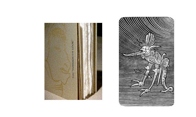
| The 'Innsmouth Look' Engravings by Shinsuke Minegishi based on drawings by Hieronymus Bosch, from the Heavenly Monkey Studio Edition of the Howard Phillips Lovecraft novella "The Shadow over Innsmouth." Vancouver, British Columbia: Heavenly Monkey, 2003. Edition of 50. 4.5 x 7" with 28 pages. Set in 12-point Bembo. Printed damp on a variety of Reg Lissel's handmade rag papers. Bound by Simone Mynene in quarter white vellum with printed Nideggen over boards. Six engravings of varied sizes printed from the original Resingrave Blocks. This is copy #2. Includes one dated press proof (#8 of 12) of an engraving that was intended for the original edition of the novella but that could not be reproduced in the reduced size. This extra engraving is tipped in a wrapper of stiff gray paper (4.375 x 6.5") with title letterpress printed on cover. Heavenly Monkey: "Heavenly Monkey Studio Editions is the imprint's test department; it will occasionally issue books that incorporate experiments in design, materials, and construction-proto-editions of just a few copies. The engravings in this book were originally commissioned as chapter heads for the first Studio Editions experiment, H.P. Lovecraft's "The Shadow over Innsmouth." Only ten copies were printed and bound, but Shinsuke Minegishi's artistry in engraving images based on centuries-old sketches by Hieronymus Bosch is too good to be limited to such a small audience, so they are being republished here." (Out of Print) |
 Click image for more |
| ISKANDARIYA By Brigit Pegeen Kelly Vancouver, British Columbia: Heavenly Monkey, 2007. Edition of 50. 5 x 9". Text set in 18-pt Perpetua italic and printed on HM Text handmade paper. Each spread of text pages separated by a folded sheet of kitakata, with an aquatint facing each page of text. With an aquatint frontis, printed on HM Text. The letterpress was completed at the Heavenly Monkey studio in July 2007; the aquatints were pulled by the artist in her studio on Whidbey Island, Washington. Sewn into a non-adhesive structure by Claudia Cohen, with a fully etched dustjacket printed by the artist on sekishu. The first 15 copies (and four contributor copies), forming the Boxed Issue, include a separate folder with various state proofs of all the aquatints, and a 12-page pamphlet recounting the publisher and artist's collaboration on designing the book. This pamphlet was set in 12-pt Perpetua and printed at Black Stone Press from polymer plates on Guarro mouldmade paper. The book, pamphlet and folder are housed in a clamshell box made by Claudia Cohen. Copies 16-50 issued in the same binding, with a printed paper chemise and slipcase. This copy is an Artist's Proof (#2 or 7) of the Standard Edition (#15-50) signed by Kelly and Morrow-Cribbs, and in the printed paper chemise and slipcase. Artist Briony Morrow-Cribbs developed and printed a series of eleven aquatint prints to accompany the first book publication of Brigit Pegeen Kelly's prose poem "ISKANDARIYA," a perfect companion for Briony's growing bestiary of anthropomorphically jumbled creatures. (Out of Print) |
 Click image for more |
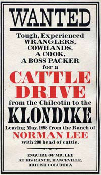
| The Journal of Norman Lee, 1898 which is the account of a cattle-drive from the Chilcotin country to Teslin Lake by the Telegraph Trail. Vancouver, British Columbia, Canada: Robert and Felicity Reid, 1959. Edition of 100, 5 of which were bound in full leather. This is one of those 5. 6.65 x 9.85", 58 pages. Set in Linotype Eldorado. Printed on English Eynsford Ancient Laid paper. Signed on colophon by Reid. Numbered. Bound in full leather by Claudia Cohen with gilt line accents as well as press device in gilt. Laid in cloth-covered clam shell box with marbled paper edges, leather title label on spine. The Journal of Norman Lee was the third in a series relating to the history of British Columbia by the Robert Reid press. Includes fold-out map and tip-ins of Lee's steamer ticket to New York, a letter to an aunt from San Francisco, and a sheet of poetical scribblings. "Reid's Leaves" (Heavenly Monkey, 2001), Robert Reid: "'We stumbled across the journal of Norman Lee listening to the radio - CBR at that time. Eileen Laurie was reading parts of it over the air, and it sounded perfect for our third B.C. historical publication. She had obtained it from Lee's younger brother, Edward Penrose Lee, along with letters and other documents. The journal had never been published and was a great find, well deserving of being printed on the British handmade Eynsford Ancient Laid paper that we had saved for just such a book." Heavenly Monkey: "Not all of the copies sent to Fritz Brunn were bound up (Reid estimates about three-quarters of the edition was actually issued). Bookseller Stephen Lunsford had 20 complete sets in 2003, which he, Reid and Heavenly Monkey publisher Rollin Milroy collaborated to issue. Rather than attempting to make these copies uniform with the original issue, an afterword was set and printed at Heavenly Monkey, as was an additional colophon that identified these copies as one of 20 issued in 2003 [i.e. 2006-8], signed by Reid. The sheets were sent to Claudia Cohen for binding: five were bound in full leather, and 15 in quarter leather, each with different marbled paper over boards. These copies were issued by Stephen Lunsford." This is copy #3 of 5 bound in full leather by Claudia Cohen. (SOLD) |
 |
Labour Vertue Glorie 8 x 12"; 68 pages. Set in Monotype Garamond on a page slightly larger than Wither's quarto. Type inked and printed by hand, with a handpress, on dampened paper (Arches Text wove and Golden Hind laid). Printed in three states. Numbered. Heavenly Monkey: "George Wither’s A Collection of Emblemes Ancient & Moderne shares the milestone for first emblem book printed in England with his contemporary, Francis Quarles. Wither’s book, however, is distinguished by, among other features, the quality of its copper-plate engravings, the same plates commissioned two decades earlier from Crispin van de Passe, for Gabriel Rollenhagen’s Nucleus Emblematum Selectissimorum (1611). Labour Vertue Glorie presents leaves from both books, side by side, illustrating the technical, physical, and conceptual similarities and differences. "Although the history and elements of emblems pre-date the Renaissance, the most commonly recognized form – an image, a motto, and an epigram, which combined make the emblem – appeared in Andrea Alciato’s Emblematum Liber (1531). The form flourished through the 16th century, but was already considered somewhat old-fashioned by the time Wither and Quarles wrote their books. Enough time had passed by the late 19th century for emblems to be rediscovered, and they have since become a field of lively academic study. "The focus of Labour Vertue Glorie, however, is not the content or interpretations of the two authors’ emblems, but the production and form of the books from which these sample leaves come. To that end, the book reprints three of Wither’s prefatory notes from A Collection: one about William Marshall’s engraved frontispiece, one about the game of lots included in the book, and 'To The Reader' in which he discusses at length the book’s creation and intent. Each of these is appended with comments from a variety of sources, discussing and sometimes disputing the author’s words. The comments also provide some insights to how Wither adopted, and more importantly adapted, Rollenhagen’s original work for his own purposes. While not exact facsimiles, the reprinted texts follow the original’s use of swash characters and seemingly random combinations of roman, italic, and majuscule types. But only the reprinted texts; the rest of the book is set in a more traditional, and calming, manner. "In addition to Wither’s introductory remarks, Labour Vertue Glorie includes brief biographies of Rollenhagen and Wither; some bibliographic details about the two emblem books; a history of Augustine Mathewes, the printer of A Collection; and the tangled story of Wither’s protracted patent dispute with the Stationers’ Company, and how it relates to the publication of A Collection of Emblemes. Engraved portraits of both authors are reproduced, along with facsimile settings of an emblem (i.e. page) each from Alciato’s Emblematum Liber and Quarles’ Emblemes. The book concludes with a facsimile of the leaf at the end of A Collection, with the two boards for playing his game of lots, complete with spinners and Wither's directions for playing. Thus, anyone feeling the need can easily find one of the facsimile or digital versions of A Collection of Emblemes available, and play the game. "A number of decorative initial letters taken from A Collection are incorporated to the setting, along with various patterns made up from the single printer's flower used in that book. In Series 1 and 2 Copies, the initial letters were illuminated by hand in bronze (a total of nine per copy). Elaborate flourishes from the engraved calligraphic mottoes on de Passe’s plates (sadly cut away for Wither’s book) adorn the top of chapter openings. "Aside from brief preliminary material (& translations), Rollenhagen’s book is entirely intaglio, printed rectos only. Wither’s book combines the intaglio plates with extensive letterpress on each page, and is printed on both sides; thus, one Wither leaf presents two emblems (recto and verso), while one Rollenhagen leaf presents one emblem (recto only). With the different formats in mind, Labour Vertue Glorie was published in an edition of 48 copies, in three states. "SERIES 1: Copies 1–16 with leaves containing the same emblems from Rollenhagen and Wither (i.e. two Rollenhagen leaves bookending a Wither leaf, presenting the same plate from each book side by side, as illustrated above), to allow for comparing the state and printing of the same plates. Also included is a text leaf, from the preliminary notes and dedications in Wither’s book, as a frontis. These copies were bound by Claudia Cohen: sewn on vellum slips, laced through a vellum spine and cased with Karli Frigge's marbled papers over boards. "SERIES 2: Copies 17–23 with a leaf from Rollenhagen paired with the same plate on a Wither leaf (recto or verso, as the case may be), bound in quarter vellum and Karli Frigge's marbled papers by Claudia Cohen. "SERIES 3: Copies 24–48 with a leaf from both Rollenhagen and Wither (different emblems). Cased in printed paper over boards, with a printed paper vellum spine, at the HM studio. "The leaves for this publication came from broken and incomplete copies, and to greater or lesser degrees, it shows. Some of the Rollenhagen leaves have minor staining or foxing around the edges, and some of the Wither pages are slightly worn or frayed at the edges. All leaves are complete. The sample leaves will be integral to the book, the Rollenhagen leaves tipped in, the Wither leaves attached to a stub and then sewn in, to allow for easy inspection of both sides." |
|
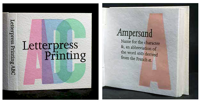
Letterpress Printing ABC 3 x 3" miniature, 57 pages. Printed on Reg Lissel's handmade HM Text paper. Sewn into a woven case structure based on the "Gospel of Mary" binding, developed during a week-long class with Claire Van Vliet. Numbered. Includes prospectus. Heavenly Monkey: "A miniature ABC book designed, printed and bound by David Clifford of Black Stone Press. It features 15-line wood type, printed in various pastel colors, with each letter accompanied by a word or phrase from the letterpress printer's lexicon. Though Clifford has been printing for over 50 years - he was among the last generation to go through the formal seven-year apprenticeship system in England in the 1950s - Letterpress Printing ABC is just his second book (in 1998 he printed a narrative series of linocuts by Vancouver artist Carel Moiseiwitsch, titled Forgotten)." |
 Click image for more |
| Metal Type By Rollin Milroy Vancouver, British Columbia: [Heavenly Monkey], 2013. Edition of 35. 7 x 10"; 42 pages. Edition of 35 numbered copies: 1-15 deluxe copies; 16 -35 standard. Deluxe: Includes two additional sections [16 pages]. Bound in full vellum with gilt embellishments by Claudia Cohen. In a cloth tray case. HM: "The first presents four uncommon foundry types (Anker Romanisch, Carolus, Gallia & Kabel) in display sizes, borrowed from the collections of several friends, each printed in two colors on Barcham Green handmade paper. The second extra section presents titling (i.e. large) fonts of eight faces already shown in the book, printed on Barcham Green & Roma papers. (Close readers may find one or two other additions...)." Standard: Sewn and cased at HM, decorated paper over thin boards. The pattern for the paper was created by artist Dana Cromie and printed at Black Stone Press on Guarro laid paper. Heavenly Monkey: "A companion of sorts to 2012's Types/Paper/Print, but more playful and colorful, this book presents all of the metal types sought out, adopted by, and dumped upon HM over the past 15 years. Some of these types have never before been printed at the studio, for a variety of reasons, e.g. insufficient quantity to be useful in a project; one of the vowels is missing; available in capitals only; and in a few cases, just too odd to use. "Rather than simply printing the alphabet in each face, or repeating the same text (who'd ever print a book repeating the same text page after page?), each recto presents one face (in some cases a few combined). The book's title reflects the process that came to be used for displaying each face. Some are used to set a quote that relates to the face or its designer. For the more uncommon faces, the complete alphabet is displayed; for the faces we all know, the sorts were used simply as design elements to create borders or pleasing shapes. Some of the faces included are American Uncial, Bradley, Garamond, Huxley Vertical, Morris Roman, Rubens, Shadow (two kinds), Meinhart's Unciala and Monument, and Verona. "While there was some general design scheme for each page, the details were worked out on the bed of the press, as the type was set. Where books typically are exhaustively planned in advance, the complete lack of continuity in content or form from page to page in this collection of types allowed - required! - an improvisational approach. Intuition was the guiding principle. Each page was created in the moment, each step and decision a response to the one preceding it, working within the constraints of the page and what was available in (& lacking from) any given drawer of type. Improvising is an act of the moment; the printed pages in this book are permanent records of the improvisations. "Each page was printed in at least two colors (drawing from a much larger palette than is HM's norm), which means each sheet passed through the press a minimum of four times; hence the small edition. HM's passion for combining different papers in a book was indulged, using nine different ones (printed damp, except for the ones that shouldn't be) throughout: Reg Lissel's HM Text for the prelims; Barcham Green Bodleian and Tovil; Wookey Hole; Arches Velin; vintage Golden Hind; Van Gelder laid; kitakata; and Guarro laid." Standard (Out of Print) |
|
| Mrs. Delaney Meets Herr Haeckel Radiolaria, Tetracoralla, Pediastra, Ciliata, etc. Rendered in paper Mosaicks By Barbara Hodgson Vancouver, British Columbia: Heavenly Monkey Editions, 2015. Edition of 25. 6 x 8.5", 50 pages. Set in Fournier. Cut-paper initial letters tipped in. Printed on dampened Arches wove with the handpress at Heavenly Monkey. Bound in full leather with gilt tooling. Housed in a clamshell box. Text and paper cuts by Barbara Hodgson. Bound by Claudia Cohen. Printed by Rollin Milroy. Numbered. Signed by the author, binder, and printer. Heavenly Monkey: "This book presents an imagined collaboration between Mrs. Mary Delany (1700-88), an English widow, woman of accomplishment, and creator of imaginative botanical 'paper mosaicks,' and Herr Ernest Haeckel (1852 - 1911), a distinguished and controversial German biologist and artist who devoted much of his time to the study and rendering of single-celled creatures. The book, which expands on a papercutting theme presented in 'Cutting Paper (2013), presents 11 cut-paper interpretations of microscopic organisms tipped on to captioned plates. An introductory text provides some biographic background for Delany and Haeckel, and describes how the cut-paper renderings could have come about. An appendix provides a detailed taxonomy and nomenclature for each of the plates." (Out of Print) |
 Click image for more |
Occupied by Color |
|
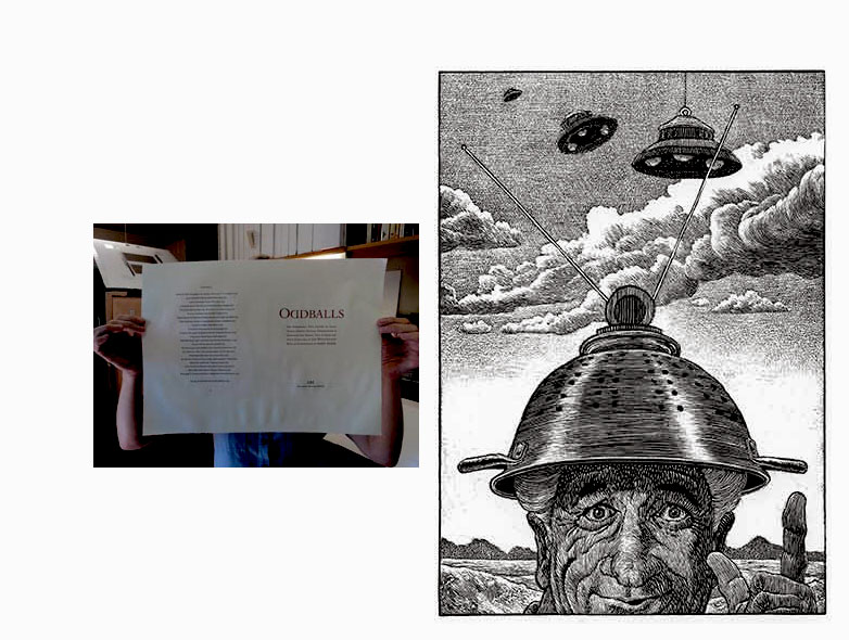
Oddballs 8 x 12.5"; 98 pages. Etchings printed by Westergard on Zerkall paper, and tipped on to verso pages in the book, with the biographical sketches on the facing rectos. Text set in Dante and Dante Titling and printed (damp) by Rollin Milroy at Heavenly Monkey on dampened Guarro laid paper with a Washington press. Includes, as a frontis, a new self-portrait engraving by Westergard. Bound by Claudia Cohen in Japanese cloth. Introduction by Barry Moser. Heavenly Monkey: "Between 2005 and 2009, Jim Westergard created a series of 40 wood engravings of curious and infamous historical personages, all with his characteristic combination of technical mastery and mischief. Lawn-chair pilot Larry Walters, Pope Joan, Aussie outlaw Ned Kelly, Gunnlaug Wormtongue, George Adamski (kindly appearing opposite) and cannon-fodder Hunter S. Thompson are just a few of Jim's subjects, each portrait accompanied by a brief biographical text written with the same wry sense of humor that informs his engravings." |
 Click image for more |
Off the Books: The 18 items include an initial folder with table of contents and brief explanation of each item. Additional contents –
(Out of Print) |
|
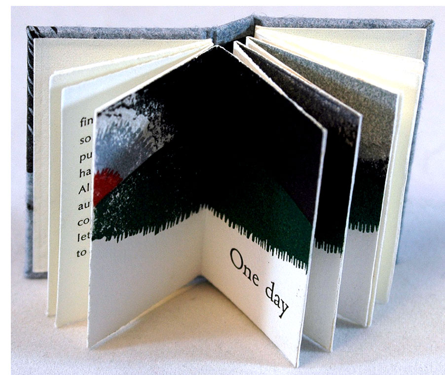
| One Day: A Short Story of Science Fiction By Anthony Burgess Vancouver, British Columbia: A Lone Press (Heavenly Monkey), 1999. Edition of 36. 1.25 x 2/125" miniature; 16 unnumbered pages. In blue pictorial handmade paper-covered boards. The imprint's (A Lone Press was the precursor of Heavenly Monkey Press) seasonal book for 1999 featuring a one-sentence story by Burgess, with color linocut illustrations. Printed as "a gift to family and friends of the press, Christmas 1999." The entire text printed across six pages: 'One day the sun rose in the west. The End.' Numbered but unsigned as issued. Heavenly Monkey: "The story was seen, years ago, in a paperback with a title like The World's Shortest Science Fiction Stories. Luckily I was able to commit the entire text to memory, as subsequent efforts to find this book, and so to make the proper publishing requests, have been fruitless. All apologies to the author's estate; your copies are ready, just let me know where to send them." (SOLD/Out of Print) |
 Click image for more |
Paper Should Not Always Be White: |
|
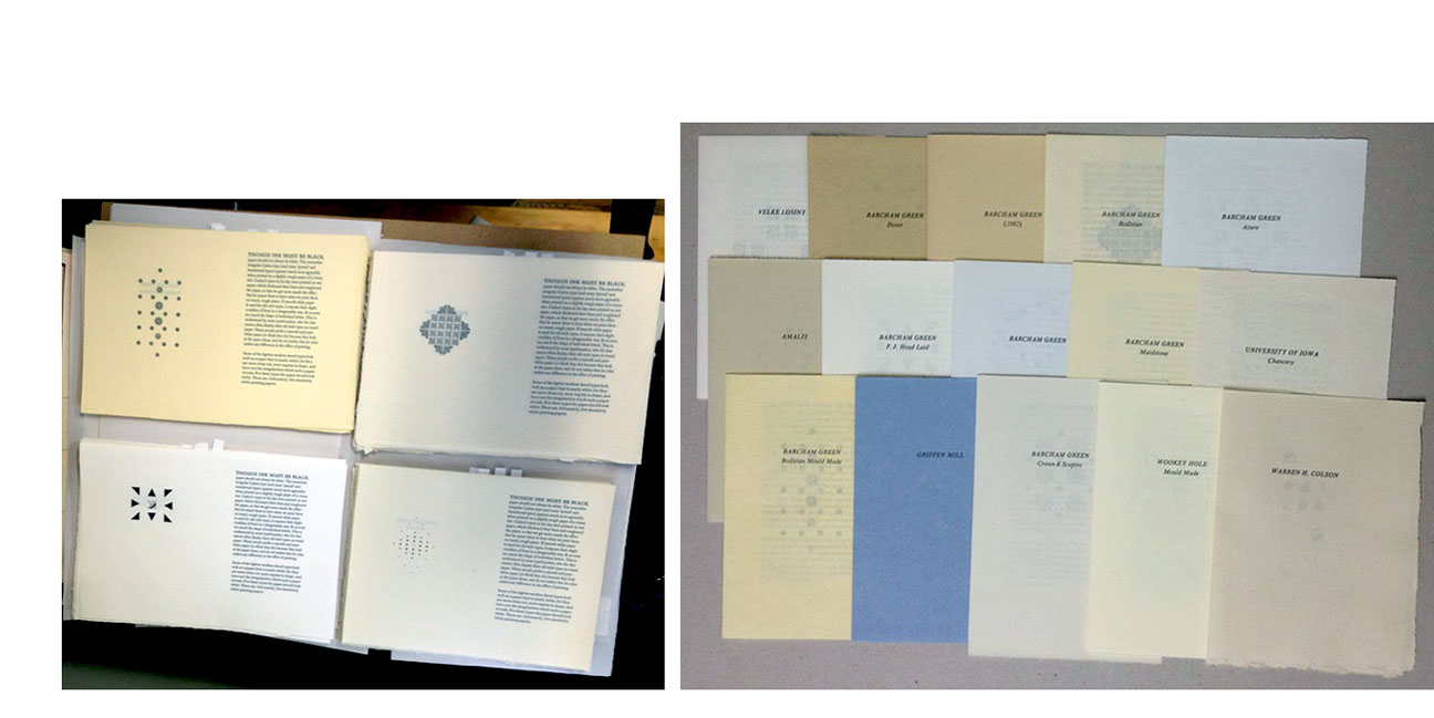
Vancouver, British Columbia: Heavenly Monkey Editions, 2013. Edition of 30 + 4 AP. Standard edition: Quarter leather millimeter binding with marbled papers. Deluxe (out of print): Full leather binding; laid in cloth covered clamshell box with marbled paper edges and title on spine; includes seven additional sheets (One of these sheets was taken from pages of a broken and incomplete volume of Joan Blaeu's "Atlas Major" (c. 1665).) Heavenly Monkey, blog, pre-publication: "Paper Should Not Always Be White (the title is taken from the essay's opening line) will consist of Updike's comments set in 10-point Caslon on a single page, repeatedly. Each four-page section will be made up from a different handmade sheet in folio (we anticipate a page size up about 5 x 7 inches). The first recto of each section will identify the paper, and the following recto will present the extract. (We'll add some simple flower arrangements to the two versos in each section, just for fun.) The paper's will all be dampened the same way (between boards), and printed with the same ink on the same forme in the HM handpress. So far we're up to 12 different papers, but we're still snooping around. The edition will be limited by whichever paper we have the fewest sheets of, but we're expecting to produce around 25 copies.” |
 Standard Click image for more |
PatternPattern Printed on dampened Arches. Set in Fournier. Drawing. Hand coloring. Tip-ins. All copies boxed with an additional pattern design item included. Copies 1-10 include supplemental material and deluxe binding (vellum and leather). Signed and numbered by the artists. Heavenly Monkey: "PatternPattern ... will explore and compare pattern systems through time: symmetry, motif, culture, Golden Ratio, grid, and variations. Accompanied by an extensive bibliography, the text and examples emphasize the patterns themselves, and the possibilities for infinite interpretations of basic styles." Expected delivery Fall 2019. |
|
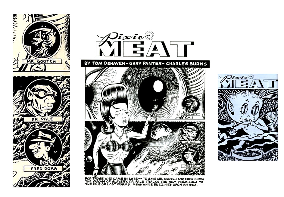
| Pixie Meat By Charles Burns, Gary Panter, Tom De Haven Sudbury, Massachusetts: Water Row Books, 1990. Edition of 200 numbered and 26 lettered copies. 12 x 15"; 12 pages, one gatefold. Letterpress printed. Clear color cellophane inserted between each spread (some copies use yellow, others red – this copy has yellow) created a duotone effect. Sewn into printed wrap. Issued in a black card-stock folder with title label laminated to board and onlaid. Velcro closure. This copy is an out-of-series copy that came from the printers and is unnumbered and without the signature plate. A collaborative comic featuring artwork by Gary Panter and Charles Burns, and novelist Tom De Haven contributing to the text. Heavenly Monkey: "It was printed by our friend Robert R. Reid and his partner, Terry Berger, in 1990, and features the combined talents of Gary Panter, Charles Burns and Tom DE Haven. The pages were reproduced with metal relief blocks and printed on Bob's Vandercook. He struck upon the idea of livening up the spreads by interleaving sheets of clear, colored cellophane (some copies are red, some yellow). " Tom De Haven, blog: " Pixie Meat (the phrase is such a Panter-ism that I’d lay money that Gary coined it; what the phrase means I have no idea, and never did) measures 12×15, with heavy black folio covers and a Velcro seal; the black-and-white drawings are reproduced crisply, perfectly, the text is hand-lettered, and there are several inserted pages of deliberately cheesy red cellophane. It’s a beauty, that book, a weird retro beauty; an artifact of late 80s art-cartooning, and something I’ve always been proud of having had a hand in, even though my contributions probably took no longer than a few hours to produce. "Gary and Charles actively collaborated on the Pixie Meat drawings; I simply was given Xeroxes and a rough character count. What I did with each individual drawing or double-page spread, I laid it down in front of me on my desk—or tacked it up on my office wall—and just stared till some vague narrative line, or just as often, a euphonious, but mysterious, phrase slowly nudged its way into my deliberately-kept-blank mind; I’d nurse the phrase till it suggested another." (SOLD) |
 Click image for more |
Reid's Leaves
|
   full leather |
| Reiner Script By Rollin Milroy Vancouver, British Columbia: Heavenly Monkey, 2011. Edition of 10. 8.75 x 13"; 2 leaves (Reiner Script at Heavenly Monkey #1 and #2). In a printed paper portfolio. Colophon: "The majuscules displayed are from a font issued by Lettergieterij Amsterdam, preserved for all the years since by Andràs Fürèsz, and then kindly given to Rollin Milroy during the summer of 2011. Printed at Heavenly Monkey with a handpress on paper made by Reg Lissel." Rollin Milroy, blog: "During our recent travels, we were presented with a still-in-the-wrapper font of 24-pt Reiner Script capitals. Irme Reiner was a Hungarian artist and typographer who designed a number of faces, many of them brush based. We're going to think up some little broadside showing the face. "Spent the weekend printing a pair of broadsides displaying the font of 24-pt Reiner Script majuscules. Found a couple of quotes from designer Imre Reiner that suited our need. There wasn't enough type to set everything (particularly the story of how the type came to us, included in the colophon), and so the text portions were printed from polymer. "Initially we couldn't decide which of the two quotes we'd found to use; the sentiments are very different (one being cheerful, the other existential). After much pondering, we decided to print both simultaneously, two up, on a single foolscap sheet of Reg Lissel's paper (seconds and extras left over from previous projects). Trimmed down, the final broadsides are 8.5 by 12.5 inches. "The red was printed on Saturday, the black on Sunday. Setting Imre's name in all caps would have been too heavy for the page, so that line is polymer. We had to trick up a base for these single lines, which we did by turning a piece of aluminum furniture on its side and raising it to the appropriate height with one 2-pt lead, one 1-pt lead, and a slip of tissue paper." (SOLD) |
|
The Shadow Over Innsmouth 5 x 7.5" with 150 pages. Includes a fold-out map of Innsmouth, drawn from Lovecraft's detailed descriptions of the town. Text set in Centaur and Arrighi, with Gill Shadow for display. Letterpress printed in two colors, from polymer plates at David Clifford's Black Stone Press in Vancouver, B.C. This is a new edition of the only book Lovecraft saw published during his lifetime, similar in size and format to the original, but with the attention to typographic and production details that the story deserves. Work on this project began in 2002, with a trial edition of 10 copies for which Shinesuke Minegishi created six wood engravings based on original sketches by H. Bosch (1453-1516)—one for each chapter and the title page. These engravings, plus one new one, were republished in 2003 with extracts from the novella, in an edition of 50 copies titled The "Innsmouth Look". This edition is a letterpress edition of this 60,000-word story. From the preface: "This story was written by Howard Phillips Lovecraft in 1931 and first published in Weird Tales. Its publication in book form five years later gives it a special place in Lovecraft's career (and a In 1934 William Crawford started publishing pulp magazines, and soon grew ambitious to undertake books as well. Since he was already in contact with Lovecraft for his magazines, he asked if the author had any manuscripts suitable for the new imprint. In an account of the project published in The Shuttered Room (Arkham House, 1959), Crawford wrote that they "had quite a bit of correspondence about various titles, and in the end it was Lovecraft himself who chose The Shadow Over Innsmouth for his first appearance between covers." The book was set in Linotype at a nearby newspaper, and printed by Crawford on a Colts Armory press. The edition of about 400 copies suffered from many errors; a few early copies bear corrections in Lovecraft's hand, and an errata sheet was subsequently inserted. Discouraged by sales of his magazines, Crawford decided to bind only about half the edition. His publishing ventures were abandoned shortly after, with about 150 of the bound copies sold, and he reported that to "the best of my knowledge, the unbound copies of Lovecraft's first book were subsequently destroyed." The Heavenly Monkey edition has been issued in three states: the Ichthyic (25 copies) featuring some additional material and more extensive handwork in the binding; the Batrachian (125 copies), a well designed, hand-bound copy of this classic story; and Abyssal (25 copies) which was reserved for private distribution to collaborators and friends. ICHTHYIC: Comprises copies I - XXV and are printed on Nideggen. Hand-bound and sewn on black vellum slips and laced into a traditional limp case made from a handmade abaca-based paper with the texture and look of vellum. The case is lined with a sheet of handmade cotton paper that has had a large linocut printed on the front, the title on the spine, and the Heavenly Monkey press device on the back. Includes proofs of the engravings printed from the original blocks on handmade gampi paper, interleaved through the text. Signed by Shinsuke Minegishi on the colophon. BATRACHIAN: Copies numbered 1 – 125 which are printed on Mohawk Superfine. Sewn & cased by hand in full black cloth with an image gold-stamped on the front board. This issue features specially printed endpapers not used in the Ichthyic copies. ICHTHYIC, hand-colored: Seven of the Ichthyic copies (two hors commerce) were hand colored by the artist. These were sewn on purple vellum slips. Includes a black paper slipcase on which the title and linocut have been printed in black. |
|
| Suminagashi: Paper & Ink Trials By Barbara Hodgson. Vancouver, British Columbia: Heavenly Monkey Editions, 2014. Edition of 12 + 3 A.P. 2.25 x 3" miniature. Marbled papers & design by Barbara Hodgson. Printed on Whatman paper by Rollin Milroy. Bound in blue leather with gilt enhancements and marbled end papers. Hand bound by Claudia Cohen. Laid in paper-covered clamshell box with leather title label on spine. Signed and numbered by Barbara Hodgson. Suminagashi is a short version of the upcoming Decorated Paper (2015), a historical survey of techniques used around the world to create patterns and designs on paper. The miniature is a sample book of Hodgson's suminagashi trials with notations as to medium and paper. Rollin Milroy, Heavenly Monkey blog 11.17.14: "Claudia's binding is lovely, especially considering she's not a fan of the miniature format. The blue leather is tooled in gilt and - the real testament to her skill - the thinnest blind rule just at the edges of boards. "Inside, following Barbara's brief text on technique, we find her suminagashi experiments on different kinds of gampi, alternating between leafs [really? not leaves? is this a technical distinction?] of Whatman handmade paper (the same as used for the text) from which a letter has been cut out - S U M I N A G A S H I." Heavenly Blog 6.23.14 entry: "While researching decorative paper processes for the tentatively titled Decorated Paper, the next book by Claudia Cohen and Barbara Hodgson, Barbara has been experimenting with Japanese ink marbling, known as suminagashi. "In the course of her experiments, she discovered that there were so many options with papers and inks, that it would be prudent to make the trial samples as small as possible. A microscope slide box (2.75 x 3.5 inches) made an ideal tray to hold the water and inks. "So far, some 300 small sheets (2.5 x 3-inches) of gampi, mulberry, kozo, hosho, yatsuo, Guarro, Rives, and more have been marbled with Boku-Undo marbling dyes and Royal, sumi, Chunghwa and Kohinoor inks." (SOLD/Out of Print) |
|
| sunblind highway Selected poems 2009 – 2016 By Harold Budd Vancouver, British Columbia: Heavenly Monkey, 2016. Edition of 100. 6 x 10"; 16 pages. Sewn into a printed paper wrap. Numbered. Signed. Colophon: "One hundred copies of this collection have been printed in conjunction with the author's performance at Vancouver's PuSh Festival, January 23, 2016. The poems have been set in Bodoni types & printed letterpress by Rollin Milroy at Heavenly Monkey. Copies 1-20, printed on Arches wove paper and sewn into a paste-paper wrap, have been signed by the author and reserved for distribution by the publisher. Copies 21-100, printed on Somerset Book paper, are for distribution by the author." Sunblind Highway is a sampler of Harold Budd's poems. It includes three poems from the upcoming Heavenly Monkey publication Aurora Teardrops; "One" and "Nine" first published in Colorful Fortune (Heavenly Monkey, 2009); "A Morning Poem for Ms Deva" and "Cojoined" first published in Angel (Heavenly Monkey, 2012); "[untitled]" first published in 4 (Heavenly Monkey, 2010); and "Her" and "Bonsai" published here for the first time. Heavenly Monkey, blog: "The Publisher's copies are printed on Arches wove, and sewn into a handmade paste paper wrap. These copies also feature a semi-transparent usu kichi jacket on which the title has been printed and registered to exactly overlay the title on the underlying wrap. "The Publisher's copies also feature a special extra print of Harold's frontis arabesque drawing, also printed on semi-transparent Japanese paper. The image is repeated in reverse on the recto of the sheet, using the same off-set technique that William Everson used for the prints in his monumental Granite/Cypress publication. Like the jacket, this extra print is sewn into the book to exactly overlay the frontis." Rollin Milroy in interview with Andrea Koczela: "One of the coolest collaborations I’ve enjoyed has been working with the composer Harold Budd. I’ve been listening to his music, regularly & heavily, since high school (i.e. early ‘80s). I got the opportunity to co-publish his first collection of poems in 2009, through a mutual friend, and that’s spun into several other projects. … I generally don’t like to meet people whose art or work I like - I prefer to maintain the distance & mystery. But getting to know & work with Harold has been everything I could have hoped for. He’s a true artist, and not being one myself, it’s fascinating & inspiring to see how a true artist creates." (SOLD) |
|
The Tale of Three Black Boxes 8.5 x 7". Text set in 12-point Gill Sans. Printed on the Heavenly Monkey handpress. Engravings printed by the artist on gampi from the studio of Shiho Nao in Japan, and then archivally mounted on the Arches text sheets. Sheets sewn in a single signature, and put into a black wrap with the image of three boxes embossed on the front cover, and debossed on the rear. In black slip case with paper titles on spine. Signed and numbered by the artist. Heavenly Monkey: "This project is Minegishi's most personal book work to date, merging and juxtaposing his interests in fine art printmaking and hand-crafted books. It is also his most ambitious publishing project to date, hence the small edition of just 25 sets, with five reserved for distribution exclusively in Japan. The book and portfolio (both measuring 8.5 x 7 inches) in each set feature descriptive colophons, numbered and signed by Minegishi (English in the book, Japanese in the portfolio). The core of the project consists of six wood engravings (each about 3 inches square) that tell a sequential narrative about the adventures of a family of three black boxes. This story is told, with spare text, in a single signature book. "A companion case holds a suite of six prints that delve more deeply into the specific imagery of each engraving. The multi-layer prints are color woodcuts that incorporate an engraving, through windows and openings cut into the printed sheet. The textures and colors created with the woodcuts are achieved through multiple inkings and overprinting. The six prints — along with a title sheet, brief commentary by the artist, and colophon — are held loose in a black portfolio case. This & the set's matching slipcase are made by the artist." Shinsuke Minegishi, introduction: "I am interested in exploring the existence of parallel worlds in some other time & space. In this case, the world happens to be the life of three black boxes (three, because that traditionally is the smallest number a family can be)." Text: "Three black boxes lived in a city where all the other boxes looked the same." |
|
This Monkey's Gone to Heaven Set in Perpetua, printed primarily in black but with some graphics in second colors. Title page calligraphy by Martin Jackson. Paper is Guarro laid, printed damp. The edition of 40 numbered copies has been uniformly quarter-bound at HM with a printed paper vellum spine and patterned paper over boards. The colophons bear the signatures of Barbara Hodgson, Claudia Cohen, and the printer. Edition printed in three versions: 1 – 10 issued in clamshell box; 11 – 15 issued with slipcase; 16 -40 standard. Monkey: "A bibliography of all publications from Heavenly Monkey from its debut in 2000 through 2020, including those issued from the HM Editions imprint; a total of 61 titles (+ HM=XX makes 62). Arranged chronologically, each title is accompanied by a concise bibliographic description of methods, materials, edition size, and any other relevant information. Most listings also include some brief comment (often an admission or confession) about the project. The listings are interspersed with graphics from projects (& several spurious woodcuts), and every other opening includes original leaves or a bifolium from 18 of the projects. "The first part of the book describes the 41 titles published under the imprint Heavenly Monkey, and includes:
"The second part of the book describes the 20 titles published by Heavenly Monkey Editions, an imprint created to issue work conceived, and to some extent produced, outside the HM studio. Most of these publications were collaborations between Barbara Hodgson & Claudia Cohen. The original samples included are:
“From the collection of samples available for any given book, some will be more visually engaging than others. Rather than cherry-picking the best and sticking them in some ‘deluxe’ subset of copies, every attempt was made for each of the edition’s 40 collections of samples to be about equal in terms of the number and caliber of stand-out pieces. "In addition to samples from her books, Barbara was recruited to add doodles and marginal annotations to various listings throughout every copy (and not necessarily the same annotations in each copy). Thus every copy has been uniquely defaced. "HM=XX was preceded by a 2003 catalogue of books issued; an 8-page checklist (No. 2) issued in 2005; and a larger, more elaborate checklist (No. 3) issued in 2010. Each of those included the three books issued by HM’s precursor, A Lone Press (1998-1999). The new bibliography does not include those publications. “HM Editions’ final publication was PatternPattern (2019). Checklist Ultimo will be the last book bearing the imprint Heavenly Monkey; the imprint for future publications from the studio will simply be HM." |
|
| TOPOS, A Collection of Paste Papers By Reg Lissel Vancouver, British Columbia: Heavenly Monkey, 2006. Edition of 25. 8.25 x 12.25"; 24 pages. Paper made from cotton blotters with a small amount of hemp bast and cotton rag added. The paste is 10% acrylic in wheat starch. The colors are artist's pigments. The types are Centaur and Duensing. The sheets were sewn at Heavenly Monkey and cased at Centennial Book binding. Cased in full cloth, with a printed handmade paper jacket. Signed by Reg Lissel. A feast for paper collectors: a dozen new paste paper designs by Heavenly Monkey's long-time collaborator, Reg Lissel, each rendered on his own handmade cotton paper. The samples are full pages sewn into the quarto-sized book. The title page is printed on a white-on-white paste paper sheet, and the papermaker's introduction (set in 18-pt Centaur) is printed damp on his Heavenly Monkey Text paper. (SOLD) |
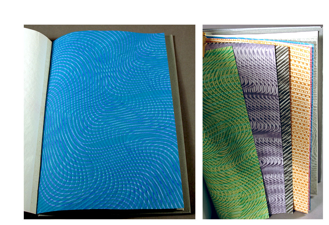 Click image for more |
Two Lovers on a Bench: 7 x 10"; 12 pages. Frontispiece guard. Printed on B. G. Bodleian paper in two colors. Type: Centaur & Duensing. Printed and bound by Rollin Milroy. Pastepaper covers. Rollin Milroy: "The book consists of Mariko Ando's frontis etching (image is approximately 4 x 6 inches), title page, copyright info, the story (4 pages printed in red & black), and colophon (call it 5 leaves + etching). The Barcham paper is so wonderful that I used full signatures (2 folio sheets/8 pages) of blanks as endsections. The book measures 7 x 10 inches. The signatures are sewn on tapes which are attached to thin boards, and then put into a case made from Claudia Cohen's paste papers (each copy is a different color/pattern). There is a printed spine label. " Heavenly Monkey: "To celebrate 20 years of marriage (to the same person) this month, HM issued a purely hors de commerce [sic] new book, Two Lovers on a Bench. The text, by the actor Samuel M. Johnson, is taken from the Philip Glass/Robert Wilson opera Einstein on the Beach. " |
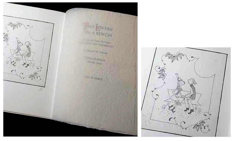 Click image for more |
| Types/Paper/Print Published by Heavenly Monkey Vancouver, British Columbia: Heavenly Monkey, 2012. Edition of 50. 8 x 12"; 28 pages. Set in nine roman and eleven italic types. Printed with the handpress on dampened Guarro laid paper. Sewn and cased at the studio. Deluxe copies 1 - 10 include the type specimen repeated on Arches Wove and Reg Lissel's handmade papers, bound together in quarter leather by Claudia Cohen. Regular copies 21 - 50 bound in marbled papers over boards with paper title label on front board. This is the regular version. Numbered but not signed as issued. Heavenly Monkey: "A type specimen book displaying the nine roman and eleven italic faces … that will form our core repertoire for the next five to ten years. It's an opportunity to use a few faces that have not been printed at the HM studio before, and to refine our work with some others. Just for fun, there's also an allusive new wood engraving cut and printed on gampi by Shinsuke Minegishi. Each face is displayed on a full page in three text sizes. There is a three page forward written by the printer, discussing why these faces have been chosen, and how they will be used (and printed) at the studio. The foreword also touches on the importance of paper, and how it can affect a type's appearance, especially when printed on the handpress. To illustrate the point, ten copies will be issued with all of the samples printed on three different papers (all damp, as is our custom), bound together sequentially, for comparison's sake. The remaining forty copies in the edition will include one duplicate leaf printed on handmade paper. "The text used to display the types is H.P. Lovecraft's story 'The Horror at Red Hook.' ... The story presented was chosen simply because it had the number of words needed to fill the space required to show the types." (SOLD) |
Click image for more |
Uncommon Deities Hallucinogenic landscapes resemble NASA shots of David Sylvian (born David Alan Batt, 23 February 1958) is an English singer-songwriter and musician, who records on his own Samadhi sound label. |
|
| Uncommon Paper By Rollin Milroy Vancouver, British Columbia: Heavenly Monkey Press , 2013. Edition of 26. 3 x 3"; 24 leaves. Miniature. Set and printed by hand on a Pratt Albion press. Frontispiece composed by Rollin Milroy from pieces of 9 of the 12 papers used in the book. Binding paper made by Red Lissel and dyed by Barbara Hodgson. Lettered. Introduction: "This book collects off-cuts of papers from HM's recent book Paper Should Not Always Be White. Not all of the papers in that book are here, just ones that had to be trimmed to fit the page dimensions. Most of the papers are handmade, and most are from mills now gone (& in one case, long gone). All of them too lovely to discard or abandon, so we make another book." (SOLD) |
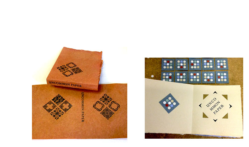 Click image for more |
| XI LXIVMOS Memoirs of a Bibliomidget By Anne C. Bromer Vancouver, British Columbia / Boston, Massachusetts: Heavenly Monkey Press / Bromer Booksellers, 2015. Edition: deluxe of 35; standard of 85. 2.25 x 2.75"; 72 pages. Miniature. Set in eight-point Centaur and Arrighi types. Printed with a Ostrander-Seymour Co. handpress on dampened papers. Signed by Anne Bromer on the colophon. Heavenly Monkey Press: "A deluxe edition of 35 copies (I-XXXV) was printed on F.J. Head handmade paper, with each copy including four sample leaves from the books. Original calligraphy on the title page and colophon in each copy by Francesca Lohmann. These copies are bound in full leather by Sarah Creighton, with the vine pattern stamped in gilt. Issued in a folding box. "The regular edition of 85 (1-85) copies was printed on Somerset Book paper, and bound by Sarah Creighton in a printed vine-patterned paper over boards. The design was created by Francesca Lohmann, who also drew the book’s interior foliage." Heavenly Monkey Press: "Twenty-six years after their last publication, Anne Bromer has written a memoir of the eleven printed miniature books she produced with her husband and partner David from 1977 to 1989. In the book - itself a miniature (2.25 x 2.75 inches, 72 pp.) - she relates brief stories of pleasure, coincidence, and difficulty for each of their publications, followed by a detailed bibliographic description." (SOLD) |
|
A Young Printer in San Francisco 1949 6 x 8.75"; 12 pages. Frontis linocut portrait by Andrea Taylor. Set in 18 pt Perpetua and printed on dampened handmade paper. Of the edition of 50, copies 1-15 deluxe and 16-50 standard. Brief memoir of visiting some of San Francisco's printing luminaries, by one of Canada's greatest designers & private press publishers. Heavenly Monkey: "In 1949 Robert Reid celebrated inclusion of his first limited-edition book (The Fraser Mines Vindicated) in that year's Rounce & Coffin Club annual book show, by driving down the West Coast to see the exhibition. Along the way he stopped in San Francisco, and during just a few days there, managed to meet a number of the city's printing luminaries: the Grabhorn brothers, Col. Carroll Harris, and perhaps most memorable of all, William Everson, then at work on A Privacy of Speech. "This brief account of the trip is written in Reid's customary style effusive for all things printed." |
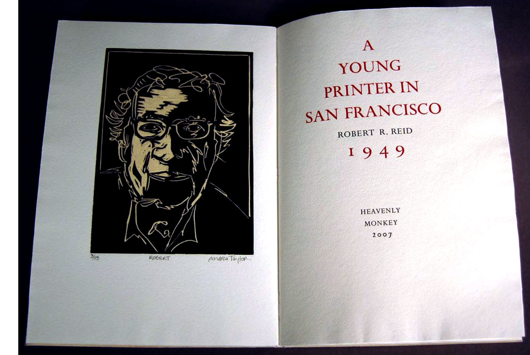 Click image for more |
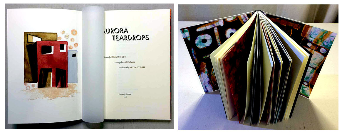
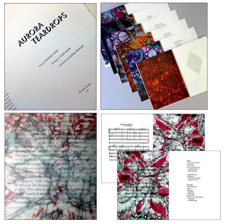
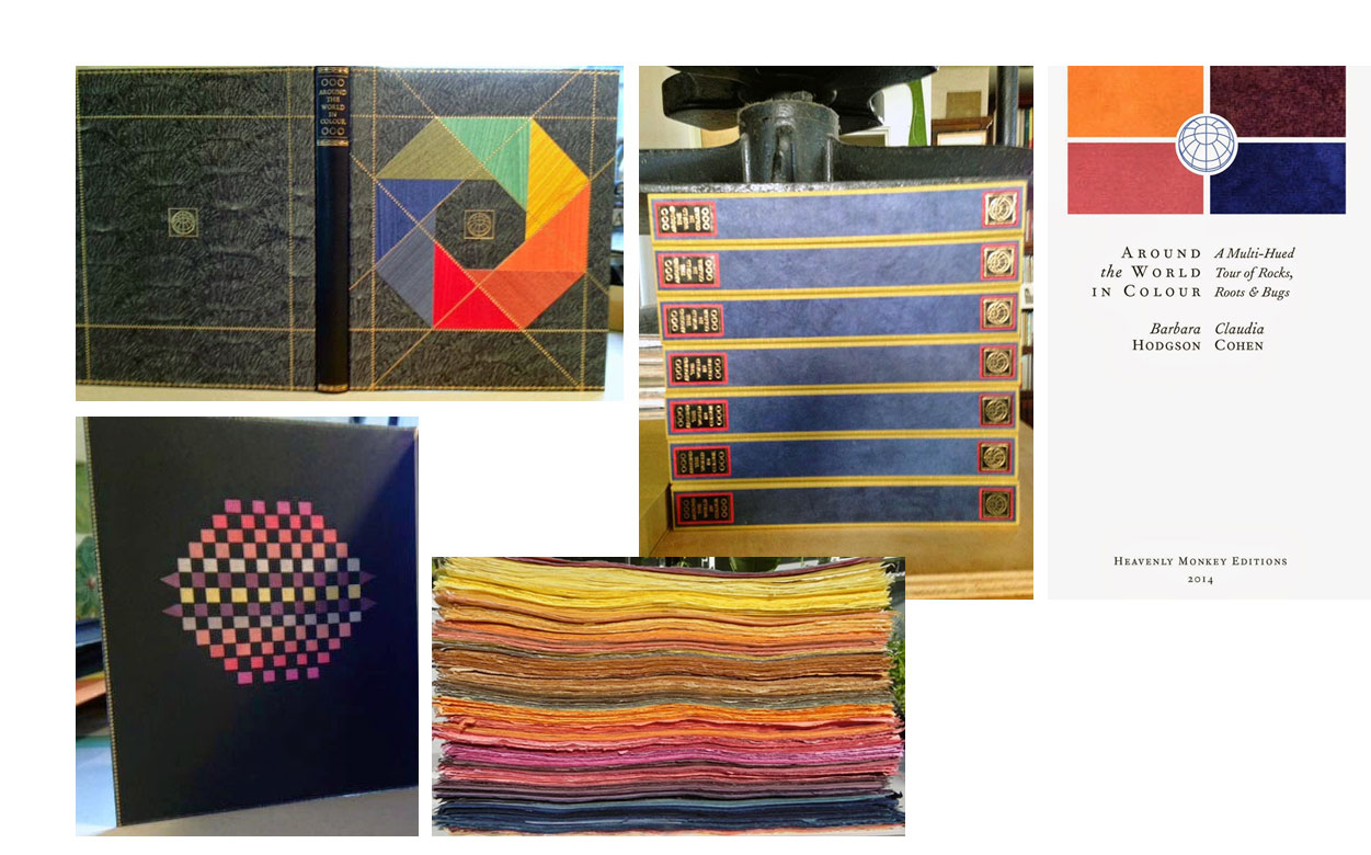
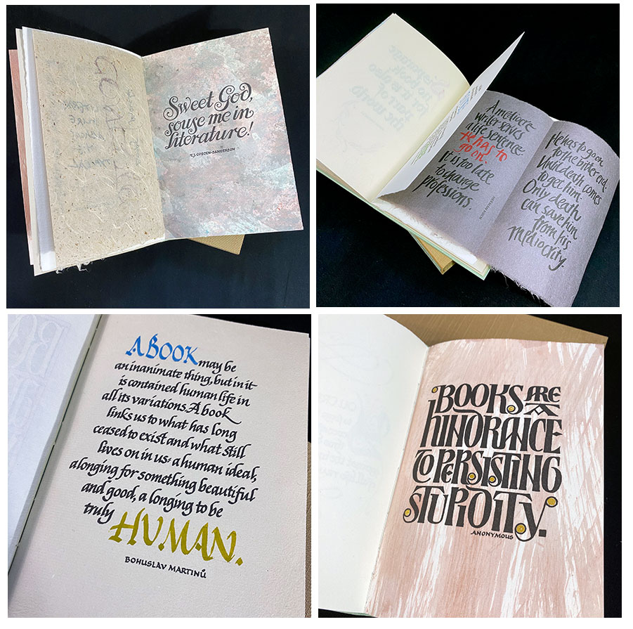
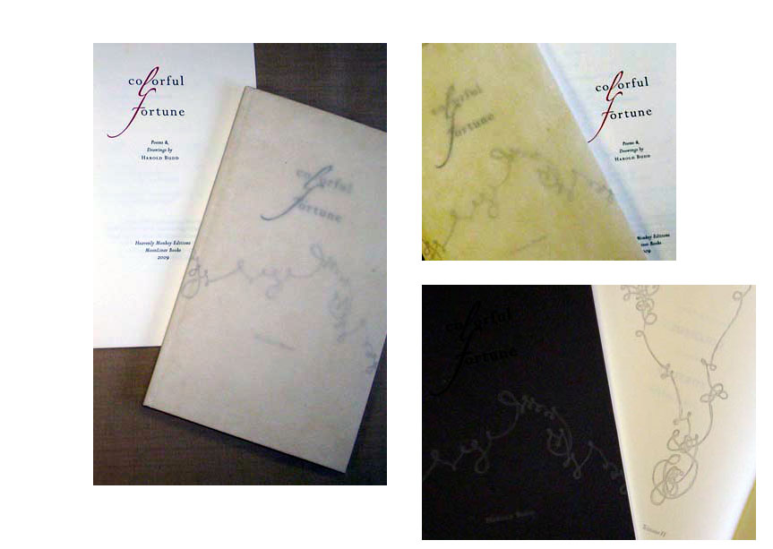
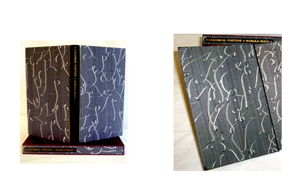
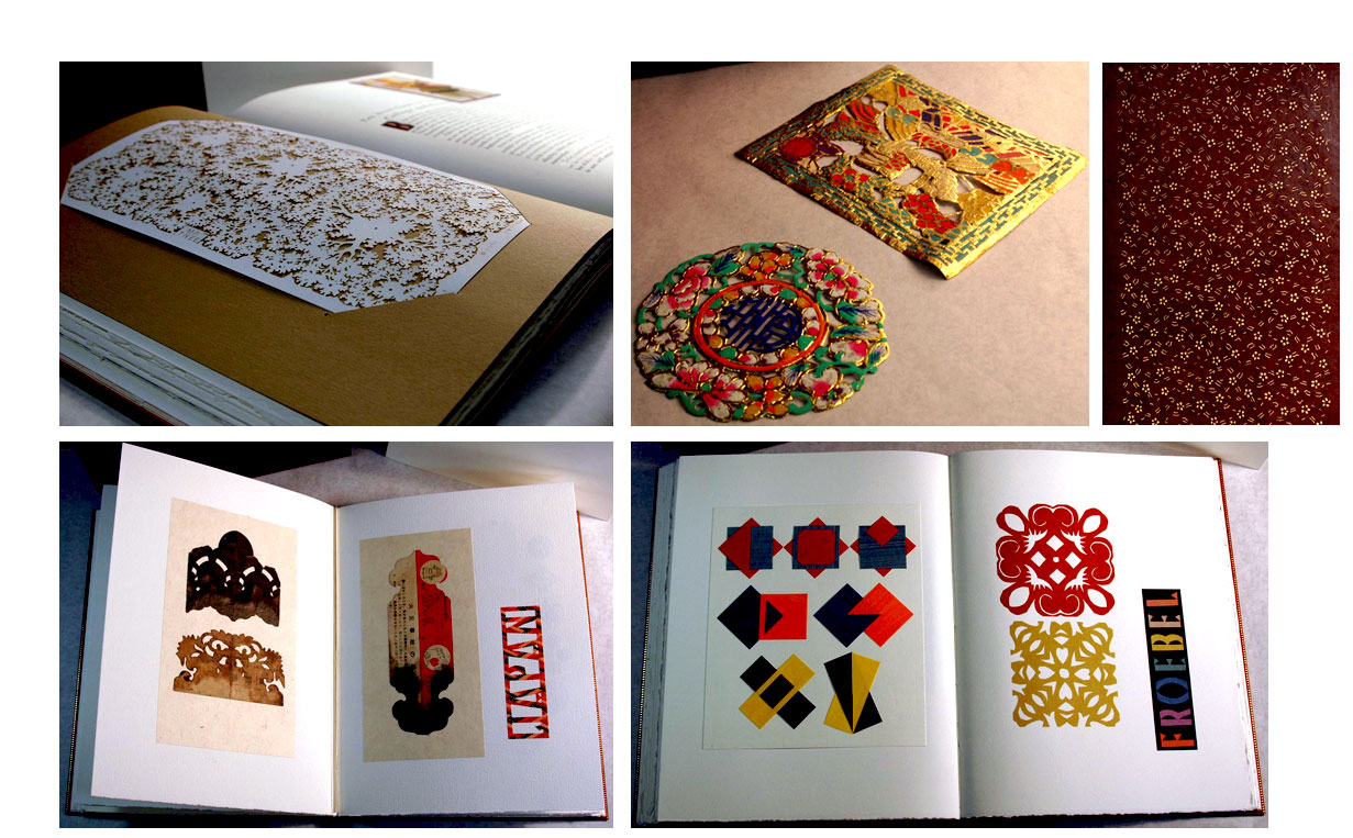
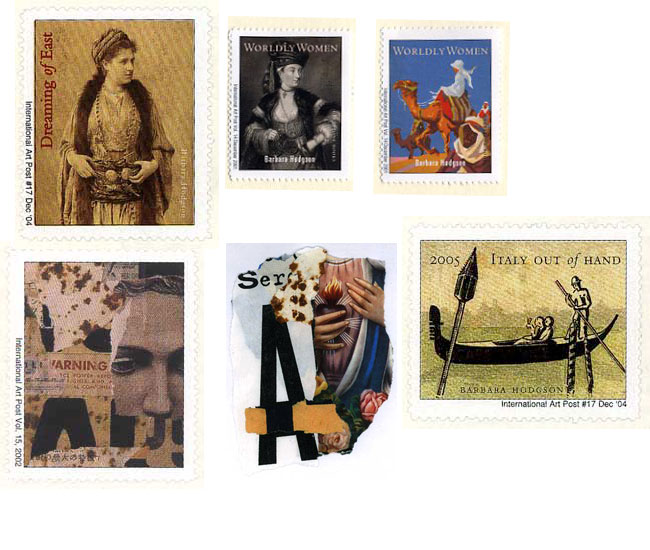
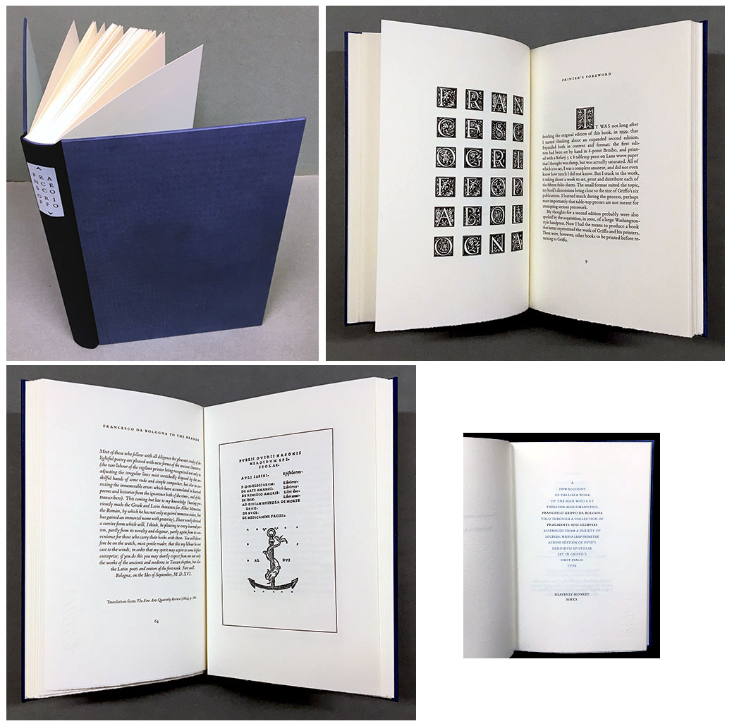
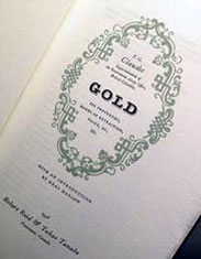
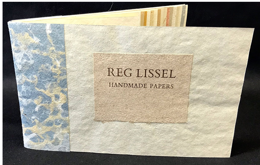
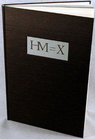
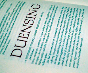
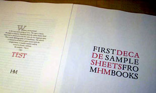
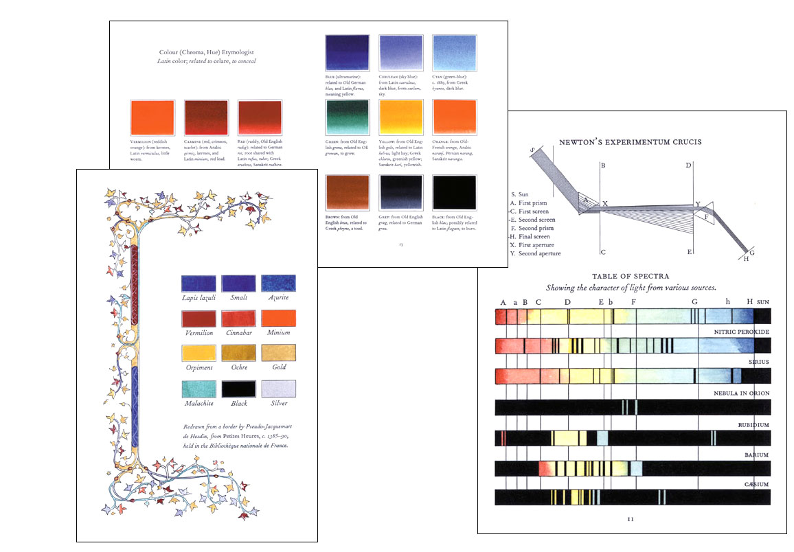
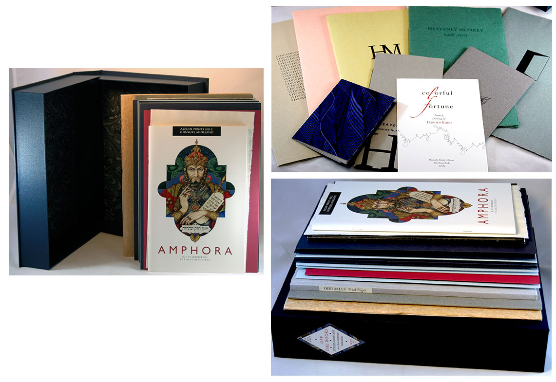

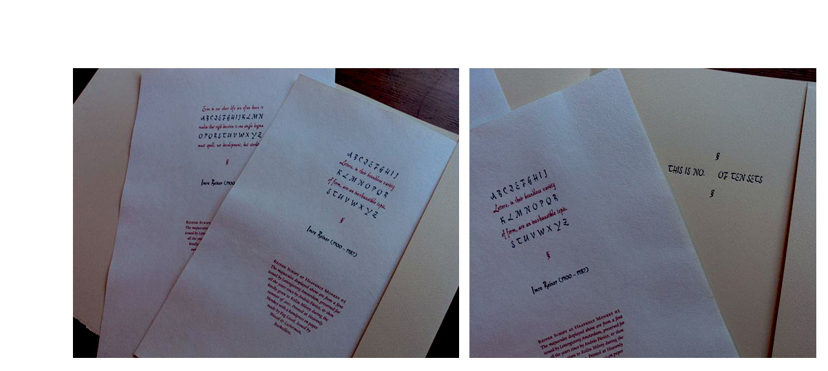
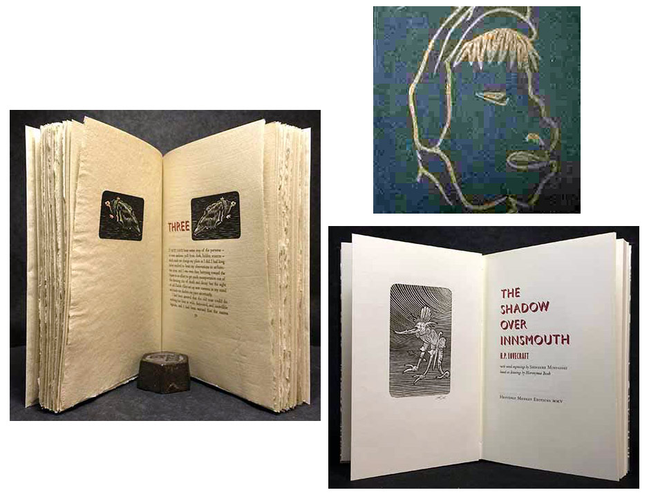
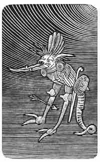
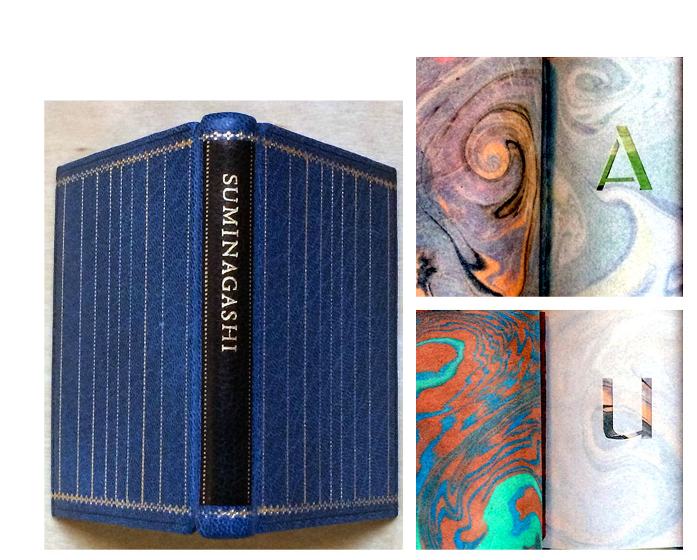
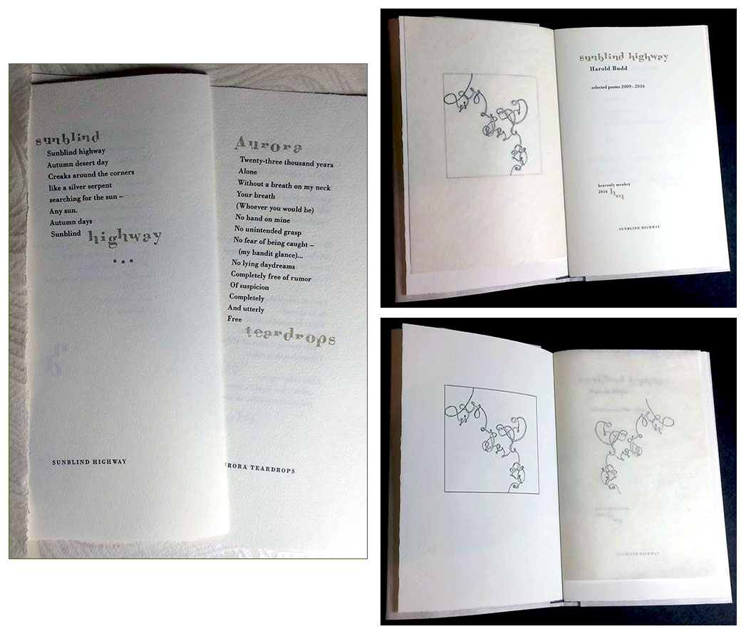
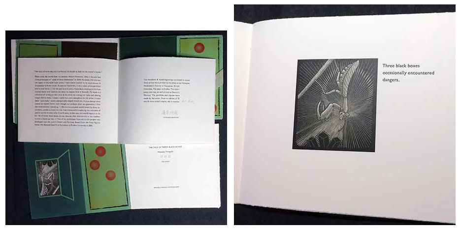
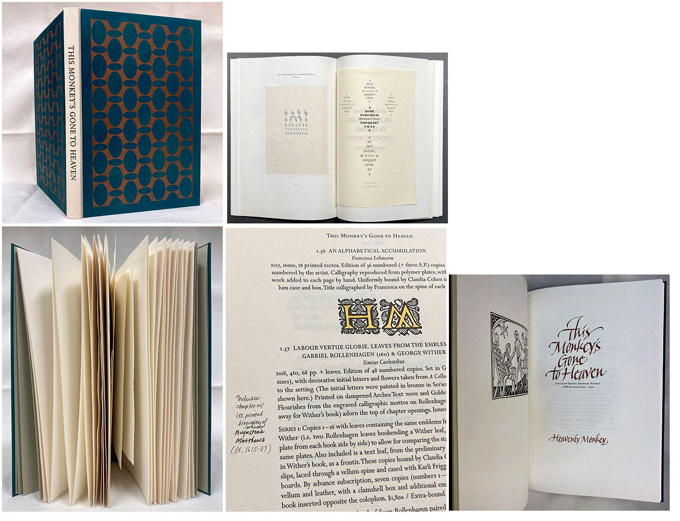
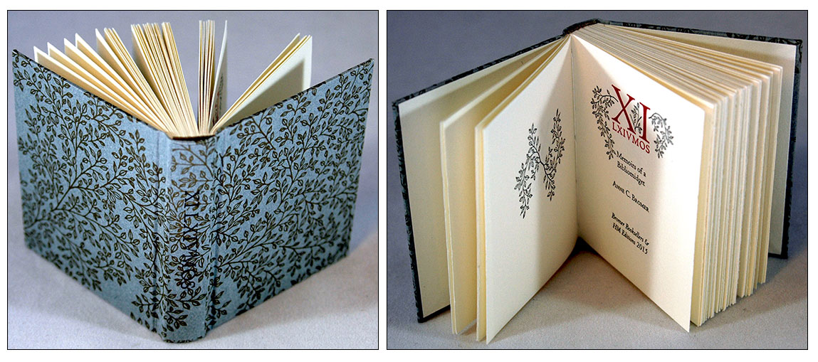
Page last update: 05.08.2025
Home | About Us | Contact Us | New Arrivals | Fine Press & Artists' Books | Broadsides |Resource Books | Order/Inquiry
Copyright © 2021 Vamp & Tramp, Booksellers, LLC. All rights reserved.