
Peter Malutzki ~ Germany |
Share this page: |
| |
|
| Artist statement: " After his studies at the University of Applied Arts in Mainz, Peter Malutzki was the co-founder of the FlugBlatt-Presse (1980–2000). Since then he has been working in the field of book art and artists' books, mostly with handset type and letterpress illustrations. Often times he uses the technique of collage, whether it be in printed or glued form. More and more he uses also the possibilities offered by the computer, and polymer-plates that have become important tools. From 1997 to 2006 he worked together with Ines von Ketelhodt on the 10-years project 'Zweite Enzyklopädie von Tlön'. Since 2002 they have a joint work shop in Flörsheim." | |
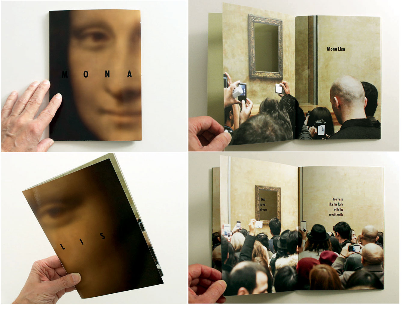
MONA LISA 23.8/16.8 cm; 34 pages. Booklet structure. Hand-set song text in Futura Condensed and printed letterpress. Images printed digitally. Numbered and signed by the artist. Peter Malutzki: "'Mona Lisa was composed by Jay Livingston and Raymond B. Evans for the 1949 film ‘Captain Carey’, U.S.A. But it was the cover version by Nat King Cole who made the song really popular in 1950. "The pictures of the Louvre visitors were taken from the internet and printed digitally. I cut the Mona Lisa pictures out of their photo frames." This painting by Leonardo da Vinci has been on permanent display at the Louvre in Paris since 1797. It is probably one of the best known pieces of art in the world. It has been integral to book plots, an object of parody, and certainly viewed by thousands. In this piece by Peter Malutzki he marries the song words with the crowds milling around the Louvre to catch a glimpse of the smile “Are you real, Mona Lisa? Or just a cold and lonely, lovely work of art?” |
 Click image for more |
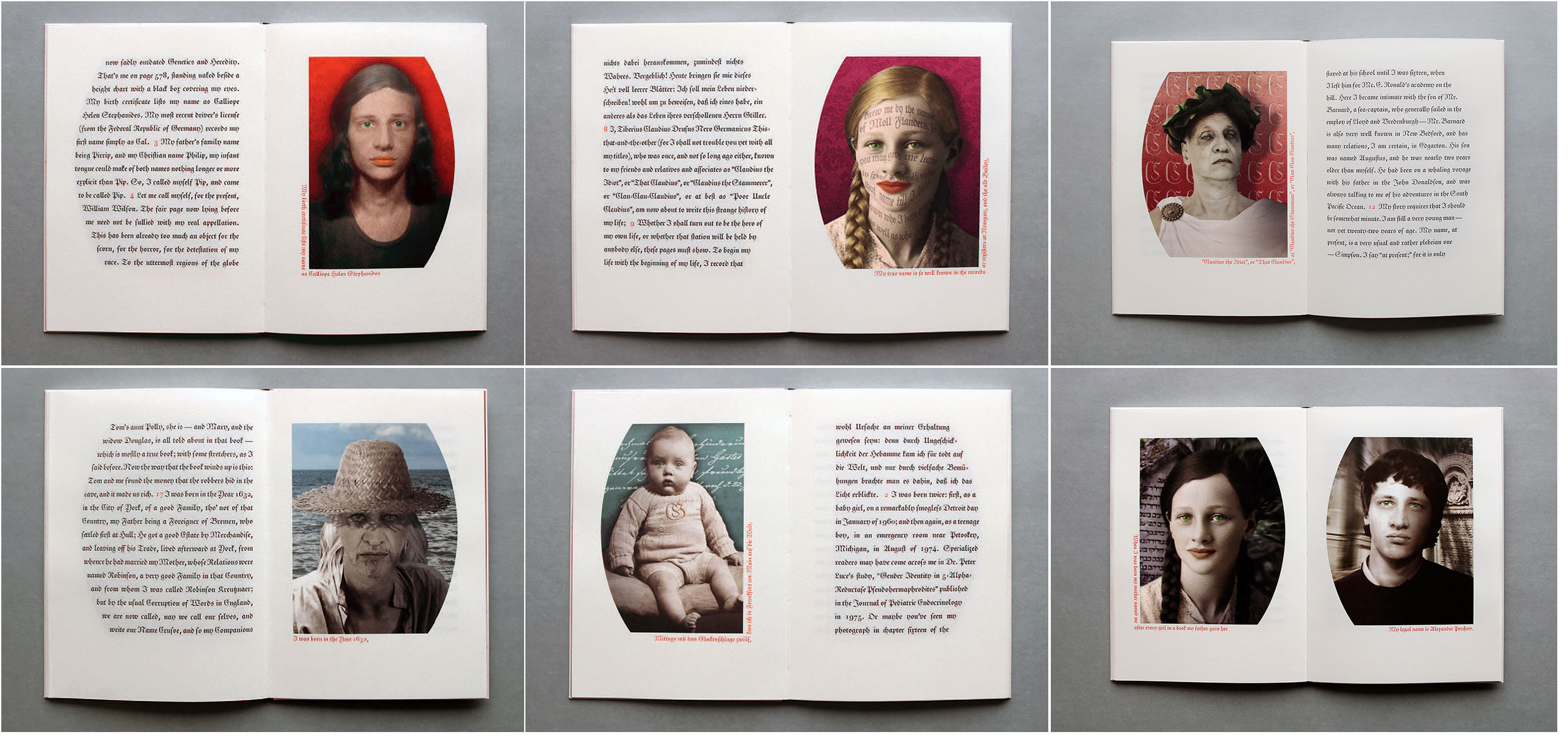
Born to Be Alive 24.6/17.5 cm; 48 pages. Photos edited in Photoshop. Printed on Bamboo Awagami Paper with archival pigments (Epson SureColor P7500). Text letterpress in Unger Fraktur type. Cloth-over-board with front title label. In slipcase. Numbered and signed by the artist. Peter Malutzki: "’Born to Be Alive’ could be described as a collage novel. It is assembled from the opening passages of the following 18 novels: Julian Barnes, ‘Talking It Over’; Daniel Defoe, ‘The Fortunes and Misfortunes of the Famous Moll Flanders’ and ‘The Life and Strange Surprizing Adventures of Robinson Crusoe’; Charles Dickens, ‘David Copperfield’ and ‘Great Expectations’; Jeffrey Eugenides, ‘Middlesex’; Jonathan Safran Foer, ‘Everything is Illuminated’; Max Frisch, ‘Stiller’; Johann Wolfgang von Goethe, ‘Dichtung’ und ‘Wahrheit’; Robert Graves,’ I, Claudius’; Nicole Krauss, ‘The History of Love’; Frank McCourt, ‘Angela’s Ashes’; Edgar Allan Poe, ‘The Narrative of Arthur Gordon Pym of Nantucket’, ‘The Spectacles’ and ‘William Wilson’; J. D. Salinger, ‘The Catcher in the Rye’; Muriel Spark, ‘Robinson’; Mark Twain, ‘The Adventures of Huckleberry Finn’. "I joined the beginnings of the novels in such a way that they created a cohesive text, in which the passages of differing lengths refer to one another and keep spinning out a narrative thread. I used the text passages in their original language; two are in German, the rest are in English. All 18 novels are written in the first person and their protagonists introduce themselves at the beginning, telling us their names and usually also where and when they were born. Inspired by this, I illustrated the novels’ figures with photographs of myself at different ages. For three female characters, I used a photograph of my mother at age 15.” |
 Click image for more |
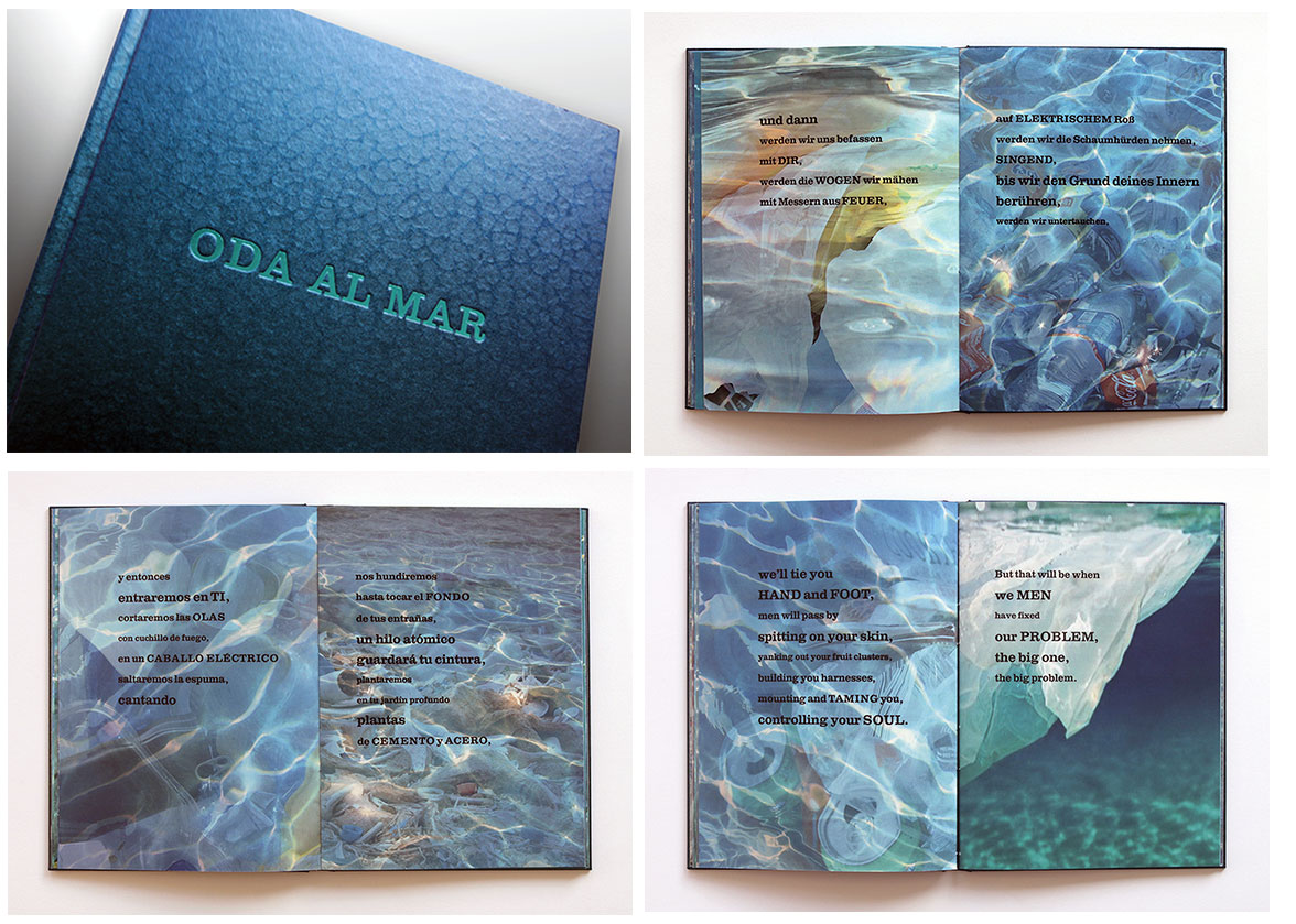
Oda Al Mar 21.7 x 16 cm; 80 pages. Printed in Spanish, English and German. Photos printed digitally. Hand-set and letterpress printed text. Numbered and signed by the artist. Peter Malutzki: "Neruda’s 'Ode to the Sea', written in 1954, is not a hymn praising the beauty and grandeur of the sea. It is written from the point of view of a Chilean, whose country is especially vulnerable to the elemental force of the Pacific and also depends upon it: 'we’re the tiny little / fishermen, / the men on shore, / we’re cold and hungry, / you are the enemy, / don’t hit so hard, / don’t roar like that,'. "From today’s perspective, the poem’s threat – powerless in the 1950s – does not seem so far-fetched: 'and then / we’ll enter you, / we’ll cut the waves / with a fiery knife, / on an electric horse / we’ll leap over the foam, / singing / we’ll sink down until we touch the bottom / of your entrails,'. "When we consider the current state of the world’s oceans, the prediction made in 'Ode to the Sea' seems to have become a reality: 'men will pass by / spitting on your skin, / yanking out your fruit clusters, / building you harnesses, / mounting and taming you, / controlling your soul.' "Neruda’s poem was printed in the original Spanish, along with the English translation by George D. Schade and the German translation by Erich Arendt, on photographs showing plastic waste in the ocean. The photos were edited on a computer and printed digitally. Text is hand-set and letterpress. In each copy of the edition the photographs appear in a different order. So each book has its own combination of photographs and printed text, in terms of the order of the photographs, no two copies are the same." |
 Click image for more |
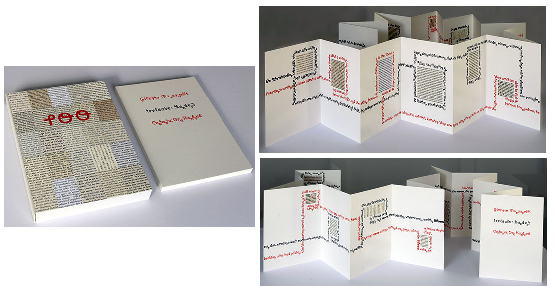
| Irrläufe: Hundert – Centuria: One Hundred | |
By Giorgio Manganelli 16.7 x 23.8 cm; 34 pages. Letterpress printed on Zerkall mould-made paper. Accordion structure. In clamshell box. Numbered and signed by Malutzki. "A writer is writing a book about a writer who is writing 2 books about 2 writers, one of whom writes because he loves the truth, and the other because it makes no difference to him. These 2 writers write a total of 22 books that talk about 22 writers, some of whom lie without knowing they are lying, others lie and know so, others seek the truth while knowing they won’t be able to find it, others believe themselves to have found it, still others believed themselves to have found it but have started to have doubts .. " Peter Malutzki: "Manganelli’s ouroboric mini-novel (No. 100 in a series of a hundred) was used in both a German and English translation. The two versions run across the accordion book as unbroken lines. The binding structure of the book (printed on both sides) allows to connect the text ends to the text beginnings, thereby associating it with a sense of endless (ouroboric) reading. The texts were set on a computer in 30 point Polymorph South, and letterpressed using polymer plates. On their meandering path through the book they 'circumnavigate' glued-in text fragments from novels by Paul Auster, Simone de Beauvoir, Michail Bulgakov, Italo Calvino, Willa Cather, Julio Cortázar, Fjodor Dostojewskij, Umberto Eco, Max Frisch, Gabriel García Márquez, Günter Grass, Nathaniel Hawthorne, Patricia Highsmith, Homer, Bohumil Hrabal, Siri Hustvedt, Franz Kafka, Selma Lagerlöf, Harper Lee, Stanislaw Lem, Giorgio Manganelli, Gustav Meyrink, Irmtraud Morgner, Haruki Murakami, Cees Nooteboom, Jean Paul, Georges Perec, Philip Roth, Arno Schmidt, Mary Shelley, Donna Tartt, TatjanaTolstaja, and Virginia Woolf. Since the novel fragments were taken from real books, each copy of the edition contains its own small extracts from the respective novels, and is in terms of the fragments one-of-a-kind." |
|
buchstäblich Buch 9 x 12"; 160 pages. Design by Peter Malutzki. Photography by Ines von Ketelhodt. Text in German and English. Translations into English by Emily Banwell. Bound in lightweight paper covers with printed dust jacket. A catalog prepared for an exhibition of the artist's work at the Klingspor Museum (Offenbach, Germany) from 5 March to 15 April [2017]. The exhibition catalog begins with an introduction by the artist, the explanations of the works are written by him, the epilogue is by the head of the museum, Stefan Soltek. Each book has the bibliographic information, the artist's description of his thought behind the work and color images of the book. Klingspor Museum: "For 35 years, Peter Malutzki has devoted himself to book art and is one of the protagonists of the contemporary artist's book. The books of his Flugblatt Press are almost completely assembled in the Klingspor Museum, as well as the 50-volume book art project 'Second Encyclopedia of Tlön', which he created between 1997 and 2006 together with the book artist Ines von Ketelhodt. His books are often collages from a variety of finds, both textual and pictorial Art. He collects almost in Schwitter's sense, arranges, revises and places the found things conceptually in new contexts. In this way, maps are transformed into faces, transforming prints from old stereotypes into new figures, and a medieval book of hours becomes a 21st-century book art work through digital alienation." |
 Click image for more |
Palimpsest 17 x 32.5cm; 88 pages. Printed paper-over-board with spine title. Woodcuts. Linocuts. Handset typography. Overprinting with 24 Cicero wood type. Signed and numbered by the artist. Peter Malutzki: "This book uses cut-up original graphics by [me] (mostly woodcuts and linocuts with hand-set typography) that appeared as broadsheets in the FlugBlatt-Presse between 1980 and 1984. Now they serve as the background for the first three lines of Samuel Beckett’s poem 'What would I do without this world ...' and are largely covered by the black overprinting. Nonetheless, the multicolored graphic motifs underneath are more or less clearly visible, and are an important part of the book. Overprinting with 24 Cicero wood type and their reverse side." The first three lines of Beckett's "What would I do without this world," which are presented in Palimpsest:
Stefan Soltek, Epilog, Buchstablich Buch: "Malutzki as a reader does not simply transfer what he has read – as it pleases him – into his books. Instead, he responds as the type of reader described by Novalis, Hermann Hesse, and Roland Barthes: a recipient who becomes involved in his reading and at the same time reshapes it according to his own manner of reading an interpretation. … Malutzki reads texts as the substance of the book that he will create from it, which is inspired by it. He does not write texts for his books in the usual sense, as an author. Instead, he generates texts by selecting, trimming and combining text passages to create a unique new work." |
 Click image for more |
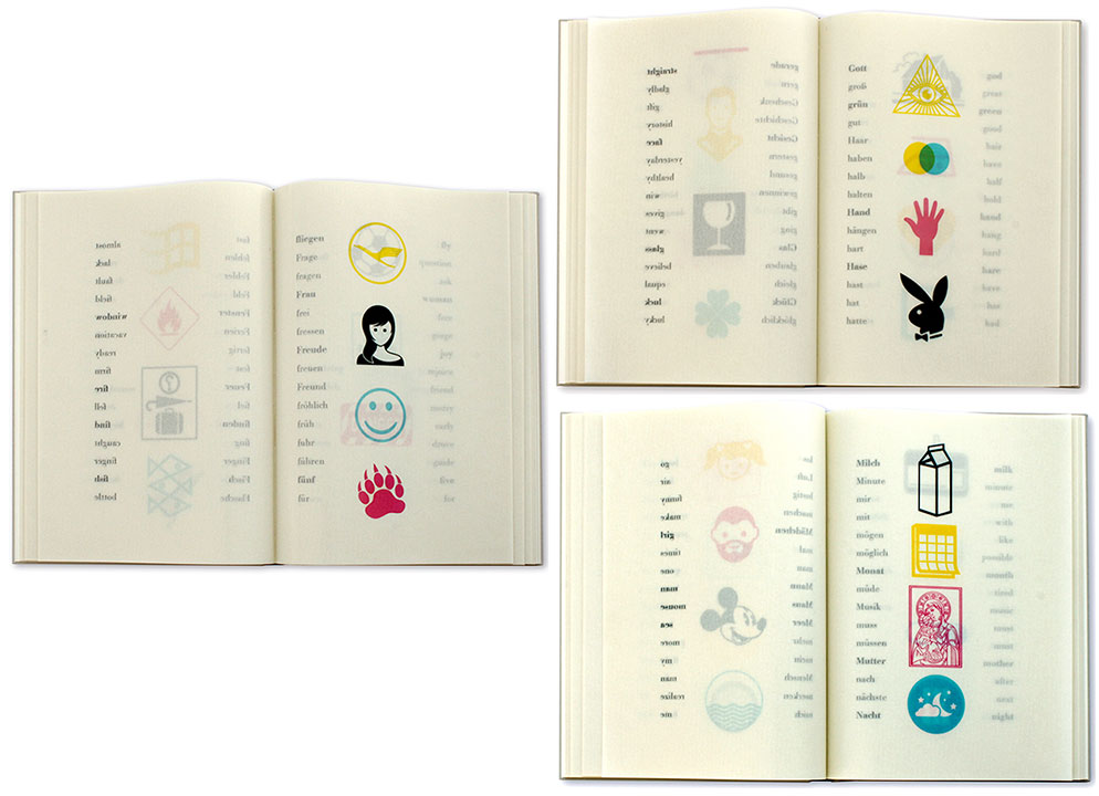
WORTSCHATZ 16.6 x 23.7 cm; 214 pages. Glassine paper. Handset and letterpress with images from polymer plates. Text in German and English. Linen-over-board cover with blind-embossed front and spine title. Numbered and signed by the artist. Peter Malutzki: "WORTSCHATZ: the German word for vocabulary, literally means a treasury of words. The book contains 495 German words and 495 possible English equivalents, along with pictographic representations of 132 of these words. According to the website Natural language processing of the University of Leipzig [http://asv.informatik.uni-leipzig.de/en], the German words chosen in the book are the most commonly used words in the German language." |
 Click image for more |
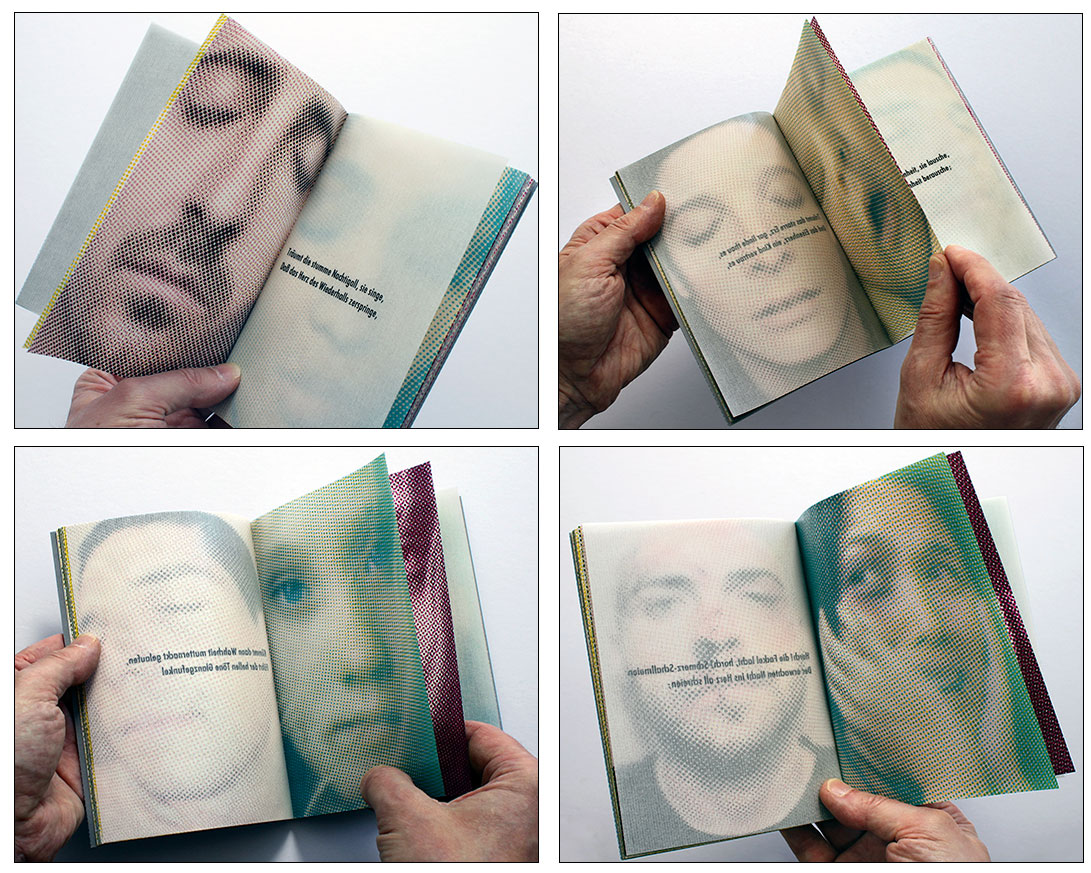
Wenn der lahme Weber träumt er webe 18 x 12.5 cm; 56 pages. Booklet with pamphlet stitch binding. Letterpress printed from handset type. Text in German. In slipcase. Signed and numbered by the artist. Peter Malutzki: "This relatively small 56-page book made of glassine paper is exclusively devoted to a poem by Clemens Brentano. What especially fascinated me about this famous poem was the contrast between dream and painful awakening. I immediately had pictorial associations – nothing was more obvious than seeing Brentano’s dreamers in the faces of people who are sleeping peacefully, their closed eyes a universally understood symbol of calm. In contrast: the sudden awakening, being immediately and unmistakably present in the wide open eyes of the 'naked truth'. Snap out of the dream. Stop imagining things. Look the facts straight in the eye. Or: Dream on. We all know the sayings. The tone of the poem changes with the line Kömmt dann Wahrheit mutternackt gelaufen [Then truth stark-naked comes running along]. Awakening is followed by the painful realization that the sweet miracles are drowning alone. From this moment on, the eyes of the people in the book are open. The faces are no longer peaceful. They regard us soberly, or are painfully distorted. The last face is a portrait of the poet, Clemens Brentano. He, too, turns a serious face toward us. He has been dead for more than 170 years, and does not know the terrible truths of our age. "The image material comes from the internet; it was edited in Photoshop and printed with polymer plates using the four-color printing process. Thus four plates had to be made for each portrait, one for each color. However, the individual colors are not printed on top of each other on one page. The transparent glassine paper I used made it possible to distribute the four colors across four pages. The blue plate is printed on the front of the first page, and the yellow plate on the reverse; the red plate is printed on the front of the second page, and the black on its reverse. Thus each image is distributed among four pages (two sheets) of the book. On the one hand, the reader has the option of seeing the individual colors that make up the four-color image; on the other hand, the paper’s transparency and translucency also allows the overlaid colors to be seen all at once. The best four-color print impression is created if the two sheets with all four colors of an image are held together up to the light. The reader’s lighting situation thus plays an important role, and can create a wide range of impressions. Two lines of Brentano’s poem, printed on the same glassine paper, lie between the color portrait series. In a certain sense, they also act as separating pages between the pictures." www.britanica.com (accessed 4/11/2017): "Clemens Brentano, [1778 – 1842] poet, novelist, and dramatist, one of the founders of the Heidelberg Romantic school, the second phase of German Romanticism, which emphasized German folklore and history. . . .Brentano was known for his imagination and the extraordinarily musical quality of his lyric poetry." |
|
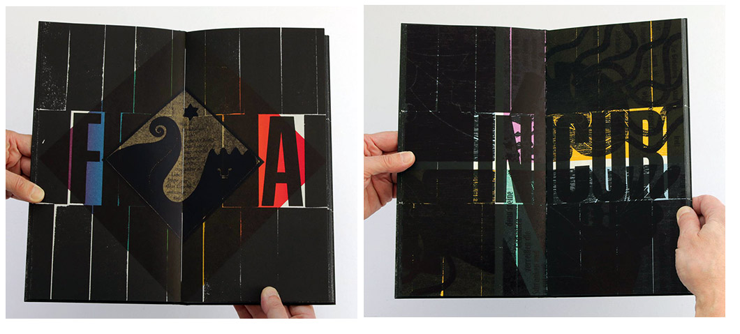
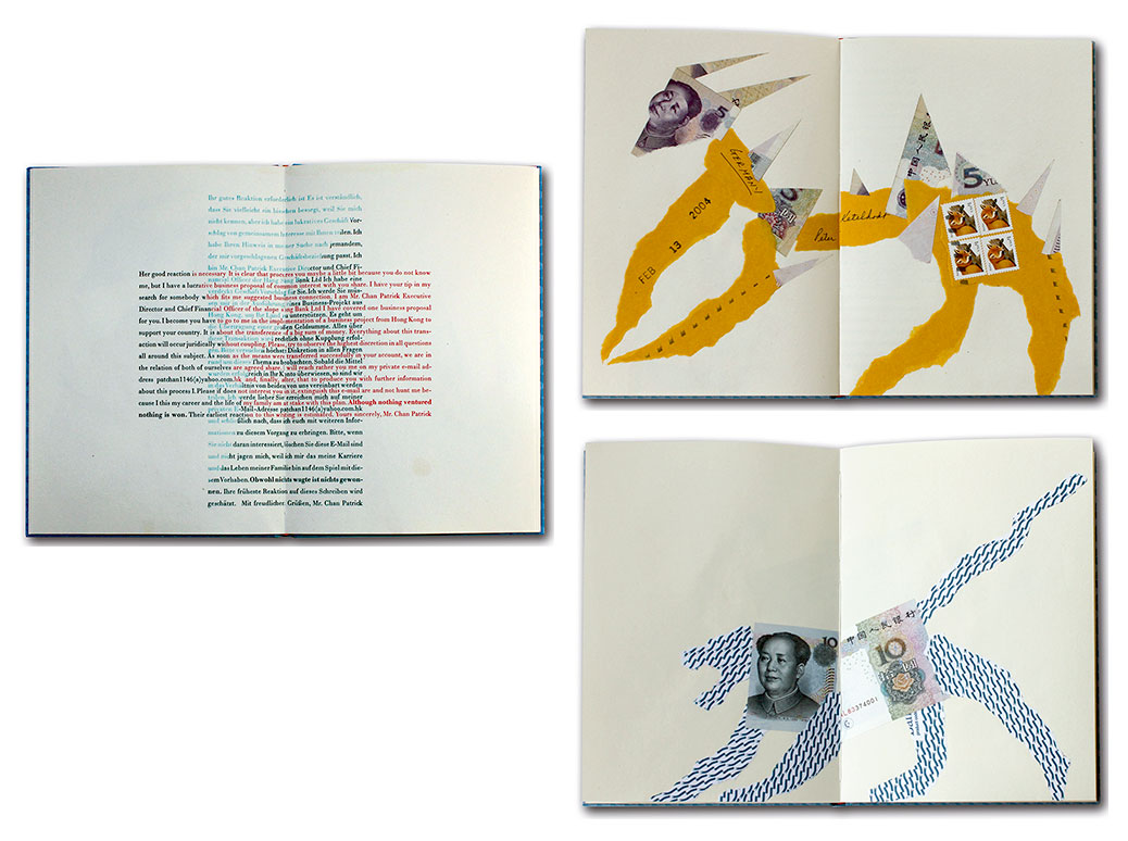
| Obwohl nichts wagte ist nichts gewonnen Although nothing ventured nothing is won By Peter Malutzki Flörsheim, Main, Germany: Peter Malutzki, 2014. Edition of 20. 17 x 24 cm (6.7 x 9.4"); 40 pages. Collages (composed of original envelopes and used banknotes). Handset and letterpress. Bi-lingual text (German / English). Numbered and signed by the artist. Bound in printed paper over boards with paper titles on front cover. Peter Malutzki: "The peculiar language and involuntary humor of some spam e-mails from Hong Kong, machine-translated into German, and their 'back translation' via a translation program into a not less funny English build the text material of the book. Added are original collages made up of letter envelopes and Chinese Yuan notes." $780 |
 Click image for more |
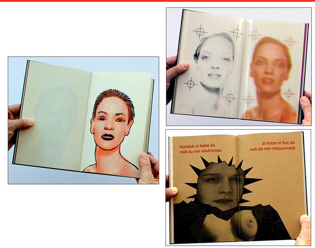
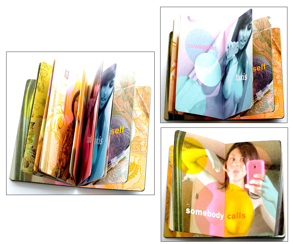
| Lucy in the Sky By Peter Malutzki Flörsheim, Main, Germany: Peter Malutzki, 2013. Edition of 60. 19 x 11.5 cm (7.4 x 4.5"); 94 pages. Design, handset, and letterpress: Peter Malutzki. Silver embossed black cardboard cover with cloth spine and titles embossed to resemble push-buttons. Signed and numbered by the artist. Peter Malutzki: "Images from the internet of girls taking photographs of themselves with their cell phones, mostly in front of a mirror. The images were made up in Photoshop, using the color separation process (adding some 19th century ornamental forms), and afterwards printed with polymer plates in letterpress (4 plates for each picture). Most of the images are printed several times using interchanged colors. The added text quotations come from the Beatles song Lucy in the sky with diamonds. The form and smallness of the book are a reference to the omnipresent mobil devices." Harvard.edu Blog (08.15.2014): "Book artist Peter Malutzki became interested with 'selfies' and especially the way young women posed themselves for display on the Internet. He reused images found online to create a book about fantasy and self-representation, Lucy in the Sky; Big Brother is Watching You. Superimposed are the words from the Beatles’ song, Lucy in the Sky, a text he found a fitting juxtaposition to the self-presentation of these pictures." $600 |
|
| RAZZLE-DAZZLE By Peter Malutzki Flörsheim, Main, Germany: Peter Malutzki, 2011. Edition of 50. 15 x 24 cm (5.9 x 9.4"); 84 pages. Design, handset, and letterpress by Peter Malutzki. Printed linen (variety of colors) over board covers with paper title label on front cover. Signed and numbered by the artist. Peter Malutzki: "The book features short texts by various authors in their original language (Konrad Bayer, The Beatles, Clemens Brentano, John Cage, Lewis Carroll, Miguel de Cervantes Saavedra, Carlo Collodi, Daniel Defoe, Emily Dickinson, Johann Wolfgang von Goethe, Walter von der Vogelweide) as well as pictures printed in letterpress using linocut, woodcut, wood engraving, and polymer-plates (1 photograph is done in digital print)." $480 |
 Click image for more |
| Stundenbuch By Peter Malutzki Flörsheim, Main, Germany: Peter Malutzki, 2010. Edition of 50. 14.5 x 21 cm (5.7 x 8.3"); 288 pages, Letterpress printed. Images printed with polymer plates with the gildings in 22.5 carat gold leaf. Transcription of the handwritten texts by Peter Malutzki. Design, handset, and letterpress by Malutzki. Bound in embossed linen-over-boards. In slipcase. Signed and numbered by the artist. Peter Malutzki: "Remake of a Book of Hours from the early 16thcentury and an attempt to bring the content of a 500 years old book into a modern contemporary artists' book form. Model was a parchment manuscript of the collection of the Herzog August Bibliothek Wolfenbüttel: the Book of Hours of Duke Augustus the Younger. Almost all texts of the prayer-book (written in an old form of the German language, related to Dutch and English) are used (in hand set letterpress) for the 'remake'. Parts of the old pictures were used for the design of the 81 picture pages of the new book." $1,400 |
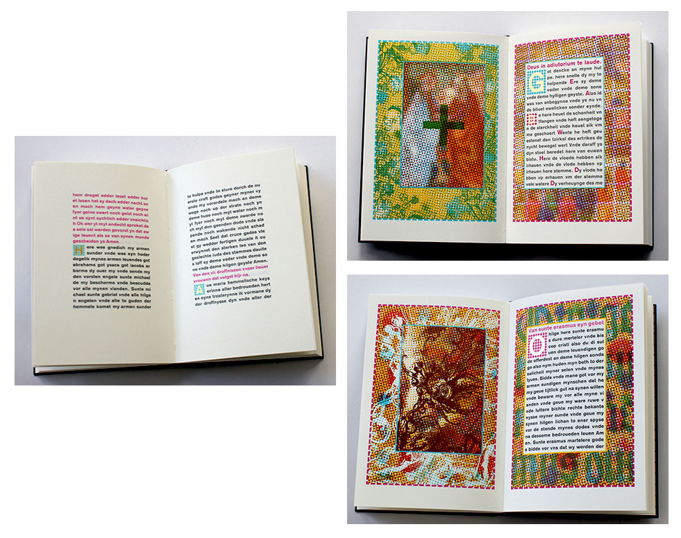 Click image for more |
Collagebuch eins Peter Malutzki: "Obviously, after 10 years of working with the relatively small encyclopedia format [project 'Zweite Enzyklopädie von Tlön'], I needed to move on to other formats. 'Collagebuch eins' marked a change in more than just that regard. After a long period of conceptual, project-based work, this spontaneous, immediate collage work was certainly a way of going back to my 'pre-encyclopedic' work and breaking new ground, and was necessarily influenced by my work on the encyclopedia. 'Collagebuch eins' was not just meant to be a book with 14 collages pasted into it; it was an attempt (at least, it was my – probably still typically encyclopedic – goal) to exemplify and call into question the architecture of a book that is supposed to combine 'texts' and images. |
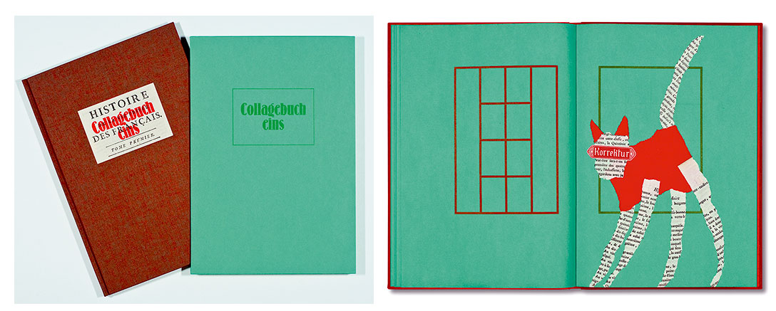 Click image for more |
Collagebuch zwei Peter Malutzki: "This book is a variation on 'Collagebuch eins', with different materials and shapes. The 'text block pages' consist of horizontal lines in red and black. The number of lines increases from page to page. But unlike 'Collagebuch eins', where the same green rectangle always provides the frame for the collages, here the number of lines increases on the collage pages as well. The material for the collages comes from original US comics. Unlike the book pages in 'Collagebuch eins', however, they are not torn up 'at random', but divided by perforations. I made perforated lines all across the comics pages, separated them along the lines, and then put the resulting postage-stamp-like pieces back together in the collages. The figures that came out of this mainly vary throughout the edition because of the image motifs on the individual comics pages, which are different in every copy. The shapes of the perforated pieces that I used are almost identical in every copy, since I perforated the necessary material for the entire edition in a single step each time. As with the first book, in version two it was also important to me to have the print layer and the collage layer bleed into each other. In other words, in some cases I glued in collage elements even before the line printing so they would be underneath the print layer later on. Conversely, I also glued collage elements over printed lines, which placed them on top of the print layer. The interplay between these two approaches produced a certain three-dimensionality in the end. In some places, it creates the impression that the collage is between the printed lines. Which technically is the case." |
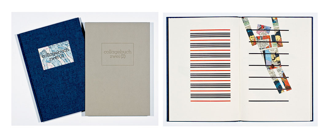 Click image for more |
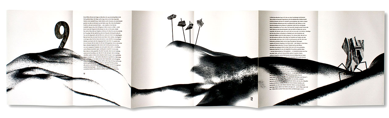
| Unser Landschaftsbericht [Our Landscape Report] auf Originalfotografien von Ines v. Ketelhodt mit Buchdruckfiguren von Peter Malutzki text by Peter Rosei Lahnstein/Oberursel, Germany: Flug Blatt-Press/ Unica T, 1996. Edition of 60. 17 x 24 cm (6.7 x 9.4"); 44 pages. Double-sided concertina. 22 photographic prints on Agfa Paper. Handset and letterpress printed. Bound in stiff paper boards with titles on front cover. Signed and numbered by poet and artists. Peter Malutzki: "Unser Landschaftsbericht was a collaboration with Ines von Ketelhodt. The title came from a text by Peter Rosei (a description of a surrealistic landscape), which we printed in its entirety on original black-and-white photographs by Ines. First we had to make all of the original photographic prints for the edition. There were 22 pictures per copy, about 1,500 in total. Our bathroom was constantly blockaded, and there were pictures hanging up to dry everywhere. The photos showed body parts of naked women and men, barely recognizable as such because of the way the images were cropped. They are more reminiscent of hilly landscapes; lined up alongside one another in the accordion, they do actually create a landscape that extends throughout the whole accordion book. The accordion has one light side and one dark side. The dark side consists of positive prints of the photos, and the light side of contact prints of the positives. Thus the light-colored photographs are negatives. In fact, the two sides look like day and night shots. We had decided to do this because there are also day and night images in Rosei’s text. I inserted letterpress figures into the imaginary landscape (printed with polymer plates, brass rules and various type materials), some of them acting as signs within the landscape, sometimes simply showing the page number but also creating figurative elements. They are not always visible at first glance on the dark pages, since they are letterpress printed in black onto the dark photo paper. But when the pages are turned slightly so that the light falls on them from a different angle, the shiny shapes are clearly visible." Peter Rosei is a prolific Austrian writer who chronicles the everyday existence of the ordinary and banal in the late 20th and early 21st century. $480 |
 Click image for more |
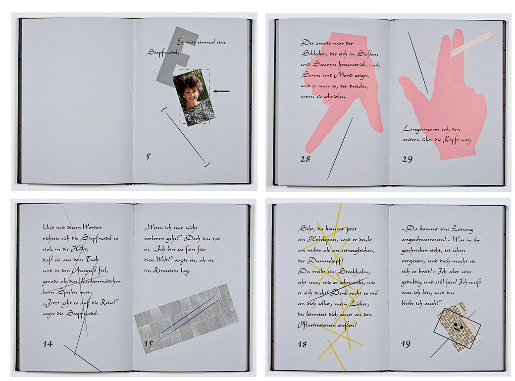
| Die Stopfnadel [The Darning Needle] By Hans Christian Andersen Illustriert von Peter Malutzki [illustrated by Peter Malutzki] Flörsheim, Main, Germany: Flug Blatt-Press, 1985. Edition of 135. 15 x 23 cm (5.9 x 9"); 48 pages. Design, handset, and letterpress by Peter Malutzki. Typeface: Legende (by Ernst Schneidler). Text in German. English translation laid in. Bound in gray linen cloth by Helmuth Halbach with paper collage and darning needle inset on front board. Signed and numbered by the artist. Buch Kunst SFCB exhibition description: "The illustrations are made up of, among other things, brass rules, photographs, linocuts, wood type, a piece of a German newspaper from 1852 and a bit of genuine gold leaf. … A darning needle with pretensions tries to hold her own as she is shunted from a maid's apron into a kitchen sink. Andersen's cautionary tale of overweening pride is not without a certain grudging admiration for this attribute as a survival tool." Peter Malutzki: "As often in Andersen's fairy tales, The Darning Needle relates the experiences of everyday objects as parables for human behavior. To illustrate this story, I used items from my workshop: typesetting materials, old zinc plates, brass rules, wire, linocuts. In addition, I used various collage materials — found objects, for instance from fashion catalogues, but also a scrap of an original Frankfurter Postzeitung , a newspaper published in 1852 (during Andersen's lifetime). For the darning needle itself, which appears on every page, I used an English line (a line that narrows to a point at each end). It first appears on the gray end paper, surrounded by blue brackets to set it apart from a mass of similar darning needles. On the front cover, it appears as original needle. When the darning needle breaks while patching an old slipper, her career as a darning needle comes to an end. The kitchen maid tucks the needle into her apron. Now the needle believes herself to be something quite special, a breast-pin. But she falls down the drain and is washed into the gutter with the dishwater. On page 14, you see the needle's involuntary tailspin. Her fall ends in the gutter, where the darning needle meets all kinds of 'personalities,' for instance a shard from a bottle, which she thinks is a diamond. The darning needle tells the shard about her life, describing the five fingers that were 'only employed to hold her.' She introduces the individual fingers: the thumb, who stands first in the rank and has only one joint in his back. Sweet-tooth, who dips himself into foods both sweet and sour and points to the sun and the moon (or the page number). Longman, who looks out over the heads of the others. Gold-band, with a golden ring around his waist. And the smallest of all, little Playman, who does nothing at all and is proud of it. The darning needle also talks about her plunge into the sink (we are reminded of the involuntary, whirling fall on page 14). In her tale, she idealizes the fall; in the illustration, it becomes a perfect dive into the inverted A of the drain (in German: Ausguss). 'They were boasters, and boasters they will remain; and therefore I left them,' says the darning needle. We can, if we wish, flip back to page 14 and remind ourselves of the real circumstances of her involuntary fall. I would like to mention one other important aspect of the book: the typeface. Ernst Schneidler's Legende (designed in the 1930s) played almost no role in the book art scene of the 1980s (at least in Germany). Although I adopted it in various sizes from the inventory of my Lahnstein printing shop, I had no use for it before then either. Such typefaces were considered suspect, since they had all too often been used in a dubious context. But for the darning-needle book, it turned out to be the appropriate typeface." $210 |
|
Page last update: 11.04.2023
Home | About Us | Contact Us | New Arrivals | Fine Press & Artists' Books | Broadsides |Resource Books | Order/Inquiry
Copyright © 2021 Vamp & Tramp, Booksellers, LLC. All rights reserved.