
|
San Francisco Center for the Book ~
California |
|
| SFCB: "The Imprint of the SFCB's Artist in Residence Program was initiated in 2005. ... The program provides emerging and established artists with technical and studio support to create handmade limited-edition books. Participants are chosen from a creative community of San Francisco Bay Area artists ranging from those in the fine arts and multi-media to photographers, poets, and writers. The goal of the Artist in Residency is to raise awareness of book arts as a vital genre in contemporary art, to bring fresh perspectives to the field, and to support artists in their vocation. Residency artists share their skills, processes and perspective through public lectures, workshops and by welcoming volunteer participation in the production of their editions which are printed and bound at the SFCB. The Residency hosts one artist (or artist team) per year, and concludes in December with a signed and numbered artist's book project issued in trade edition and deluxe edition versions." | |
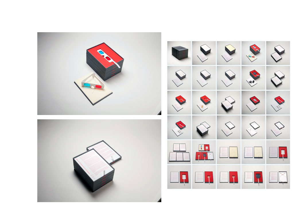
| One for Each By Paolo Salvagione San Francisco, California: San Francisco Center for the Book, 2011. Edition of 40. 6 x 8.5 x 5.325" set of five stacked drawers. Five books: Sight (18 pages with 3D glasses), Smell (4 pages with 3 vials); Taste (2 pages with 10 pills); Touch (6 pages with 12 leaf cutouts); and Sound (10 pages). Medium: glass, nylon, leather, buckram, scent, paper, and bookboard. Drawers bound in English buckram. Banded in 4.25 x 23" black stiff paper with titles in white. San Francisco Center for the Book: "Paolo Salvagione has created a sensory Wunderkammer. His elegant cabinet of curiosities contains five drawers, one for each of the human senses. Each drawer holds a distinct, self-contained object — and in the playful manner that routinely characterizes Salvagione's work, the senses mingle in unexpected ways. "Three-dimensional projections emphasize the tactile nature of printed images. Silhouettes of leaves ask you to gauge species by contour, yet the absence of color brings attention to the visual. Talking tapes acknowledge a tangible aspect of sound. A musky, smell-based exploration summons up mental images of physical activity. A unique taste enhancer promises to temporarily bond to your receptors, making all things sour seem sweet — but first your fingers must negotiate the brittle blister pack. "And all, in combination and individually, show how our senses can deceive us, and in the process yield something akin to a child's surprise at the roles these senses play in helping us navigate the world. "Paolo Salvagione is an artist who works at the intersection of engineering, participation, and levity. "He was born in Chicago and at an early age moved with his family to Southern France, where he developed an affection for bullfighting. He spent his teen years in Albuquerque, New Mexico, living around the corner from Joel-Peter Witkin, whom he occasionally assisted with set construction and corpse transportation. He spent his college years in Manhattan reading philosophy. "Grounded in the practice of thinking about thinking about things, he spent a half a decade circling the world setting up bicycle factories from Italy to Indonesia — mastering titanium fabrication after hours at Martin Marietta in Colorado, working on next-generation paint-application systems for Boeing, employing CAD software for hi-tech bike design in Marin, even designing an atmospheric-dust collection tool for NASA. And he has worked, for over a decade, as lead engineer on the 10000 Year Clock of the Long Now Foundation. "In his art, Salvagione has sent his studio visitors out one second-story window and in another on a 900-pound steel wheel. He has used a laser cutter to give negative space a razor-sharp edge, creating a frozen bellows of light. He has filled a World War I gymnasium with a mix of pure geometry and pure fun in the form of ten oversized swings, with the implicit suggestion that visitors compete. He has commented on the role of finance in the art market by selling uncut currency presented in a fetishized box, including a pair of paper sheers. And he has pushed kinetic sculpture past what the eye perceives as sufficiently balanced. "He is an autodidact by trade and yet, as the son of a printmaker and the grandson of a sculptor and of an architect, very much an artist schooled in tradition. All his works balance humor and craftsmanship, the novel and the banal, the tactile and the conceptual." $550 |
|
Erratum See Erratum brick tying method |
|
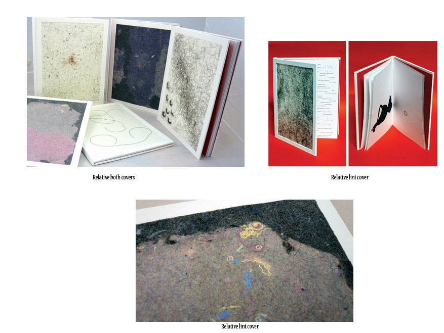
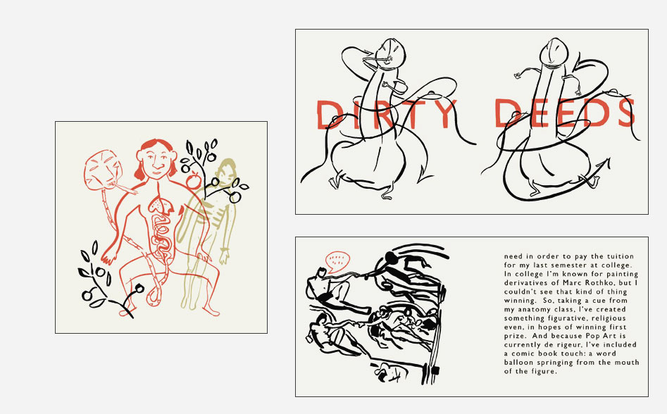
THE RELATIVE VALUE of things 10.5 x 8"; 30 pages. White paper covered boards. Perfect bound. Front board designed with dryer lint or hair. San Francisco Center for the Book: "The Relative Value of Things consists of three projects that investigate the joys, follies, and contradictions of collecting, desire, and valorization. The first project is the books' front covers, each uniquely embellished with encapsulated hair or lint donated by a multitude of individuals. The second is the books' contents, comprised of color images and letterpress-printed lists documenting personal possessions discarded by the artist over time. The third project comprises the back covers, featuring meticulously drawn text that addresses the struggle to find reassurance and meaning amidst life's mysteries and uncertainties." [The back cover is from a project called Someday I Will Be As Insignificant As a Swarm of Summer Insects.] Nigel Poor, 2007 Aperture West Book Prize submission: “The Relative Value of Things is a photographic project that also includes a fair amount of text. I see the text and images as having equal importance. Today the written list numbers over 500 objects and the photographic aspect is a simple sampling of these ‘dumb discarded things.’ The text is small and handwritten, yet large enough to read. Most of the list is written with a black rapidograph, though the words in red signify the items which have been photographed. The photographs are straight ahead images of objects. As one looks at the collection of things and words, threads begin to emerge; patterns and sensibilities can be seen. The objects range from beautiful and mysterious to humble, hopeful, and sad. They are the cast off objects of everyday life given weight by knowing they once reflected something of intrinsic value.” |
|
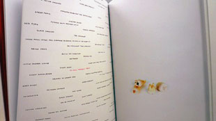
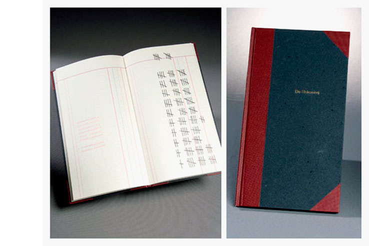
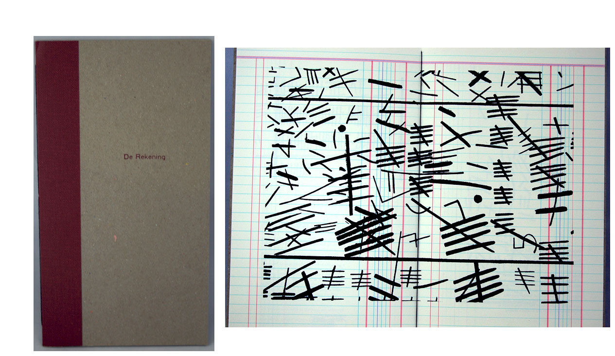
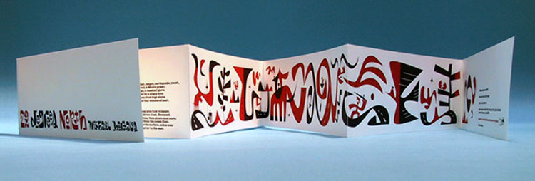
De Rekening Numbered edition: 6.75 x 11.5"; 72 pages. Letterpress printed by the artists at the Center for the Book. Printed on Mohawk Superfine paper. Repetitive motifs printed using letterpress with photopolymer plates, rubber stamps, gold stamping, and handwriting. Endsheets of handmade paper from La Papeterie Saint-Armand. Bound in Japanese buckram with stamped title. Signed and numbered by the artists. Trade edition: 6.25 x 11.5"; 8 pages. Hand sewn binding. Bound in quarter Japanese buckram with chipboard covers. John DeMerritt, a bookbinder, and his wife printmaker Nora Pauwels were Artists in Residence at the San Francisco Center for the Book in 2006 where they produced De Rekening, an editioned artists' book. SFCB: "De Rekening is a work built upon an artist-created system of 'fake writing' used to mark the passing of time. "Inspired by the anonymous entries in 19th-century ledgers and account books, De Rekening borrows its form and repetitive structure from those utilitarian yet evocative receptacles of time. The ruled lines in the book were mechanically drawn using a pen ruling machine at Golden Business Forms in West Burlington, Iowa, especially for this edition. "Pen ruling was widely used in the 19th and early 20th century in the ledger and account book trade; Golden Business Forms is one of the last purveyors of this technology. " John DeMerritt, Artists in Residence Arts Talk 2007: "We had this old hotel ledger that I’ve owned for years and years. A friend of mine who’s involved in advocacy for the homeless received it from a client. It’s a hotel ledger from the Hotel Iroqois, 835 O’Farrell Street, 1945 through January ’45 through March, April ’46. A fascinating document from the post war. There’s probably a lot of servicemen in there. This document was the jumping off point for us in creating 'De Rekening.' In a lot of ways, we see 'De Rekening' as a companion piece to this ledger. ... "Nora is a printmaker and does a lot of drawings. She’s really interested of late in this kind of automatic writing. They don’t say anything. Well, they have dates and stuff and they say a lot but they don’t say anything. ..." Nora Pauwels, Artists in Residence Arts Talk 2007: " I’m very interested in the visual aspect of the writing. It’s hard, it’s just as a visual the way you look at like foreign text that you don’t understand but you kind of like to look at it." |
|
Small Plates Series San Francisco Center for the Book: "We've invited selected artists and writers to create books of a specific size and cohesive theme. For 2008, the books are four inches square and devoted to the theme How-To." |
|
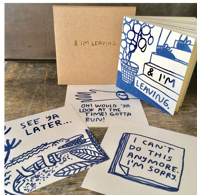
& I'm Leaving 4 x 4"; 18 pages. Risograph printed double sided. One color. Saddle stitched binding. In slip and slot closure envelope with titles foil stamped. Signed and numbered by the artist. Includes four 4 x 4" individual cards printed on one side (colophon + 3 exit cards). Carissa Potter: "Leaving is hard. Like that last relationship I had with that guy who did nothing wrong. Or my friends party where everyone else forgot to show up. Or the country when things go to shit. How do you know when to stay and stick through it? & I'm Leaving is a short rumination on tricky situations you might one day find yourself in (happy ending included). "The envelope with gold is a nice classy way to leave someone a goodbye letter. Also included are some cards to help you exit." SFCB, about the artist: "Originally from Minneapolis, Carissa Potter lives and works in Oakland, California. Her prints and small-scale objects reflect her hopeless romanticism through their investigations into public and private intimacy. Speaking both humorously and poignantly to the human condition, Carissa's work touches chords we all can relate to — exploring situations we've all experienced at some point in our lives and conveying messages we simply long to hear. Carissa Potter is a founding member of the Colpa Press and founder of People I've Loved." |
|
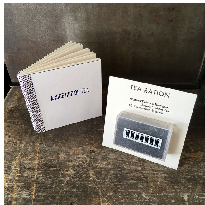
A Nice Cup of Tea 4 x 4"; 36 pages. Letterpress printed on 170 gsm Velata Ivory. Text handset 12 point News Gothic & Palatino. Decorative text and titles include Bulmer, Futura, Garamond, Onyx, & various wooden types. Bound in binder's board with illustrated paper spine. Numbered. Includes "Tea Ration" attached to 4 x 4" card with LCD Temperature indicator. "A Nice Cup of Tea" from The Collected Essays, Journalism and Letters of George Orwell, Volume III: As I Please, 1943-1945. Used by permission of Houghton Mifflin Harcourt Publishing Company. All rights reserved. SFCB: "In 1946, George Orwell wrote an essay for the Evening Standard of just over a thousand words entitled 'A Nice Cup of Tea.' It's a 10 point treatise on how to properly brew a cup of traditional English tea. This book is a sewn modified drum leaf and includes a ration of tea and an LCD temperature strip to ensure the water is hot enough. The book and equipment serve as a portable kit, just add a teacup or pot. "Brian wandered into SFCB several years ago and continues to haunt the place. He completed both the bookbinding and letterpress core programs as well as several of the summer historic structure classes. He began vending his excess production and practice pieces at conventions a few years ago. He's lived in San Francisco for more than 20 years, having arrived shortly after completing his MFA at the University of Texas at Austin." |
|
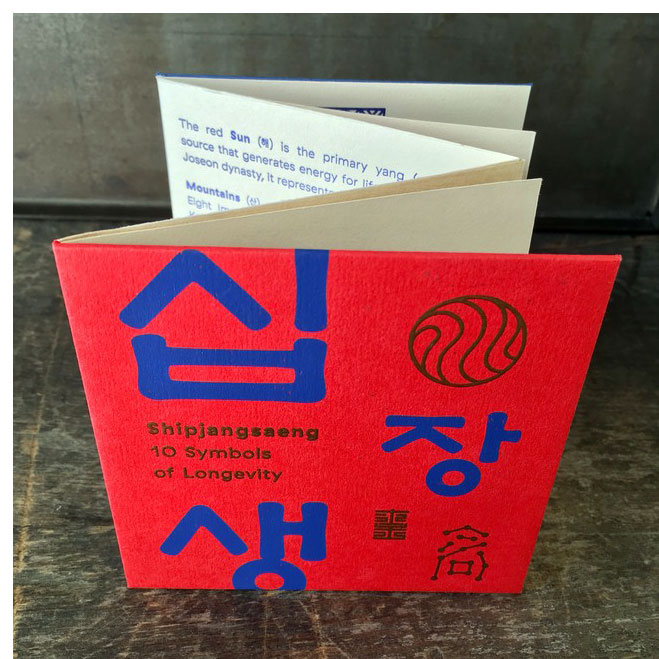
Shipjangsaeng 4 x 4"; T-cut book structure, 10 total pages. Letterpress and screen printed on Colorplan 91 lb. Text in Bright Red, Mist, and Sapphire. Illustration printed on hanji (Korean handmade paper) from Jang Ji Bang paper mill in Gapyeong, Korea. Signed and numbered by the artist on the colophon located on the back board. SFCB: "A modern interpretation of Shipjangsaeng or the Ten symbols of Longevity. These Daoist-inspired motifs collectively depict an auspicious life in harmony with nature and are celebrated in the decorative arts by all social classes throughout Korean history. The binding is a T-cut book structure — to follow early Korean bookbinding methods and the shape of folding screens placed in traditional Korean homes, many of which feature calligraphy or landscape scenes like Shipjangsaeng. "Lars Kim is a designer and printmaker living in San Francisco. She has a deep passion for fine typography and complex print projects, often blending letterpress with offsest printing, screen printing, intaglio, handmade paper, and bookbinding. She manages production at Logos Graphics and slings pixels at her own practice, Solsken Design." |
|
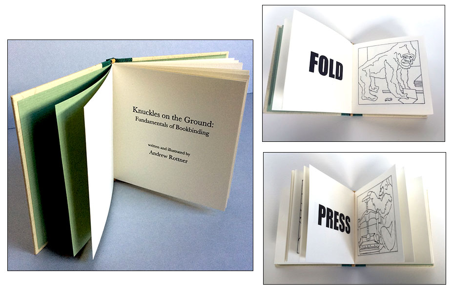
Knuckles On The Ground: 4 x 4"; 32 pages. Printed on Classic Crest 100T Natural White. Paper-covered boards with titles printed on front board. Signed, dated, and numbered by the artist. San Francisco Center for the Book: "Knuckles on the Ground is a whimsical illustrated guide to ten key elements of bookbinding. "Andrew Rottner received a BFA from Wittenberg University in 2001 and an MFA from San Francisco Art Institute in 2007. He has studied and worked as a bookbinder and book artist in the Bay Area since 2004 and teaches at San Francisco Art Institute as well as SFCB. Andrew's books, paintings, and drawings have been exhibited locally and internationally including at Photo LA and the Codex Book Fair in Berkeley. Andrew's imprint, Super Classy Publishing, produces mass market and fine press books with Bay Area artists and printers." |
|
| Deconstruction/Construction the Central Freeway, the Hayes Valley Farm, and ongoing changes to San Francisco's landscape |
|
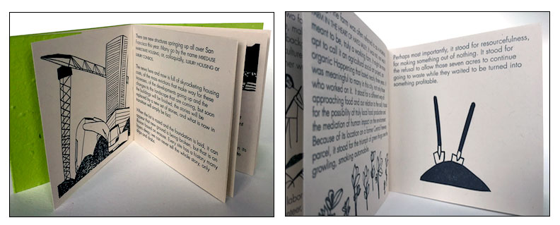
By Annemarie Munn 4 x 4"; 12 pages. Letterpress printed. Text: Newsprint White Dur-otone by French Paper. Cover: plantable paper handmade by Porridge papers. Signed, dated and numbered by the artist. Annemarie Munn: "The news here and now is full of skyrocketing housing costs, of the mass evictions that make way for these increases, of the developments going up and the changes to the landscape that are coming, but soon the buildings will be finished, the stories will be replaced by a new set of stories, and what is now in transition will simply be fact." SFCB: "Deconstruction/Construction addresses themes of change, growth, and destruction in San Francisco. It looks at the way that physical and social aspects of space inform each other. Telling the story of the Hayes Valley Farm, erected in 2010, the book reflects on the intense economic and population-density growth within the city of San Francisco, during which concepts of 'useful' or 'social' space shifted. It fights the erasure of rapid change by reflecting on the history of spaces as they are rapidly transformed." |
|
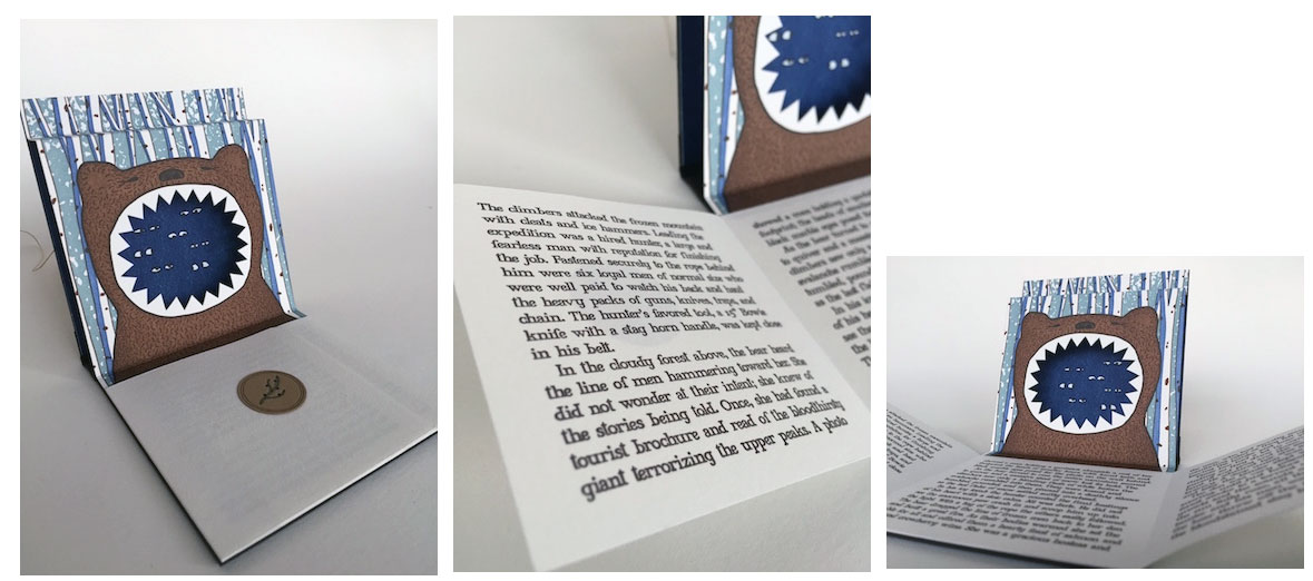
The Hunter and the Bear San Francisco, California: San Francisco Center for the Book, 2014. Edition of 100. 4 x 4"; 3 pages. Pop up. Letterpress printed. Materials: paper, book cloth, button, string. Bound in black boards with cloth spine. Paper title label on front cover. Button and string closure. Numbered. SFCB: "This book tells a fairytale-like story of a hunter and a bear. The hunter, along with six helpers, heads into the mountains to kill a fearsome beast of legend, an extremely large bear. What he finds is something deeper, when he falls in love with his prey. Unfortunately the bonds of love are not strong enough to overpower the two lovers’ basic natures. There is a betrayal, a scuffle, and the story ends when the bear eats the hunter and all six of his men." |
 Click image for more |
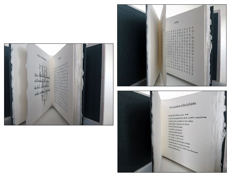
Words Fail 4 x 4"; 24 pages. Typeset in Optima. Printed from photopolymer plates on dampened Rives de Lin. Bound in paper covered boards. Signed and numbered by the artist. Twelve poems by Lisa Rappoport using six versions of typographic erosion. Texts are printed with only the top 50% of the letterforms shown; crossed writing or crossed letters; stoichedon (letters in a grid without word spaces); omitted vowels; blind hit (impression without ink); and boustrophedon (one line reading left to right, the next right to left, and so on). San Francisco Center for the Book: "'Lisa Rappoport publishes poetry broadsides and artists' books under the imprint Littoral Press. "Since 1998 she has produced a series of broadsides by the poets who teach at the Squaw Valley Community of Writers; she has also printed poetry broadsides for Lawrence Ferlinghetti and City Lights Books, Lyric Poetry Review, and many others (last but not least, the Poets Pulling Prints series of the SFCB). Her poetry has appeared in Five Fingers Review, Literal Latte, and elsewhere." |
|
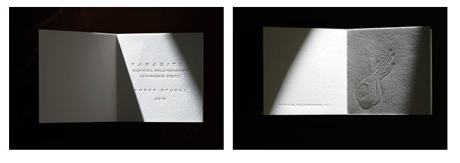
Parasites: Survival Relationships (Symbiosis State) 4 x 4"; 23 pages. Printed on a Chandler & Price Platen Press. Blind embossed. White boards with title embossed on front cover. Numbered and initialed by the artist. San Francisco Center for the Book: "'With this publication Stucke interrogates the biological and cultural definitions of symbiosis. By combining experiential and rational knowledge systems with the medium of drawing, she appropriates visual taxonomies that create conversations between local knowledge systems of the human body and scientific classification structures. "In essence, Parasites: Survival Relationships (Symbiosis State), explores the invisible, sensorial, and imaginative experience of parasites using the letterpress printing techniques of SFCB Master Printer Chad Johnson." |
|
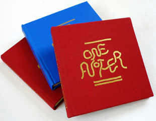
One Another This project was inspired by Howard Zinn's Artists in Times of War, and the work of bay area artists Allison Smith & Susan O'Malley." |
|
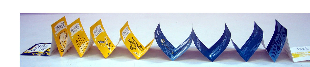
| Sideshow By Rigel Stuhmiller San Francisco, California: San Francisco Center for the Book, 2010. Edition of 100. 4.5 x 4.5"; 45 pages. Double-sided vertical accordion fold book. Three-color letterpress printed. Colophon pastedown. Illustrated wraparound wrapper. San Francisco Center for the Book: "The book follows the rise and fall of a vintage fictional circus. The format of the book, 11 double-sided pages, uses two storytelling channels to mimic the duplicity of a performance. Bright circus poster image on the front side of the page are the show presented to the audience. The back sides of the pages are the behind-the-scenes perspective: newspaper clippings, notes, and various ephemera that tell the story of the lives of the people who create the performance." Rigel Stuhmiller: "Hand-creating a book is a unique process, so I thought it appropriate to try a unique storytelling method. I took inspiration from one of my heroes, statistician Edward Tufte to tell the story of the rise and fall of two circuses using only circus posters and newspaper clippings. ... "The book is formatted in two sections. Showy, multi-color circus posters will be on the front of all the pages. More subtle black-and-white newspaper clippings will be on the back of the pages. These clippings are very important as they give all the details of plot development." Rigel Stuhmiller is a Bay Area artist working in printmaking, illustration, design, and storyboarding. $44 |
|
god's femur 4.125 x 4"; 30 pages. 15 illustrations. Letterpress printed on a Vandercook 4 press. Paper: Somerset. Typeset: Gill Sans. Handbound in heavyweight illustrated paper cover with cloth spine. Written and illustrated by Ward Schumaker, this is one in the Small Plates series published under the Imprint of the San Francisco Center for the Book. Text designed by Lili Ong and Michael Bartalos. Kafkaesque story of a young artist meeting up with provincial tastes (or perverted minds?) in 1965 Nebraska. Ward Schumaker: "Yes, the story in God's Femur is true—all except the part about the painting being dirty. It wasn't. And isn't. But I was making a book out of the event, a small and short book, so I came up with a different ending. And after all this time and water-under-the-bridge, did I care? Better to look back and laugh." About the writer/artist: "As an illustrator Ward Schumaker’s work has appeared in over 100 magazines, including Poetry, The New Yorker, Le Figaro, Le Monde, Esquire Japan, and the L.A. and N.Y. Times. He has drawn for clients as diverse as Hermès, Neiman Marcus, United Airlines, and SFJazz. He is author/illustrator of three children’s books: Dance; Sing a Song of Circus; and In My Garden. He has illustrated two limited edition letterpress books for the Yolla Bolly Press: Two Kitchens in Provence by M.F.K. Fisher, and Paris France by Gertrude Stein. … He is the creator of many logotypes, including Moose’s Restaurant (San Francisco), Columbus Bakery (New York City) and MosBurger (Tokyo). He has received awards from the AIGA, CA Illustration and Design Annuals, Print Magazine, Graphis, American Illustration, and The Society of Illustrators. His work has been featured in articles in Communication Arts, Print, Step-by-Step, Design Journal (Korea), and Portfolio (Japan). With the Smithsonian Institution, Cooper-Hewitt, National Design Museum in New York, he received a Federal Design Achievement Award for his work on "Unlimited by Design." |
|
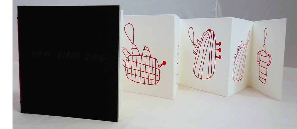
How Birds Sing 4 x 4"; 9 pages. 6 illustrations. Letterpress printed on a Vandercook 4 press. Heavyweight paper cover and hand-bound. Ryan's 11-line poem (posted in the Central Park Zoo) is here illustrated by Tucker Nichols. Ryan, appointed the Library of Congress’s sixteenth Poet Laureate Consultant in Poetry in 2008, was called by Billy Collins "the Fabergé Egg" of poetry. |
 Click image for more |
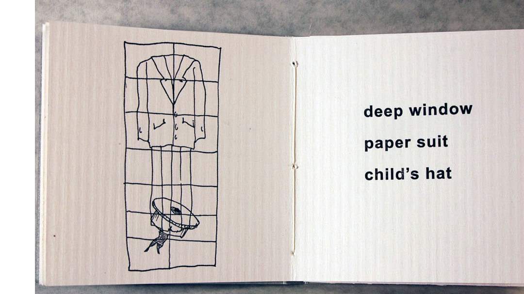
Lyrica 4 x 4"; 24 pages. Letterpress printed. Poet Michael Hannon's list of two-word combinations ("deep window / paper suit / child's hat") are illustrated by Bay Area artist William Wiley's black-and-white line drawings. (Lyrica is a drug for nerve pain, which might help.) |
 Click image for more |
| San Francisco Center for the Book Out of Print Title: | |
29 Degrees North 5.4 x 14.6" closed, accordion. Six leaves printed on one side only. San Francisco Center for the Book: "The title of our first publication refers to a degree of latitude shared by six destinations depicted in this artist's travelogue. From west to east, the poem and images progress from Mexico to Morocco, through India on to China, and over to Japan before terminating in Hawaii. Two-color iconic images, printed by Nat Swope at Bloom Screen Printing, Oakland, California, extend over an accordion-fold structure. The binding was designed by John DeMerritt in collaboration with the artist and features a deluxe clamshell box covered in Japanese silk with foil-stamped title and illustration." |
|
BICHOS DEL CAMPO 4 x 4"; 14 pages. Linoleum cuts. Printed in two colors on Rives Heavyweight 175 gsm. Letterpress printed at Aardvark Letterpress in Los Angeles. Bound in Bhutan Shawa covers at the San Francisco Center for the Book (SFCB). Illustrations, type design and printed by Daniel González. Binding designed by Vi Thuc Ha. Book production coordinated by Rhiannon Alpers with binding assistance of SFCB volunteers and interns. SFCB: "Bichos del Campo is a bestiary of three Mexican folk tales re-told and illustrated by artist Daniel González. "Bichos del Campo translates as Creatures of the Fields. Its introductory text and fables are illustrated in Daniel's signature linoleum block print style, delivering on the mood set in his preface: If there was ever a setting where anything was possible, where the real and imagined can coexist, it would be in the ranchos of my grandparents. At night, the small flicker of the kerosene lamp was the only light for miles in a night filled with sounds. In these adobe homes, I learned that bees pray, snakes steal milk from cows, and some people fly in the shape of owls. "Daniel studied graphic design and printmaking at the California College of the Arts. He currently lives and works in Los Angeles where he served a two-year apprenticeship at La Mano Press before striking out on his own. He draws on his Mexican heritage and bicultural experiences in much of his artwork." |
|
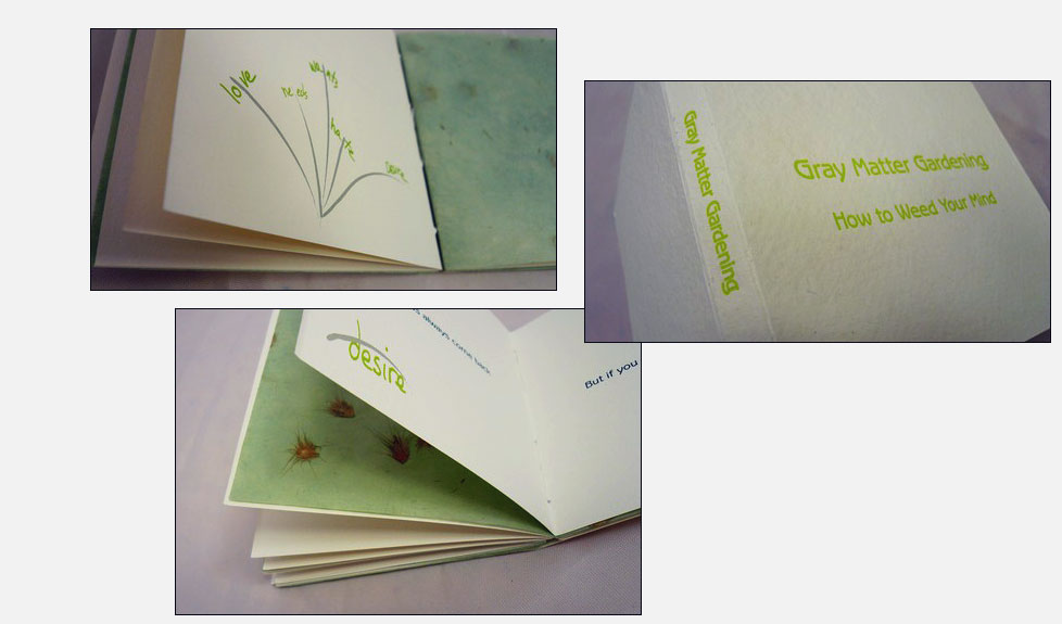
Gray Matter Gardening 4 x 4"; 23 pages. 23 illustrations. Letterpress printed paper cover. Inkjet images. Handbound. San Francisco Center for the Book: "Nanette Wylde is a conceptual artist and cultural worker with a passion for artists’ books. She is a native of California where she makes her home with one spousal unit, one cat, and an abundance of edible and decorative plant life." Five sections: Create an environment conducive to weeding; Determine what is a weed and what is not a weed; Remove the weeds; Understand the weed; and, Repeat as needed. "Inspiration provided by the Dharma." |
|
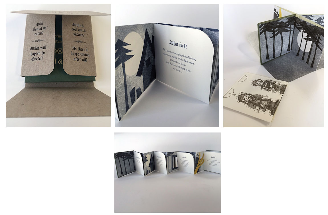
Grimm's Fairy Tale Theater: Hänsel & Gretel 4 x 4"; Accordion structure with fold-out pages. Foil stamped cover. Linoleum block letterpress printed images. Letterpress printed text. Letterpress printed paper dolls in glassine envelope. Housed in a folded paper box. Signed and numbered by the artist. SFCB: "Like so many children in Germany, book artist Bettina Pauly grew up listening to and reading Grimm’s fairy tales, which left a lasting impression on her imagination and creative work. In Grimm's Fairy Tale Theatre, Pauly retells the tale of Hänsel & Gretel. A dark tale of two children, brother Hänsel and sister Gretel are taken to the dark forest and left alone to die. The lost children eventually discover a small cottage built of cake and candy-canes, oblivious of the fact that the cottage belongs to an evil witch. The witch plans to feed Hansel to become fat and juicy so she can cook him and eat him as her favorite dinner: young tender little children! Gretel learns of her plan, and before Hansel meets this terrible fate, Gretel tricks the witch and pushes her into the fire of the oven that is waiting for Hänsel. Both children are freed from the witch's cottage and good has succeeded over evil. Pauly was trained as a professional chef in Germany and worked as a head-server throughout Europe before moving to the United States. This experience as both a chef and a host connects Pauly to this story in unexpectedly funny ways. "About the artist: Bettina Pauly loves books and boxes both as physical objects and as containers of meaning. She teaches book arts and letterpress classes at the Academy of Art University and at the San Francisco Center for the Book and is interested in a variety of folded, sewn, and woven structures in which she can incorporate her printing." |
 Click image for more |
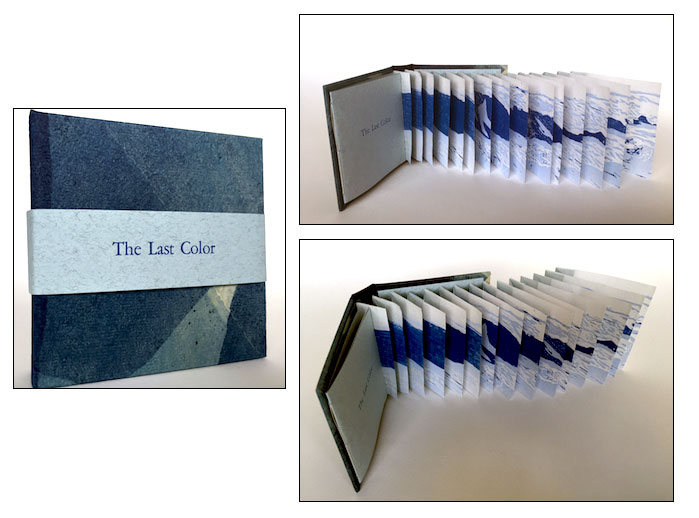
The Last Color 4 x 4" with opening extending from the interior front pastedown. Structure: variation on the Flag Book invented by Hedi Kyle. Papers: Sekishu, Fabriano Tiziano, ave Paper's Multi-dipped Indigo. Imagery printed from reduction woodblocks. Text: Garamond, letterpress printed. Bound in paper covered boards. Band closure with titles. Signed and numbered by the artist. San Francisco Center for the Book: "According to the theory of linguistic relativity and the hierarchy of color, almost all spoken languages evolve words for colors in a specific order: black/white, red, yellow, green, and finally, blue. Almost universally, the word for the color blue is the last to develop. Linguists now theorize that languages do not evolve words for colors until their cultures can fabricate them. Since blue is the most difficult color to reproduce, it is usually the last color word for a language to develop. Additionally, once a color can be replicated, the mind develops a category for items that fit that classification. In fact, in many ancient texts, such as the Iliad and the Odyssey, the word blue is nonexistent. Which means that poetry, particularly for such aquatic epics, is older than a word to describe the color of the sea. The languages we speak and the words we know influence how we perceive the world. In The Last Color, readers are invited to contemplate this notion, and to wonder what it would be like to look at the ocean and not know the word for blue. "About the artist: Michelle Wilson is a papermaker, printmaker, book, and installation artist. She is also one-half of the ongoing collaborative political art team BOOK BOMBS. She has exhibited her work both internationally and in the United States, including participation in biennials such as Philadelphia's Philagrafika 2010 and the 2006 Second International Biennial for the Artist's Book in Alexandria, Egypt. "In addition, she is a past hand-papermaking advisor to Signa-Haiti, a non-governmental organization developing a sustainable and bio-dynamic economy in Haiti. Wilson’s imprint is Rocinante Press. A former longtime resident of Philadelphia, Wilson now lives and works in the San Francisco Bay Area." |
|
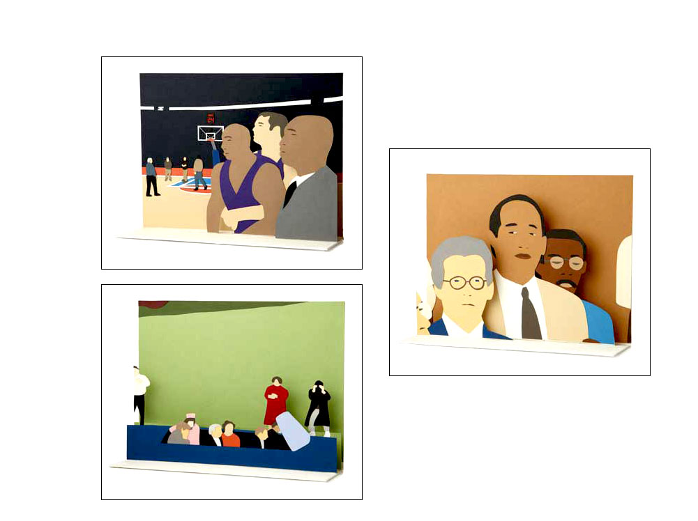
| Paper Space By Kota Ezawa San Francisco, California: San Francisco Center for the Book, 2011. Edition of 40. 9.75 x 12 x 1.75"; 4 pages. Pop-ups. Papercutting. Collage using solid colored paper shapes. Housed in a custom lidded cloth-covered box. The seventh Artist-in-Residence project under the imprint of the San Francisco Center of the Book, Paper Space was produced by Rhiannon Alpers in conjunction with Michael Bartalos. San Francisco Center for the Book: "Paper Space is a 4-page pop-up book consisting of paper cut-out dioramas based on film and TV depictions of historic events from the mid-19th century to the present. The book unfolds into a structure divided into four spaces – each housing one of the pop-up scenes. The dioramas create a timeline of events that have disrupted and confused America’s view of itself. Page 1 shows witnesses of Abraham Lincoln’s assassination in 1865 at Ford Theatre. The second diorama re-creates John F. Kennedy’s limousine passing the grassy knoll in Dallas in 1963. Page 3 presents O.J. Simpson and his legal team awaiting the reading of his 1995 criminal trial verdict. The last diorama recreates the infamous brawl at Auburn Palace in Detroit, involving players of the Indiana Pacers, the Detroit Pistons, and fans attending the 2003 NBA game. "Each diorama is based on a still frame of a widely circulated film or TV program, while simultaneously referencing an existing animated film by Ezawa (The Unbearable Lightness of Being, 2005; The Simpson Verdict, 2002; Brawl, 2008). "Paper Space meditates on space – the space of a book, the space of a page; the book as space, flatness, and three-dimensionality. In this way, two of the most persistent illusions that surround us – time and space – form a kind of pact to create a Paper Space for history. "Kota Ezawa is a kind of video, film, and photography archeologist unearthing animations and still images that are hidden in archival footage. His projects have taken the form of digital animations, slide projections, lightboxes, paper cutouts, intaglio etchings, ink drawings, and wood sculptures." (SOLD/Out of Print) |
 Click image for more |
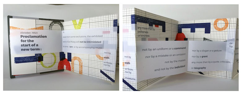
Proclamatie 4 x 4"; 18 pages. Accordion fold. Hand bound, hand stamped, and hand letterpress printed on SFCB’s iron handpress. Signed and numbered by the artist. SFCB: "H.N. Werkman (Dutch, 1882 – 1945) was an artist and technician ahead of his time. Investigating fine art ideas related to form and typography, Werkman composed prints and small press booklets on the bed of his iron handpress. Incredibly complex, these prints and books were often regarded by Werkman’s contemporaries with puzzlement. "Proclamatie is an artist's book in homage to H.N. Werkman. Much of the design work took place on the bed of the press, allowing for spontaneous design decisions during the process. True to Werkman’s methods of working, the project included 'unrehearsed' techniques such as stencils and hand stamping. The text is taken from Werkman’s manifesto Proclamatie (Proclamation), originally published in 1932. "About the artist: As a 'near-native' of San Francisco, Jennie Hinchcliff has been creating artists books since 2000. … [H]er work often explores the beauty of small details and incorporates obscure materials which speak of other eras." |
|
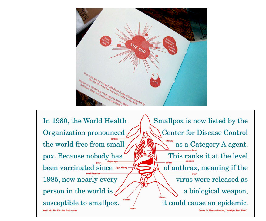
RABBITPOX 4 x 4"; 20 pages. Hand set in Century Schoolbook type. Printed on a Vandercook Proof Press. Housed in a handmade lightweight illustrated card box with flap and tab closure. This is the second of four Small Plates editions published in 2009 under the Imprint of the San Francisco Center for the Book. The book production was coordinated by Katherine Case and Pam De Luco with printing and binding assistance of SFCB volunteers. SFCB: "Rabbitpox, written and illustrated by Allison Weiner, casts rabbits as the heroes and the pawns in a tale of biological warfare. The story is inspired by a 2004 Harper's Magazine item describing American scientists as having engineered extra-lethal forms of mousepox, cowpox and, of course, rabbitpox. Allison's book combines text, inventive design, and diagrammatic illustrations with a whole lot of personality to find humor, absurdity, and alarm at the dark extremes of biological science. "Each book is housed in a handmade box and bound with thread spun by Pam [De Luco] from the fur of her pet rabbit Charisma, a white German Angora who reportedly had a show career. "Allison [Weiner] is a Bay Area creative who studied at Stanford University, The San Francisco Art Institute, and the California College of the Arts. Rabbitpox is her first artist's book edition. It is Charisma's first foray into book arts as well." |
|
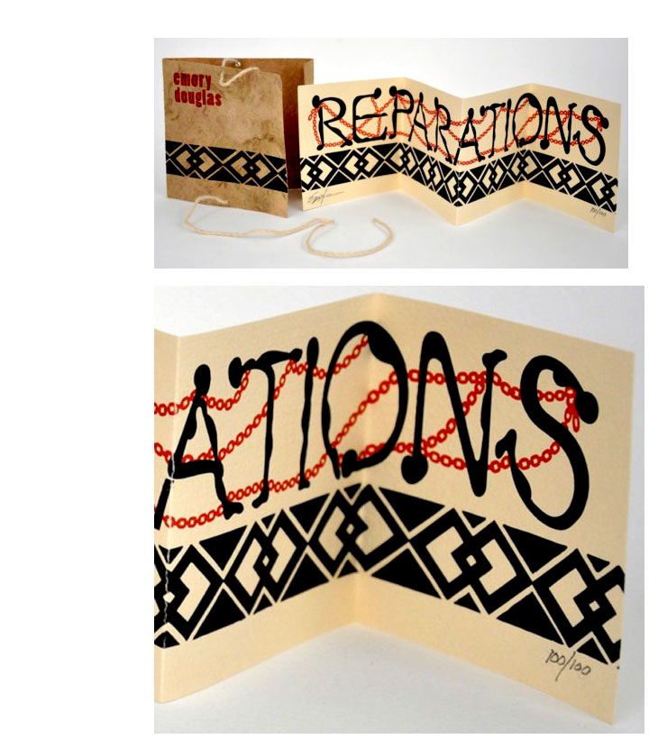
Reparations 4.125 x 4"; 4 leaves. Accordion structure with one continuous illustration. Original painting by the artist printed letterpress in two colors. Wrapper of Amate bank with hand-spun hemp and silk thread. Colophon page tipped to interior of wrapper. Book design by Michael Bartalos and Lili Ong. Emory Douglas: "The content of my Imprint publication deals with the subject of reparations and slavery with each abstract designed figure chained together making up the word, REPARATIONS." San Francisco Center for the Book: "This featured artist, Emory Douglas, is renowned for his iconic representations of the Black Panther Party through his work the Party's Minister of Culture. For decades, he communicated the power and charisma of the movement through his compelling straightforward graphic style. Recently, his work has been celebrated and displayed at the New Museum in New York City, the Museum for Contemporary Art in Los Angeles, as well as in England at the URBIS Exhibition." |
|
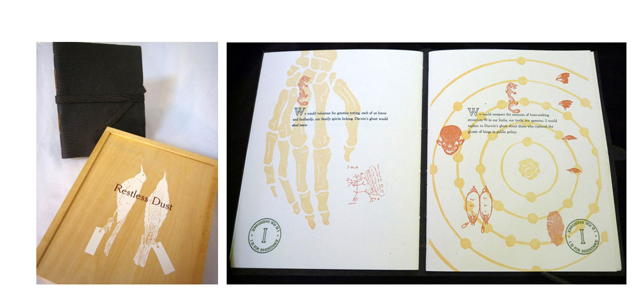
Restless Dust 7.75 x 9.75 x 3.5" container with book and shadowbox installation. Book: 6.5 x 8.25", 36 pages. Linocut images. Hand set in Cheltentam Old Style. Printed on Rives heavyweight paper. Letterpress printed on a Vandercook press. Bound in leather with leather tie closure. San Francisco Center for the Book: "Wight's text, Restless Dust, invites Charles Darwin's ghost to sail to San Francisco and wander with her through the greater Bay Area terrain. The focus of the journey is three part: to celebrate the unique species of the San Francisco Bay Area; to look at the ways in which Darwin's legacy has impacted contemporary Bay Area culture; and to acknowledge the fragile and endangered state of many of our local flora and fauna caused by environmental degradation. "Artist/author Gail Wight created Restless Dust as a multimedia installation housed in a two-tiered wooden box. The top portion holds a letterpress printed, leather bound artist's book which is separated by Plexiglas from a velvet-lined bottom chamber containing two illuminated paper birds (activated when the box lid is removed). " Gail Wight: "In attempts to understand life, I have: made maps of various nervous systems, practiced art while under hypnosis, conducted biochemical experiments on myself and willing others, executed medical illustrations in black velvet, documented dissections of humans, dissected machines and failed to put most of them back together, removed my teeth to model information systems, translated EEGs into music, painted with slime mold, made music with mice, drawings with bones, and have attempted to create models of my own confused state. "The interplay between art and biology, theories of evolution, cognition and the animal state-of-being form the groundwork for my thoughts. In what ways do we resemble worms? Is a machine more or less reliable due to its lack of endorphins, emotions, and opiate addictions? Can an artist collaborate with other species? What does compassion look like at the neuroanatomical level? "My artwork investigates issues in biology and the history of science and technology. It explores the cultural impact of scientific practice, and our ongoing redefinition of self through epistemological constructions. I try to follow the ways in which these ideologies both metaphysical and manifest travel through time, moving from the scientific to the social sphere, the social to the scientific, and so often become the overlooked of the everyday. " Gail Wight works in experimental media focusing on issues of biology, the history of scientific theory and technology. She is currently Associate Professor at Stanford University Department of Art and Art History and Director of Graduate Studies in Studio Art and Experimental Media Arts. |
|
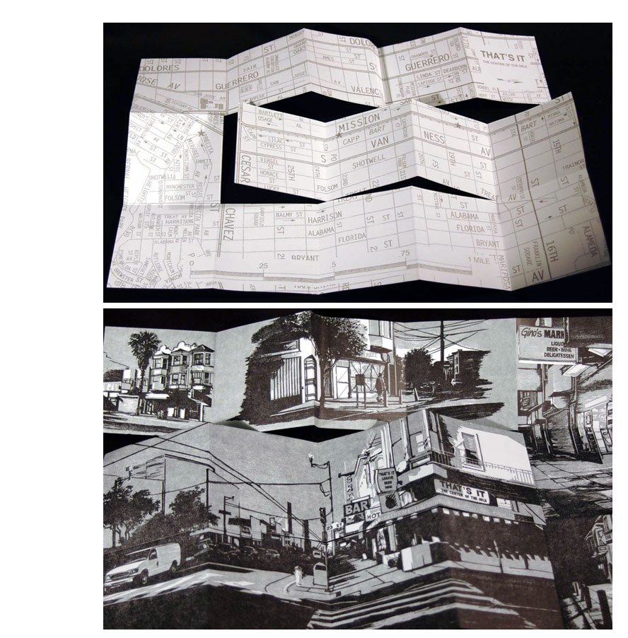
| That's It: Liquor, Beer, and Wine By Sarah Newton San Francisco: San Francisco Center for the Book, 2011. Edition of 100. 4.5 x 4.25"; 18 pages. Double-sided single-sheet. Letterpress printed in two colors. Illustrations from hand-carved woodblocks transformed into polymer plates. Colophon pastedown. Illustrated wraparound wrapper with slip in slot closure. Signed by the artist. San Francisco Center for the Book: "'That's It: the Center of the Mile' is an intriguingly named liquor store on San Francisco's Mission Street. Sarah Newton's Imprint Small Plates edition, That's It: Liquor Beer Wine, is an observation of the square mile that surrounds this self-proclaimed nexus. The images are based on five woodcuts that depict the locations found at the edges of the mile, one half mile to the north and the south, in the morning and at night, leading the reader through a mile of urban experience. A screenprinted map on the back provides geographical context as well as the opportunity for further exploration. "Sarah Newton received her BFA in Printmaking from the California College of Arts where she studied under Charlie Gill, Barron Storey, and Larry McClary. After completing her degree she continued printmaking at the Graphics Arts Workshop in San Francisco. She continues to investigate public spaces, both urban and rural, and the ways in which they are re-contextualized by the activities of the people who use them. Sarah was a featured artist at the SFCB 2010 Roadworks event and her work was included in the Dec. 2010/Jan 2011 west coast issue of New American Paintings." Sarah Newton, general artist statement: "The subjects of these prints are drawn from my immediate surroundings. Almost all of them are within about a mile or less of where I live, public spaces that are part of my lived experience. Many of these places, such as fenced-off lots and vacant buildings, no longer have any prescribed function. Still, they remain as part of the environment; the activities of the people around them give them new uses and additional meanings. The depiction of such subjects is a form of contemplation on the commonplace. "With either photographs or sketches as initial studies, I then reinterpret these images as prints. Hand drawn on woodblock or metal plate, the prints are created slowly, through cutting, scraping, burnishing and proofing the plates or blocks. The attention that goes into the development of the image constitutes a meditation on details and spaces that normally don't receive more than a passing notice. It is a reflection of the attention required to find value in anything ordinary and to recognize its particularity." (SOLD) |
|
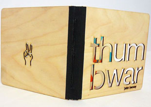
Thumb War 4 x 4"; 36 pages. 27 illustrations. Set in Blockhead unplugged. Letterpress printed in two colors using a Vandercook 4. Hand-bound with wooden boards and cloth spine. Front board laser-cut into finish grade plywood, with a small number of them laser-cut into chipboard. Text: "The ancient sport of thumb war was first recorded with pictograms on ceramics unearthed at Xanadu, the summer court of Kublai Kahn in the 13th century. Though there is earlier mention of a similar game 2000 years previous through buddhist texts where combatants engaged in zhi jue di, or toe wrestling, in a similar fashion. It is believed that Marco Polo brought the game to the West when he returned from his travels. Scholars have conjectured that the game was used to settle differences between rival officers as to who was going to sleep with the most popular concubine versus who was going to have to churn the ayrag in the morning before the great sky god awoke, but no one knows for sure." |
|
Page last update: 03.25.2023
Home | About Us | Contact Us | New Arrivals | Fine Press & Artists' Books | Broadsides |Resource Books | Order/Inquiry
Copyright © 2021 Vamp & Tramp, Booksellers, LLC. All rights reserved.